
Basic Data Interpretation interview questions
1. Imagine you have a simple bar graph showing the number of apples and oranges sold. Can you tell me which fruit was sold more?
2. If I give you a pie chart that represents the percentage of different colors in a box of crayons, how would you figure out which color is the most common?
3. Let's say you have a table showing the daily temperature for a week. Can you identify the hottest and coldest days?
4. Suppose you see a line graph that tracks the growth of a plant over time. How can you tell if the plant grew faster in the first week or the second week?
5. If you have data showing the number of students in different grades, how would you compare the size of each grade?
6. Imagine a scenario: A report states 'Sales increased by 10%'. What additional information would you need to fully understand if this is a significant increase?
7. A table shows website traffic over several months. How do you identify trends – are more people visiting, fewer, or is it staying the same?
8. If you're presented with a chart comparing two products, what key features would you focus on to decide which one is 'better'?
9. You're given a report saying that customer satisfaction is at 80%. What questions would you ask to understand the meaning and validity of this 80%?
10. A graph shows revenue fluctuating. What could be the reasons for these fluctuations? How would you determine the key influencing factors?
11. If you see a bar chart displaying survey results, how would you identify the most and least popular choices?
12. You have a dataset on the number of customers visiting a store each day. How would you check for any anomalies or unusual patterns in the data?
13. What are the important considerations while using a sample of the entire population to arrive at conclusions?
14. I have conducted a poll and have got 70% votes in my favor, can I claim to have won the election? What other data do you need to validate this claim?
15. A report card shows the distribution of grades in a class. How would you find out the percentage of students who passed?
16. If I say there is high correlation between two variables - what does that mean?
17. Can you tell me the difference between correlation and causation?
18. If a company's profits have increased, what additional data would you consider before investing?
19. A survey indicates 90% customer satisfaction. What potential biases could affect this result, and how could we mitigate them?
20. Explain the concept of a 'confidence interval' in simple terms and why it's important when interpreting data.
Intermediate Data Interpretation interview questions
1. A company's sales are trending upwards, but profit margins are shrinking. What could be the reason?
2. Explain how you would investigate a sudden drop in website traffic, using data.
3. Describe how to identify outliers in a dataset and their potential impact.
4. How would you analyze customer survey data to improve customer satisfaction?
5. How can correlation be misleading when interpreting data? Give an example.
6. Explain a scenario where a high average can be misleading in data analysis.
7. How would you determine if a new marketing campaign was successful using A/B testing results?
8. How do you account for seasonality when forecasting future sales?
9. Walk me through how you'd interpret a regression analysis output.
10. If you saw a significant increase in user churn, what data points would you investigate?
11. Explain how to use cohort analysis to understand user behavior over time.
12. What are some common pitfalls in data visualization that can lead to misinterpretation?
13. How would you present data insights to a non-technical audience?
14. Describe a time you had to make a decision based on incomplete data.
15. A product's customer ratings are declining, but sales are still increasing. What's happening?
16. How can you use data to identify opportunities for cost savings within a company?
17. Explain the difference between causation and correlation with a business example.
18. How would you assess the credibility and reliability of a data source?
19. Imagine you have conflicting data from two different sources. How do you resolve this?
20. What are some ethical considerations when working with sensitive customer data?
21. How would you handle missing data in a dataset?
22. If you notice a bias in your data, what steps would you take?
23. Can you explain how data mining can be useful, even when you don't know what you're looking for?
24. Let's say a survey shows 90% of people prefer a certain product feature. What other data would you want to see before making a decision about that feature?
Advanced Data Interpretation interview questions
1. How would you handle a situation where the data provided for analysis is incomplete or has missing values?
2. Imagine you're analyzing sales data and notice a sudden spike. How would you investigate the potential causes?
3. Explain how you would use data visualization techniques to present complex findings to a non-technical audience.
4. Describe a time you had to make a decision based on conflicting data. What steps did you take?
5. How would you go about identifying and addressing potential biases in a dataset?
6. If you have a dataset with multiple variables, explain how you would determine which variables are most important for predicting a specific outcome.
7. Walk me through your approach to validating the accuracy of a data source.
8. Let's say you are presented with a regression model. How would you interpret the coefficients?
9. How can statistical significance be misleading in data interpretation, and what can be done to mitigate this?
10. Explain how you would design an experiment to test a specific hypothesis using data analysis.
11. Describe your experience with different data analysis software or programming languages (e.g., Python, R, SQL).
12. How would you handle outliers in a dataset when performing statistical analysis?
13. Explain how you would use cohort analysis to understand user behavior over time.
14. Describe a situation where you had to present data findings to stakeholders with different levels of understanding. How did you tailor your approach?
15. How would you go about identifying trends and patterns in unstructured data (e.g., text, images)?
16. Explain the difference between correlation and causation, and how to avoid confusing the two when interpreting data.
17. How would you evaluate the performance of a classification model, such as a model that predicts customer churn?
18. Describe how you would use A/B testing to optimize a website or application based on user data.
19. If you have a dataset with categorical variables, explain how you would analyze the relationships between them.
20. How would you use time series analysis to forecast future trends based on historical data?
21. Describe how you would approach a data interpretation problem with limited time and resources.
22. Imagine you have a large dataset. What steps would you take to perform feature engineering and improve the performance of a predictive model?
23. Explain the concept of data normalization or standardization, and why it is important in data analysis.
24. How would you assess the risk associated with making decisions based on incomplete or uncertain data?
25. Explain how machine learning algorithms can be used for data interpretation and what considerations are important.
26. How would you go about building a data dashboard to track key performance indicators (KPIs) for a business?
Expert Data Interpretation interview questions
1. Walk me through a time you identified a critical flaw in a dataset that others missed. What was your process?
2. Imagine you have two datasets that contradict each other. How do you determine which one is more reliable and why?
3. Describe a situation where your data interpretation led to a significant business decision. What was the impact?
4. How do you handle missing or incomplete data when interpreting trends? What are the potential biases to watch out for?
5. Explain how you would interpret data from a controlled experiment versus observational data. What are the key differences in your approach?
6. Let's say you're presenting data to a non-technical audience. How do you ensure they understand the key insights without getting lost in the details?
7. Tell me about a time you had to defend your data interpretation against strong opposition. How did you handle the situation?
8. Describe a situation where you had to change your initial data interpretation based on new evidence. What did you learn from that experience?
9. How do you stay updated on the latest techniques and best practices in data interpretation?
10. What is your approach to identifying and mitigating potential biases in data collection and interpretation?
11. Explain how you would use data interpretation to forecast future trends or outcomes.
12. Describe a project where you used data interpretation to solve a complex business problem. What were the key challenges and how did you overcome them?
13. How do you ensure the accuracy and validity of your data interpretations?
14. Imagine you have a large dataset with many variables. How do you prioritize which variables to focus on when interpreting the data?
15. Tell me about a time you had to work with poorly documented or unfamiliar data. How did you approach the challenge?
16. How do you use data visualization to enhance your data interpretation and communicate your findings?
17. Describe a situation where you had to make a decision based on incomplete or uncertain data. How did you weigh the risks and benefits?
18. What are some common pitfalls or mistakes to avoid when interpreting data?
19. How do you collaborate with other stakeholders, such as data scientists, engineers, or business leaders, to ensure your data interpretations are aligned with their needs?
20. Explain how you would use data interpretation to identify opportunities for improvement or innovation within a business.
21. If you could have any superpower related to data interpretation, what would it be and why?

Data interpretation is an talent required in many roles. Just like how the importance of excel in business cannot be overstated, you need to know the aptitude of the candidate in cracking data.
This blog post offers a question bank categorized by complexity, from basic to expert level, including multiple-choice questions for assessing data interpretation skills. This guide is structured to equip you with carefully curated questions to evaluate candidates efficiently.
By using these questions, you can streamline your interview process and make informed hiring decisions, and to further enhance your assessment, consider using Adaface's Data Interpretation Test before interviews.
Table of contents
Basic Data Interpretation interview questions
Intermediate Data Interpretation interview questions
Advanced Data Interpretation interview questions
Expert Data Interpretation interview questions
Data Interpretation MCQ
Which Data Interpretation skills should you evaluate during the interview phase?
Streamline Your Hiring with Data Interpretation Skills Tests
Download Data Interpretation interview questions template in multiple formats
Basic Data Interpretation interview questions
1. Imagine you have a simple bar graph showing the number of apples and oranges sold. Can you tell me which fruit was sold more?
To determine which fruit was sold more, I would look at the bar graph. The fruit with the taller bar represents the fruit that was sold in greater quantity. I would compare the height of the bar for 'apples' to the height of the bar for 'oranges'. The fruit corresponding to the higher bar is the one that was sold more.
2. If I give you a pie chart that represents the percentage of different colors in a box of crayons, how would you figure out which color is the most common?
The most common color corresponds to the largest slice in the pie chart. I would visually inspect the chart and identify the slice with the largest area or central angle. This slice represents the color with the highest percentage in the crayon box. If the pie chart includes percentage labels for each slice, I would simply look for the slice with the highest percentage value.
3. Let's say you have a table showing the daily temperature for a week. Can you identify the hottest and coldest days?
To identify the hottest and coldest days, you'd first need to examine the 'daily temperature' column. The hottest day would correspond to the maximum temperature value, and the coldest day would correspond to the minimum temperature value in that column.
For instance, if your data was in a SQL database, you could use the following SQL queries:
SELECT day FROM temperature_table ORDER BY temperature DESC LIMIT 1;(for the hottest day)SELECT day FROM temperature_table ORDER BY temperature ASC LIMIT 1;(for the coldest day)
4. Suppose you see a line graph that tracks the growth of a plant over time. How can you tell if the plant grew faster in the first week or the second week?
To determine if the plant grew faster in the first week or the second week, examine the slope of the line graph for each week.
- Steeper Slope: A steeper slope indicates faster growth because it means the plant's height increased more rapidly over that time period.
- Compare: Compare the steepness of the line during the first week to the steepness of the line during the second week. The week with the steeper slope experienced faster growth.
5. If you have data showing the number of students in different grades, how would you compare the size of each grade?
To compare the size of each grade, I'd first represent the data in a suitable format (e.g., a list or dictionary where keys are grades and values are the number of students). Then, I'd calculate basic descriptive statistics. A simple way would be to use a bar chart or pie chart.
Specifically, I would:
- Calculate percentages: Determine the percentage of students in each grade relative to the total student population. This allows for easy comparison regardless of the overall school size.
- Visualize the data: Create a bar chart (grade vs. number of students) or a pie chart (each slice representing a grade's percentage). Bar charts are better for showing exact numbers, while pie charts are useful for highlighting proportions. I could use Python with libraries like
matplotliborseabornto generate these visualizations.
6. Imagine a scenario: A report states 'Sales increased by 10%'. What additional information would you need to fully understand if this is a significant increase?
To fully understand if a 10% increase in sales is significant, I'd need several pieces of additional information. Firstly, the time period over which the increase occurred is crucial; a 10% increase year-over-year is different from a 10% increase month-over-month. Secondly, understanding the baseline sales figure is important; a 10% increase from a very low initial sales volume might not be as meaningful as a 10% increase from a large established sales base. Thirdly, I'd need context on the industry average or competitor performance; if the industry is experiencing a general boom, a 10% increase might just be keeping pace, while in a stagnant or declining market, it could be very impressive.
Finally, knowing the historical sales trends of the company would be valuable. Has the company consistently seen similar growth, or is this an unusual spike? Also, understanding the profit margin on the sales is important; a 10% increase in revenue might not be significant if it comes at the expense of significantly reduced profit margins. Understanding the costs associated with achieving the increase is also important. For example, has there been an increase in the marketing budget that correlates with the sales increase? Or other influencing factors like seasonal events, promotions, marketing campaigns etc.
7. A table shows website traffic over several months. How do you identify trends – are more people visiting, fewer, or is it staying the same?
To identify website traffic trends, I would analyze the data for patterns. I would calculate metrics like month-over-month growth, year-over-year growth, and moving averages. A consistently positive month-over-month or year-over-year growth indicates increasing traffic. A consistently negative growth indicates decreasing traffic. A relatively stable metric with small fluctuations suggests the traffic is staying about the same. I'd also look for seasonality or cyclical patterns in the data.
8. If you're presented with a chart comparing two products, what key features would you focus on to decide which one is 'better'?
When comparing products using a chart, I'd focus on features directly relevant to my specific needs and priorities. These often include: price, performance metrics (speed, efficiency, resource usage - the specifics depend on the product type), features offered, scalability, security features (if applicable), and user reviews/ratings summarizing experiences. Also, I'll look at supported platforms and ease of integration with existing systems (if any).
Ultimately, 'better' is subjective. The best product is the one that best fits my individual requirements and constraints within a reasonable budget. I'd weight features according to importance, potentially assigning numerical scores to each product for each feature to arrive at a more objective comparison, but would still consider the overall user experience that might not be easily quantified.
9. You're given a report saying that customer satisfaction is at 80%. What questions would you ask to understand the meaning and validity of this 80%?
To understand the validity and meaning of an 80% customer satisfaction score, I'd ask several questions to dig deeper. First, I'd want to know how the satisfaction was measured: What was the survey methodology? Was it a representative sample of our entire customer base, or a specific segment? What was the sample size, and what was the response rate? Also, what specific questions were asked, and what was the rating scale (e.g., 1-5, 1-10, NPS)? Understanding the specifics of the data collection is crucial.
Second, I'd investigate what the 80% represents: Is it the percentage of customers who rated us highly (e.g., 4 or 5 out of 5), or is it an average score converted to a percentage? Is this a 'top box' score (percentage of customers giving the highest possible rating)? How does this score compare to previous periods (trend analysis), and how does it compare to industry benchmarks or competitors? Furthermore, what actions are taken based on the customer satisfaction data, and is there a process for addressing negative feedback or low scores?
10. A graph shows revenue fluctuating. What could be the reasons for these fluctuations? How would you determine the key influencing factors?
Revenue fluctuations can stem from various sources including seasonality (e.g., increased sales during holidays), economic conditions (recessions leading to decreased spending), competitor actions (new product launches affecting market share), marketing campaigns (successful campaigns boosting sales), pricing changes (adjustments impacting demand), product lifecycle (new vs. aging products), or even external events like natural disasters. Supply chain disruptions could also cause fluctuations. To determine key influencing factors, I'd start by analyzing historical data using time series analysis and regression models. I would also examine external data (economic indicators, competitor data) to identify correlations. A/B testing on marketing campaigns or pricing changes could further isolate specific impacts. Finally, I'd conduct qualitative research such as customer surveys or expert interviews to gain a deeper understanding of underlying drivers.
11. If you see a bar chart displaying survey results, how would you identify the most and least popular choices?
To identify the most and least popular choices from a bar chart displaying survey results, I would visually inspect the chart. The most popular choice will be represented by the tallest bar, indicating the highest frequency or percentage of respondents who selected that option. Conversely, the least popular choice will be represented by the shortest bar, showing the lowest frequency or percentage.
If the chart includes data labels, I would look for the largest numerical value associated with a bar to identify the most popular choice and the smallest numerical value to identify the least popular one. In cases where bars have very similar heights, the data labels are particularly helpful in accurately determining the most and least popular choices.
12. You have a dataset on the number of customers visiting a store each day. How would you check for any anomalies or unusual patterns in the data?
To check for anomalies in customer visit data, I'd start with visualization techniques like time series plots to identify sudden spikes or dips. I'd also compute basic descriptive statistics such as mean, standard deviation, and moving averages. Points falling outside a certain range (e.g., 3 standard deviations from the mean) could be flagged as potential anomalies.
Further analysis might involve more sophisticated techniques. For instance, I could use anomaly detection algorithms like the Isolation Forest or One-Class SVM. Seasonality and trends could be removed using time series decomposition (e.g., using libraries like statsmodels in Python) before applying these algorithms to the residuals, enabling the model to focus on genuine anomalies rather than expected fluctuations. Hypothesis testing could also be performed if there is a prior belief (e.g. A/B testing if there were marketing interventions).
13. What are the important considerations while using a sample of the entire population to arrive at conclusions?
When using a sample to draw conclusions about an entire population, several considerations are crucial. First, sample representativeness is paramount. The sample must accurately reflect the characteristics of the population to avoid bias. Random sampling techniques are often employed to achieve this. Second, sample size matters significantly; a larger sample generally leads to more accurate inferences about the population. The required sample size depends on the population variability and the desired level of precision. Third, sampling bias must be minimized. Be aware of potential sources of bias (e.g., selection bias, non-response bias) and take steps to mitigate them. Finally, always consider the margin of error and confidence level associated with your estimates. These provide a measure of the uncertainty in your conclusions and the probability that the true population parameter falls within a certain range.
14. I have conducted a poll and have got 70% votes in my favor, can I claim to have won the election? What other data do you need to validate this claim?
No, you cannot definitively claim to have won the election based solely on 70% of the votes in a poll. Polls are not the same as the actual election results. Several factors can invalidate the claim.
To validate the claim, you need data on:
- Actual election results: The final vote count from the election is the most critical piece of data.
- Margin of error of the poll: What is the confidence interval of your poll?.
- Sample size and representativeness: Is the poll representative of the entire voting population?.
- Turnout: What was the turnout for the election, as a low turnout can skew results.
- Voter demographics: Do demographics for poll respondents match the actual election?
- Poll bias: Was there any bias introduced to the poll questions that may skew results?.
15. A report card shows the distribution of grades in a class. How would you find out the percentage of students who passed?
To find the percentage of students who passed, you need to know the passing grade. Let's assume the passing grade is 'C' or above.
- Count the number of students who received a grade of C or higher (e.g., A, B, C). This represents the number of students who passed.
- Divide the number of students who passed by the total number of students in the class.
- Multiply the result by 100 to express it as a percentage.
For example, if 20 out of 25 students passed: (20 / 25) * 100 = 80%. Therefore, 80% of the students passed.
16. If I say there is high correlation between two variables - what does that mean?
High correlation between two variables means they tend to move together. A positive correlation indicates that as one variable increases, the other tends to increase as well. A negative correlation means that as one variable increases, the other tends to decrease.
However, correlation does not imply causation. Just because two variables are correlated doesn't mean that one causes the other. There might be a lurking variable or a coincidental relationship.
17. Can you tell me the difference between correlation and causation?
Correlation indicates a statistical association between two variables, meaning they tend to move together. Causation, however, implies that one variable directly influences the other; a change in one variable causes a change in the other.
Essentially, correlation doesn't prove causation. Just because two things are correlated doesn't mean one causes the other. There could be a lurking variable affecting both or the relationship could be purely coincidental. To establish causation, controlled experiments are often needed to rule out other explanations.
18. If a company's profits have increased, what additional data would you consider before investing?
While increased profits are a positive sign, I'd want to assess the sustainability and source of those profits. Key data points include: revenue growth (is it organic or from acquisitions?), gross profit margin (are costs well managed?), operating expenses (are they scaling efficiently?), debt levels and interest coverage ratio (can the company service its debt?), and cash flow (is the company generating enough cash?). Competitor performance and market trends are also crucial. Finally, understanding why profits increased is essential. Was it a one-time event (e.g., selling an asset) or a sustainable improvement in operations? Is it possible that there was a temporary dip in spending that is expected to return, thus artificially boosting the profit margin?
I'd also want to analyze the company's financial ratios over several periods, like return on equity (ROE) and return on assets (ROA) to gauge profitability and efficiency. Examining the quality of earnings is also important. For example, significant changes in accounting practices or aggressive revenue recognition could inflate profits artificially. I'd also look at customer acquisition cost (CAC) and customer lifetime value (CLTV) to determine if sales and marketing is working. Lastly, understanding management's strategy for future growth is very important.
19. A survey indicates 90% customer satisfaction. What potential biases could affect this result, and how could we mitigate them?
Several biases can inflate customer satisfaction scores. Response bias occurs when satisfied customers are more likely to respond than dissatisfied ones. Selection bias might arise if the survey targets a specific group (e.g., recent purchasers) instead of the entire customer base. Acquiescence bias refers to the tendency for respondents to agree with survey statements, regardless of their true feelings. Also, the survey wording can influence responses; leading questions may generate artificially high satisfaction rates.
Mitigation strategies include: using random sampling to reach a representative customer base, ensuring anonymity to encourage honest feedback, employing neutral question phrasing, offering incentives for participation to reduce non-response bias, and analyzing response rates to identify potential skews. Follow-up with non-respondents can also help gauge the opinions of those less inclined to participate.
20. Explain the concept of a 'confidence interval' in simple terms and why it's important when interpreting data.
A confidence interval is a range of values that we are fairly sure contains the true value of something we're trying to measure. It's usually expressed as a percentage, like a 95% confidence interval. This means that if we were to repeat the measurement many times, 95% of the calculated confidence intervals would contain the true population parameter. For example, if a 95% confidence interval for the average height of women is 5'4" to 5'6", we can be 95% confident that the true average height of all women falls within that range.
Confidence intervals are important because they give us a sense of the uncertainty around our estimates. Instead of just having a single point estimate (like a sample mean), we get a range that acknowledges the possibility of sampling error. A wider interval indicates more uncertainty, while a narrower interval suggests more precision. This helps us avoid over-interpreting our data and making overly strong claims based on a single study or sample. It's also important to compare different studies, since they might have different confidence intervals for the same values. Overlapping confidence intervals between studies are often interpreted to mean that the true values for the two studies are not statistically different, and can be a more meaningful comparison method.
Intermediate Data Interpretation interview questions
1. A company's sales are trending upwards, but profit margins are shrinking. What could be the reason?
Several factors can cause sales to increase while profit margins decrease. One common reason is rising costs of goods sold (COGS). This could include increased raw material prices, higher labor costs, or more expensive shipping. Even with higher sales revenue, these increased expenses eat into the profit margin.
Another possibility is increased operating expenses. Perhaps the company is spending more on marketing to drive those higher sales, or incurring higher costs related to increased production volume, such as utilities or equipment maintenance. Price competition in the market could also force the company to lower prices to attract customers, leading to higher sales volume but lower profit per unit.
2. Explain how you would investigate a sudden drop in website traffic, using data.
To investigate a sudden drop in website traffic using data, I would start by examining key metrics in analytics platforms like Google Analytics. I'd look at overall traffic, traffic by channel (organic, paid, referral, direct), and landing page performance, comparing the period before and after the drop. Specifically, I would check if the drop is concentrated in specific geographic locations or devices. Identifying the affected areas helps to pinpoint the source of the issue.
Next, I'd investigate potential causes based on the data. A drop in organic traffic might suggest SEO issues like a Google algorithm update or a technical problem (e.g., robots.txt). A decline in paid traffic could indicate problems with ad campaigns. If referral traffic is down, I'd check the referring sites. To check for technical issues, I'd review server logs for errors, page load times, and website uptime monitoring to confirm the site is functioning correctly. For example, I'd check the HTTP status codes returned by the server, looking for 5xx errors using grep '5[0-9]{2}' access.log. This will give a view of server-side issues to resolve. Analyzing these data points will help identify and address the root cause of the traffic decline.
3. Describe how to identify outliers in a dataset and their potential impact.
Outliers can be identified using several methods. Simple techniques include visualization (scatter plots, box plots, histograms) to visually spot data points far from the rest. More quantitative methods involve calculating descriptive statistics like the Z-score (how many standard deviations a point is from the mean) or IQR (Interquartile Range). Values beyond a certain threshold (e.g., Z-score > 3 or values outside 1.5 * IQR) are often flagged as outliers. For example in python using pandas, you could calculate IQR and detect outliers.
Outliers can significantly impact statistical analyses. They can skew the mean and standard deviation, leading to inaccurate conclusions about the population. In regression models, they can disproportionately influence the regression line, resulting in poor predictive performance. Therefore, it's crucial to identify and handle outliers appropriately, which may involve removing them (if justified), transforming the data, or using robust statistical methods less sensitive to outliers.
4. How would you analyze customer survey data to improve customer satisfaction?
I would start by cleaning and preparing the data, handling missing values and ensuring consistency. Then, I'd perform descriptive statistics (mean, median, mode) and create visualizations (histograms, bar charts) to understand response distributions for each question.
Next, I'd segment customers based on demographics or survey responses (e.g., using clustering). I'd then analyze the relationship between different survey questions and overall satisfaction scores using correlation or regression. Text analysis of open-ended responses would identify common themes and sentiments. Finally, I'd prioritize areas for improvement based on the impact on satisfaction and feasibility of implementation. For instance, if specific product features are consistently mentioned negatively and correlate strongly with low satisfaction, those would be a focus. A/B testing of changes can further validate improvements.
5. How can correlation be misleading when interpreting data? Give an example.
Correlation indicates a statistical relationship between two variables, but it doesn't prove that one variable causes the other. This is a crucial point because mistaking correlation for causation can lead to incorrect interpretations and flawed decisions. A confounding variable might influence both variables, creating a spurious correlation.
For example, ice cream sales and crime rates often show a positive correlation – as ice cream sales increase, so does crime. However, eating ice cream doesn't cause crime, and committing crimes doesn't make people crave ice cream. The underlying confounding variable is likely temperature; warmer weather leads to both increased ice cream consumption and more people being outside, providing more opportunities for crime.
6. Explain a scenario where a high average can be misleading in data analysis.
A high average can be misleading when the data has outliers or a skewed distribution. For example, consider the average income of residents in a town. If a few individuals have extremely high incomes (outliers), they can significantly inflate the average income, making it seem like most residents are wealthier than they actually are. This doesn't accurately represent the income distribution for the majority of the population.
Another scenario is in customer satisfaction surveys. Suppose you are analyzing average satisfaction ratings (on a scale of 1 to 5). If you have a few customers giving consistently high ratings (5), while many others are giving ratings of 3 or 4, the average may still appear relatively high. However, it might mask underlying issues causing dissatisfaction among a significant portion of the customer base, who are not represented by the inflated average.
7. How would you determine if a new marketing campaign was successful using A/B testing results?
To determine if a new marketing campaign was successful using A/B testing, I would analyze the key performance indicators (KPIs) defined before the campaign launch. Specifically, I'd compare the performance of the 'A' (control) group against the 'B' (new campaign) group. If the 'B' group shows a statistically significant improvement in the defined KPIs (e.g., conversion rate, click-through rate, revenue) compared to the 'A' group, and that improvement is above a pre-determined threshold or minimum detectable effect, then the campaign can be considered successful. Statistical significance ensures the results aren't due to random chance.
Further, I would consider practical significance. Even if statistically significant, a tiny improvement might not justify the cost of implementing the new campaign. Factors like the cost of implementation, the longevity of the effect, and the overall impact on business goals also play a role in the final assessment. It's crucial to look beyond p-values and consider the business context.
8. How do you account for seasonality when forecasting future sales?
To account for seasonality in sales forecasting, I would use time series analysis techniques. Methods like Seasonal ARIMA (SARIMA) or exponential smoothing models (e.g., Holt-Winters) are well-suited for this. These models decompose the time series data into trend, seasonal, and residual components, allowing for separate modeling of each component. For example, SARIMA directly models the seasonal patterns using seasonal differencing and autoregressive/moving average terms at the seasonal lag.
Alternatively, I could use regression models. In that case, I would incorporate seasonal dummy variables (e.g., one dummy variable for each quarter) as predictors to capture the impact of different seasons on sales. Before selecting a method, visualizing the data and performing exploratory data analysis to understand the nature of the seasonality (additive or multiplicative) is essential. The most suitable approach depends on the specific dataset and forecast horizon.
9. Walk me through how you'd interpret a regression analysis output.
Interpreting regression output involves understanding several key components. First, I'd examine the R-squared value, which indicates the proportion of variance in the dependent variable explained by the independent variable(s). A higher R-squared suggests a better fit, but it's crucial to consider adjusted R-squared, especially with multiple predictors, to account for model complexity. Next, I'd look at the p-values associated with each independent variable. A p-value below a predetermined significance level (e.g., 0.05) indicates that the variable is a statistically significant predictor. Finally, I'd examine the coefficients, which quantify the relationship between each independent variable and the dependent variable. The sign of the coefficient indicates the direction of the relationship (positive or negative), and the magnitude indicates the strength of the effect. Also look at the residuals to check for homoscedasticity.
10. If you saw a significant increase in user churn, what data points would you investigate?
If I observed a significant increase in user churn, I'd investigate several data points to understand the underlying causes. First, I'd look at time-based trends in churn, segmenting users by cohorts (e.g., sign-up date) to identify if specific groups are more affected. I'd also analyze churn rates across different user segments, like by plan type (free vs. paid), demographics, device type, or engagement level.
Key data points to examine include: recent product changes or updates (if any new features were introduced or existing ones modified), website/app performance (load times, errors), customer support interactions (number of tickets, resolution times, sentiment analysis of interactions), user activity metrics (frequency of use, feature adoption, session duration, completion of key tasks), subscription renewal rates (if applicable), and user feedback from surveys or reviews. For example, if we recently deployed an update that increased the response time of a commonly used function, I would check server side logs and system performance logs to see if the change impacted users or not. To do this, I could run a query such as: SELECT * FROM server_logs WHERE timestamp BETWEEN 'start_time' AND 'end_time' AND event_type = 'slow_response'.
11. Explain how to use cohort analysis to understand user behavior over time.
Cohort analysis groups users based on shared characteristics (e.g., signup date, acquisition channel) and tracks their behavior over time. By observing how different cohorts behave, you can identify trends, understand user retention, and measure the impact of changes to your product or marketing strategies. For example, you might compare the purchase behavior of users who signed up in January versus February to see if a new onboarding flow implemented in February improved activation rates.
To perform cohort analysis, you typically visualize data in a cohort table or graph. Rows represent different cohorts, columns represent time periods (e.g., months since signup), and cells show a metric of interest (e.g., retention rate, average revenue). This allows you to easily see how user behavior evolves within each cohort and compare across different cohorts. This method helps you address question like: Are newer users more or less engaged? Which marketing channels bring in the most valuable customers long-term?
12. What are some common pitfalls in data visualization that can lead to misinterpretation?
Several common pitfalls in data visualization can lead to misinterpretation. One major issue is using inappropriate chart types for the data. For example, using a pie chart to compare several similar values makes it difficult to discern differences. Similarly, truncated axes or inconsistent scales can exaggerate or minimize differences in data, leading to skewed perceptions. Color usage is also critical; using too many colors, or colors that don't map well to the data, can confuse the viewer.
Other pitfalls include:
- Misleading labels: Using unclear or ambiguous labels on axes or data points.
- Ignoring context: Presenting data without sufficient context about the source, collection methods, or potential biases.
- Cherry-picking data: Selectively presenting data that supports a particular viewpoint while omitting contradictory evidence.
- Overplotting: Displaying too much data on a single chart, making it difficult to identify patterns. Consider aggregation or interactive filtering in these cases. Finally, failing to consider accessibility for colorblind viewers is a key mistake.
13. How would you present data insights to a non-technical audience?
When presenting data insights to a non-technical audience, focus on clear, concise storytelling. Avoid jargon and technical terms. Instead, use visuals like charts and graphs to illustrate key findings. Focus on the "so what?" by explaining the implications of the data and how it relates to their goals or business outcomes.
For example, instead of saying "The regression model yielded a p-value of 0.03," say "This means we're highly confident that increased marketing spend leads to more sales." Frame the insights in terms of benefits, impacts, and actionable recommendations. Use relatable examples and analogies to make the data more understandable. Remember to always tailor your presentation to your audience's level of understanding and focus on the practical implications.
14. Describe a time you had to make a decision based on incomplete data.
In a previous role, I was tasked with optimizing a marketing campaign targeting a new customer segment. Initial data regarding their preferences and online behavior was limited, consisting mostly of broad demographic information and assumptions from previous campaigns targeting similar but distinct groups. To address this, I implemented an A/B testing strategy, creating multiple ad variations and landing pages, each designed to appeal to different aspects of the presumed customer profile. I then closely monitored the performance of each variation, focusing on click-through rates, conversion rates, and bounce rates.
Based on the initial results, I quickly identified which approaches resonated best with the target audience, even though the underlying reasons for their preferences remained unclear. I iteratively refined the campaign, shifting budget and resources towards the higher-performing variations and phasing out the less successful ones. Although the initial data was incomplete, this iterative, data-driven approach allowed me to significantly improve the campaign's effectiveness and achieve a positive ROI, despite the uncertainty.
15. A product's customer ratings are declining, but sales are still increasing. What's happening?
Several factors could explain declining customer ratings alongside increasing sales. A key possibility is that the product is attracting a new segment of customers who have different expectations or use cases compared to the original user base. This new segment might find the product adequate but not exceptional, leading to lower ratings. Another reason could be aggressive marketing or promotional activities driving sales volume, overshadowing negative reviews. Furthermore, a competitor exiting the market or supply chain issues impacting alternatives could force customers to purchase the product despite its declining reputation. Finally, the product's quality might be deteriorating over time, impacting customer satisfaction but not immediately affecting sales momentum.
Another possibility is that the sales increase is driven by a different metric than customer satisfaction. Perhaps the product is now cheaper, or being bundled with other services that increase its value to the customer. In this situation, the customer may tolerate lower performance to take advantage of the new value proposition.
16. How can you use data to identify opportunities for cost savings within a company?
To identify cost savings, analyze data across various departments. Start by examining spending patterns using tools like accounting software or data visualization platforms. Look for outliers, trends, and inefficiencies. For example, analyze supplier contracts to identify opportunities for renegotiation or consolidation. Examine energy consumption patterns to uncover areas for efficiency improvements. Track employee expenses to identify potential cost control measures. Categorize and prioritize saving opportunities by potential impact and feasibility.
Further, perform cohort analysis to understand customer retention costs, look at marketing spend to identify underperforming campaigns, and analyze operational data to pinpoint bottlenecks and optimize processes. Implement A/B testing for pricing strategies and analyze the results carefully. Regular monitoring and reporting are essential to ensure that cost savings are sustained over time.
17. Explain the difference between causation and correlation with a business example.
Correlation means two variables are related; they tend to move together. Causation means one variable directly influences another. For example, ice cream sales and crime rates might be correlated – both tend to increase in the summer. However, ice cream sales don't cause crime, and vice versa. The common cause is likely warmer weather.
In a business context, consider marketing spend and sales. We might see a strong correlation – as marketing spend increases, so do sales. However, it's important to determine if the marketing spend caused the increase in sales. Perhaps a competitor went out of business, or a new product trend emerged independently. Just because sales and marketing spend move together doesn't automatically mean marketing is driving the sales increase. A proper A/B testing methodology, where one group receives marketing interventions and another doesn't (the control group), can help establish a causal relationship.
18. How would you assess the credibility and reliability of a data source?
To assess the credibility and reliability of a data source, I would consider several factors. First, I'd evaluate the source's reputation. Is it known for accuracy and objectivity? Has it been vetted or peer-reviewed? Second, I'd examine the data collection methodology. Was the data gathered using sound practices and validated? Are there potential biases in the data collection process? If documentation is available, review it carefully.
Furthermore, I'd look at the consistency of the data with other reliable sources. If the data significantly deviates from established norms or contradicts other credible information, I would investigate further. Finally, consider the data's age and relevance. Is the data current enough to be useful for the intended purpose?
19. Imagine you have conflicting data from two different sources. How do you resolve this?
When faced with conflicting data from two sources, I first try to understand the root cause of the discrepancy. This involves verifying data integrity and timeliness of both sources. Some steps include: examining data lineage, checking for ETL errors, or identifying differences in data definitions and data capture methods. I also try to assess the reliability and credibility of each source.
Resolution strategies can include: prioritizing the more reliable source, implementing data reconciliation rules based on business logic (e.g., using the most recent value or averaging values), or flagging the conflicting data for manual review and correction. If the conflict is systematic, then a longer term fix involves updating the ETL pipeline to correct the invalid data.
20. What are some ethical considerations when working with sensitive customer data?
When handling sensitive customer data, several ethical considerations are paramount. Privacy is key; data should only be accessed and used for explicitly stated purposes with informed consent. Security is crucial to protect data from unauthorized access, breaches, and misuse. Transparency requires being upfront with customers about what data is collected, how it's used, and with whom it's shared.
Furthermore, data minimization is important - collect only the data that is absolutely necessary. Fairness requires avoiding discriminatory practices in data usage. Finally, adhere to all relevant data protection regulations (e.g., GDPR, CCPA). Any data analysis should be conducted responsibly and ethically, avoiding potential harm or unfair outcomes.
21. How would you handle missing data in a dataset?
Handling missing data depends on the dataset, the extent of missingness, and the goals of the analysis. Common approaches include:
- Deletion: Removing rows or columns with missing values. This is simple but can lead to significant data loss if missingness is widespread or not completely random. Only feasible if only few values are missing.
- Imputation: Replacing missing values with estimated values. Simple methods include using the mean, median, or mode. More sophisticated methods involve using regression models or k-Nearest Neighbors to predict missing values based on other variables. For example, in Python, you might use
SimpleImputerfromsklearn.imputefor basic imputation orIterativeImputerfor more complex scenarios. Can usedf.fillna(method='ffill')to forward fill values. - Creating an indicator variable: Adding a new binary variable that indicates whether a value was missing. This preserves the original data and allows the model to capture the effect of missingness itself.
Choosing the best method requires careful consideration of the data and potential biases introduced by each approach. It's crucial to document the chosen method and its potential limitations.
22. If you notice a bias in your data, what steps would you take?
If I notice a bias in my data, my first step would be to identify the source and nature of the bias. This involves carefully examining the data collection process, the features being used, and the potential for sampling bias or other systematic errors.
Following the identification, I would take steps to mitigate the bias. This could involve:
- Data Augmentation: Introduce new, unbiased data points.
- Re-sampling: Adjust the sample to reflect the actual population distribution.
- Feature Engineering: Create new features that are less susceptible to the bias.
- Algorithmic Adjustments: Use algorithms that are less sensitive to bias or apply bias correction techniques (e.g., re-weighting samples, using fairness-aware algorithms).
For example, if there is a gender imbalance, I might use re-sampling techniques such as oversampling the minority class or undersampling the majority class. After mitigation, I would re-evaluate the data and the model performance to ensure the bias has been reduced or eliminated without negatively impacting the overall accuracy or utility of the model.
23. Can you explain how data mining can be useful, even when you don't know what you're looking for?
Data mining can be useful even when you don't have a specific question because it excels at uncovering hidden patterns and relationships within large datasets. Techniques like clustering, association rule learning, and anomaly detection can reveal unexpected groupings, correlations, or outliers that might not be apparent through simple observation or predefined queries. These discoveries can then lead to new hypotheses or insights.
For example, in retail, association rule mining (like the Apriori algorithm) might reveal that customers who buy product A also frequently buy product B and C, even if you weren't explicitly looking for that connection. This newfound knowledge can then be leveraged for targeted marketing campaigns or strategic product placement to improve sales. Similarly, anomaly detection could highlight unusual transactions that indicate fraudulent activity, even if you didn't have a specific fraud pattern in mind beforehand. In this way data mining enables you to explore unknown unknowns.
24. Let's say a survey shows 90% of people prefer a certain product feature. What other data would you want to see before making a decision about that feature?
While a 90% preference seems strong, I'd want more data before deciding. I'd look at:
- Sample Size: Is it 10 people or 1000? A larger sample size gives more confidence.
- The 'other' 10%: What do they prefer and why? Their needs might be critical for a specific user segment.
- Cost & Complexity: Is this feature expensive or difficult to implement? Does it introduce technical debt?
- Impact on other features: Will it break existing functionality? Does it negatively impact the performance or usability of other areas of the product?
- How the question was framed: Was the question leading or unbiased? The wording can significantly influence results.
- Target Audience: Are the people surveyed our target customers? If they are not, then their preference may not be as impactful.
- Retention impact: Does the inclusion of this feature improve retention?
Advanced Data Interpretation interview questions
1. How would you handle a situation where the data provided for analysis is incomplete or has missing values?
When faced with incomplete or missing data, my approach involves several steps. First, I'd identify the extent and nature of the missingness - is it random, systematic, or completely at random? This helps determine the best strategy. Second, I would choose a suitable method for handling the missing data. This might involve:
- Imputation: Filling in missing values using techniques like mean/median imputation, regression imputation, or more sophisticated methods like k-NN imputation. Selection depends on data characteristics.
- Deletion: Removing rows with missing values (listwise deletion) or variables with excessive missingness. Use cautiously as it can reduce sample size.
- Using algorithms that can handle missing data directly: Some machine learning algorithms can handle missing values, but it is important to understand that this is still a type of imputation under the hood.
Importantly, I'd document the method chosen and justify the choice given the data context. I would also assess the impact of the method on the analysis results and be transparent about the limitations in the final report.
2. Imagine you're analyzing sales data and notice a sudden spike. How would you investigate the potential causes?
First, I'd verify the data's accuracy to rule out errors in data collection or reporting. I'd then segment the data by region, product, time period (e.g., daily, weekly), and customer type to pinpoint where the spike is most prominent. I'd look at external factors that could have influenced sales, like marketing campaigns, promotions, competitor activity, seasonal trends, or even news events. If I had access to website analytics, I'd check for increased traffic or conversion rates.
Digging deeper, I'd analyze individual transaction data for unusually large orders or bulk purchases. I'd also examine customer demographics or behavioral patterns associated with the spike. Were there any recent changes in pricing, product features, or distribution channels? Finally, I'd communicate with sales, marketing, and customer support teams to gather anecdotal evidence and insights from their direct interactions with customers.
3. Explain how you would use data visualization techniques to present complex findings to a non-technical audience.
To present complex findings to a non-technical audience using data visualization, I'd prioritize clarity and simplicity. I would select visualization types that are easily understood, such as bar charts for comparisons, line graphs for trends over time, and pie charts for proportions. I would avoid overly complex charts like scatter plots with numerous dimensions or 3D visualizations unless absolutely necessary and carefully explained. Crucially, I'd focus on providing clear labels, concise titles, and a key that explains what the visualization represents. I would also use color sparingly and consistently to highlight key data points or trends, avoiding distracting or confusing palettes. Every visual should tell a story, highlighting the most important insights and avoiding technical jargon.
Moreover, instead of overwhelming the audience with a single complex visualization, I would break down the findings into smaller, simpler visualizations that each address a specific aspect of the data. I would also use annotations and callouts directly on the visualization to emphasize key findings and provide context. When presenting, I would walk the audience through each visual step by step, explaining what they are seeing and the implications of the data. The goal is to make the data accessible and engaging, allowing the audience to grasp the key takeaways without getting bogged down in technical details.
4. Describe a time you had to make a decision based on conflicting data. What steps did you take?
In a previous role, I was tasked with improving the performance of a critical API endpoint. Monitoring data showed high latency, but profiling data indicated minimal CPU usage. This was conflicting because I would expect a CPU bottleneck if latency was the issue.
To resolve this, I first validated the data sources to ensure accuracy. Then, I broadened the scope of my investigation to include network latency and I/O operations. Using tools like tcpdump and strace, I discovered that the database server was experiencing periodic network congestion, causing delays in data retrieval. The fix involved optimizing database queries and implementing connection pooling which resolved the conflicting data observations.
5. How would you go about identifying and addressing potential biases in a dataset?
To identify biases in a dataset, I'd start with exploratory data analysis (EDA). This includes visualizing data distributions (histograms, box plots) for different features, calculating summary statistics (mean, median, standard deviation) for various groups, and examining correlations between features. Look for unexpected skews, outliers, or patterns that might indicate bias. I would also critically evaluate the data collection process itself, asking questions like: Who collected the data? What was their motivation? What population does the data represent, and is it representative of the target population for the problem I'm trying to solve? Are there any known limitations or gaps in the data?
Addressing biases depends on the specific bias and the context. Techniques include re-sampling the data (e.g., oversampling minority groups, undersampling majority groups), re-weighting samples during model training, using algorithmic fairness techniques (e.g., fairness-aware machine learning algorithms), or collecting more diverse data to mitigate the bias. Feature selection is also useful; I might remove or transform features that are highly correlated with a sensitive attribute (e.g., race, gender) that is contributing to the bias. If the bias is due to labeling issues, I would correct or relabel the data. Documentation of biases and mitigation strategies is important.
6. If you have a dataset with multiple variables, explain how you would determine which variables are most important for predicting a specific outcome.
To determine the most important variables for predicting a specific outcome, I would use a combination of statistical techniques and domain knowledge. First, I'd explore the data using techniques such as correlation matrices and scatter plots to identify potential relationships between variables and the outcome. Then, I'd employ feature selection methods. For example, I might use techniques like:
- Univariate Feature Selection: Select features based on statistical tests (e.g., chi-squared test for categorical features, ANOVA for numerical features).
- Feature Importance from Tree-based Models: Train a Random Forest or Gradient Boosting model and extract feature importances directly.
- Regularization: Use L1 (Lasso) regularization in a linear model. Lasso performs feature selection by shrinking the coefficients of less important variables to zero. Example in Python:
from sklearn.linear_model import Lasso
lasso = Lasso(alpha=0.1) # alpha is the regularization strength
lasso.fit(X, y)
importances = lasso.coef_
Finally, I would assess the model's performance using different subsets of variables and evaluate using appropriate metrics (e.g., R-squared, RMSE, AUC) on a held-out test set to prevent overfitting.
7. Walk me through your approach to validating the accuracy of a data source.
My approach to validating the accuracy of a data source involves several steps. First, I focus on understanding the source's purpose and intended use, along with any available documentation about its data collection methods and limitations. This helps define what 'accurate' means in context. Then, I perform data profiling to understand data types, distributions, and identify potential anomalies like missing values, outliers, or inconsistencies. I also cross-validate the data against other trusted sources or benchmarks where possible, and look for data duplication.
To technically validate data sources, I might write SQL queries or use data validation libraries in Python (like Great Expectations or Pandas) to check for data quality issues based on pre-defined rules. These rules could include verifying data types, checking for valid ranges, ensuring referential integrity, and identifying duplicates. Finally, I document all validation steps and findings and implement monitoring to track data quality over time and alert me to any deviations. I also ensure a clear communication channel is established to report data quality issues to the data source provider and stakeholders.
8. Let's say you are presented with a regression model. How would you interpret the coefficients?
Interpreting coefficients in a regression model depends on the type of regression (linear, logistic, etc.) and whether the features are standardized.
For a simple linear regression, the coefficient represents the change in the dependent variable for a one-unit change in the independent variable, holding all other variables constant. For example, in the equation y = b0 + b1*x1 + b2*x2, b1 represents the change in y for a one-unit increase in x1, assuming x2 remains the same. If features are standardized (mean 0, standard deviation 1), coefficients indicate the relative importance of each feature in predicting the target variable. Larger absolute values indicate greater influence. For logistic regression, coefficients are in terms of the log-odds of the outcome. A positive coefficient indicates that an increase in the predictor increases the log-odds (and thus the probability) of the outcome, while a negative coefficient decreases the log-odds.
9. How can statistical significance be misleading in data interpretation, and what can be done to mitigate this?
Statistical significance, often indicated by a p-value, can be misleading because it only tells us if an effect is likely not due to chance, not its practical importance or size. A statistically significant result might have a tiny effect size, rendering it meaningless in real-world applications. Large sample sizes can amplify this issue, making even trivial differences appear significant. Also, focusing solely on statistical significance can lead to p-hacking where researchers selectively analyze data until a significant result is found, inflating the false positive rate.
To mitigate these issues, consider effect sizes (e.g., Cohen's d, r-squared) alongside p-values to understand the magnitude of the effect. Report confidence intervals to show the range of plausible values. Always consider the context and practical relevance of the findings. Replication of findings is also critical. Further consider correcting for multiple comparisons if multiple tests are carried out on the same dataset. Finally, pre-registration of studies can help to avoid p-hacking.
10. Explain how you would design an experiment to test a specific hypothesis using data analysis.
Let's say our hypothesis is: "Website visitors who see a personalized product recommendation are more likely to make a purchase than those who don't." First, we'd conduct an A/B test. We'd randomly split website visitors into two groups: a control group and a treatment group. The control group would see the standard website without personalized recommendations. The treatment group would see the website with personalized product recommendations based on their browsing history. The independent variable is the presence or absence of personalized recommendations, and the dependent variable is whether or not the visitor makes a purchase.
We would collect data on website visits, page views, and purchases for both groups over a set period. Then, using statistical analysis (e.g., a t-test or chi-squared test), we'd compare the conversion rates (purchase rate) between the two groups. If the conversion rate for the treatment group is significantly higher than the control group, we'd have evidence to support our hypothesis. We would need to consider statistical significance (p-value) to ensure the results aren't due to random chance. We'd also calculate effect size to understand the practical significance of the personalization.
11. Describe your experience with different data analysis software or programming languages (e.g., Python, R, SQL).
I have experience with several data analysis tools and programming languages. My primary language is Python, where I utilize libraries like pandas for data manipulation, numpy for numerical computations, scikit-learn for machine learning, and matplotlib and seaborn for data visualization. I'm also proficient in SQL for querying and managing data in relational databases.
I've used R for statistical analysis and creating publication-quality graphics, particularly with the ggplot2 package. While Python is my go-to for most tasks, I recognize R's strengths in specific statistical applications and have used it for projects involving time series analysis and hypothesis testing. I'm comfortable writing complex SQL queries to extract, transform, and load data for analysis in either Python or R.
12. How would you handle outliers in a dataset when performing statistical analysis?
When handling outliers in a dataset for statistical analysis, I typically start by identifying them using methods like box plots, scatter plots, or Z-score/IQR-based techniques. Once identified, I choose a strategy based on the context and the impact of the outliers. Options include:
- Removing outliers: If the outliers are due to errors or are not representative of the population, I might remove them. However, I'm cautious about this, as it can introduce bias.
- Transforming the data: Techniques like log transformation or winsorizing can reduce the influence of outliers.
- Using robust statistical methods: Methods like median instead of mean are less sensitive to extreme values.
- Keeping outliers: If outliers represent genuine extreme values, I retain them and consider using models robust to outliers, or explicitly model the outliers. For example, consider a mixture model.
- Imputation: replace outlier values with a value. This can be a mean/median etc or a value based on some model predictions. Care must be taken to not significantly alter the distribution of data.
The final choice depends heavily on the specific data, the goals of the analysis, and the potential impact of each approach.
13. Explain how you would use cohort analysis to understand user behavior over time.
Cohort analysis groups users based on shared characteristics, like signup date or first purchase month, and then tracks their behavior over time. By observing how different cohorts behave, we can identify trends and patterns. For example, we might see that users who signed up in January are more likely to still be active after six months compared to users who signed up in February. This could be due to a change in the onboarding process or a seasonal factor.
To perform cohort analysis, you'd typically use a tool like Google Analytics, Mixpanel, or Amplitude. You define your cohorts (e.g., users who signed up in a specific week) and then track metrics like retention rate, conversion rate, or average order value for each cohort over time. Comparing these metrics across cohorts reveals insights into how user behavior evolves and helps identify areas for improvement in the user experience.
14. Describe a situation where you had to present data findings to stakeholders with different levels of understanding. How did you tailor your approach?
In a previous role, I was tasked with presenting user behavior data to both the marketing team (familiar with high-level metrics) and the engineering team (interested in the technical details). To tailor my approach, I prepared two versions of the presentation. The first version, for the marketing team, focused on key performance indicators (KPIs) like user engagement and conversion rates, presented visually through charts and graphs. I avoided technical jargon and instead highlighted actionable insights, like which marketing campaigns were most effective.
For the engineering team, I created a more detailed presentation that included the data collection methodology, statistical significance, and potential limitations. I used specific examples of SQL queries and data transformations to illustrate how the data was processed. This allowed them to understand the data's integrity and reliability, and to identify areas where data collection could be improved. I also dedicated time for specific questions and technical discussions for the engineering team.
15. How would you go about identifying trends and patterns in unstructured data (e.g., text, images)?
Identifying trends and patterns in unstructured data involves several steps. For text data, I'd use Natural Language Processing (NLP) techniques like tokenization, stemming/lemmatization, and sentiment analysis to extract meaningful features. Topic modeling (LDA, NMF) can help discover underlying themes. For image data, I'd leverage computer vision techniques such as object detection, image segmentation, and feature extraction using convolutional neural networks (CNNs). Pre-trained models can be fine-tuned for specific tasks.
After feature extraction, I'd apply machine learning algorithms like clustering (k-means, hierarchical clustering) or association rule mining to identify patterns. Time series analysis could be used if the data has a temporal component. Visualization tools are important for exploring and communicating the identified trends. Regular evaluation and refinement of the process are crucial to ensure accuracy and relevance.
16. Explain the difference between correlation and causation, and how to avoid confusing the two when interpreting data.
Correlation indicates a statistical association between two variables, meaning they tend to move together. Causation, on the other hand, means that one variable directly influences another – a change in one variable causes a change in the other. It's easy to confuse them because strong correlations are often mistaken for causal relationships.
To avoid this confusion, consider these points:
- Correlation does not equal causation: Just because two things are related doesn't mean one causes the other. There might be a lurking/confounding variable influencing both.
- Establish temporal precedence: The cause must precede the effect. If A causes B, A must happen before B.
- Consider confounding variables: Are there other factors that could explain the relationship?
- Experimentation: The best way to establish causation is through controlled experiments where you manipulate one variable and observe its effect on another, while controlling for other variables.
17. How would you evaluate the performance of a classification model, such as a model that predicts customer churn?
To evaluate a classification model like one predicting customer churn, I'd use several metrics. Accuracy measures overall correctness, but can be misleading with imbalanced datasets (e.g., few churned customers). Precision (of those predicted to churn, how many actually did?), Recall (of all who churned, how many were correctly predicted?), and the F1-score (the harmonic mean of precision and recall) provide a more balanced view. I'd also use the AUC-ROC curve to assess the model's ability to distinguish between churned and non-churned customers across various threshold settings.
Beyond metrics, I'd also consider the business context. For example, what is the cost associated with false positives (incorrectly predicting churn) versus false negatives (missing actual churn)? This cost analysis would guide the choice of the optimal classification threshold. I'd also perform error analysis to understand why the model is making specific mistakes and how it can be improved. Finally, I would perform A/B testing or champion/challenger model comparison in a production environment to evaluate actual business impact.
18. Describe how you would use A/B testing to optimize a website or application based on user data.
To optimize a website or application using A/B testing, I'd start by identifying a specific metric I want to improve (e.g., conversion rate, click-through rate, time spent on page). Based on user data and analytics, I'd formulate a hypothesis about what changes might positively impact that metric, for example changing the call to action or page layout.
Next, I'd create two versions: Version A (the control) and Version B (the variation with the proposed change). Users would be randomly assigned to see either version. After a sufficient period (determined by sample size calculations), I'd analyze the data to see if there's a statistically significant difference in the target metric between the two versions. If Version B performs better, it's implemented. If not, I refine the hypothesis and test again.
19. If you have a dataset with categorical variables, explain how you would analyze the relationships between them.
To analyze the relationships between categorical variables, I'd primarily use techniques like the Chi-squared test or Cramer's V. The Chi-squared test determines if there's a statistically significant association between two categorical variables by comparing observed frequencies with expected frequencies under the assumption of independence. A statistically significant result suggests a relationship exists. Cramer's V is a measure of the strength of association between two categorical variables, ranging from 0 to 1, where 0 indicates no association and 1 indicates a strong association.
Additionally, I would create contingency tables (cross-tabulations) to visually inspect the distribution of the variables and identify patterns. Mosaic plots are another useful visualization technique for exploring these relationships. For example, using pandas in python, pd.crosstab(df['variable1'], df['variable2']) can create a contingency table, and scipy.stats.chi2_contingency() can perform the Chi-squared test.
20. How would you use time series analysis to forecast future trends based on historical data?
Time series analysis forecasts future trends by examining patterns in historical data collected over time. First, I'd visualize the data to identify trends (increasing, decreasing, seasonal), seasonality (repeating patterns), and any outliers. Next, I'd decompose the time series into its components: trend, seasonality, and residual (noise).
Based on these observations, I'd select an appropriate model. Common choices include ARIMA (Autoregressive Integrated Moving Average) models, which capture autocorrelations in the data, or exponential smoothing models like Holt-Winters, which are suitable for data with trend and seasonality. After model fitting, I'd evaluate its performance using metrics like Mean Absolute Error (MAE) or Root Mean Squared Error (RMSE) on a holdout dataset. Finally, I'd use the trained model to forecast future values and regularly update the model with new data to maintain accuracy.
21. Describe how you would approach a data interpretation problem with limited time and resources.
Faced with a data interpretation problem under time and resource constraints, I would prioritize efficiency and actionable insights. First, I would clearly define the core question or business need the data should address. Then, I would focus on identifying the most relevant data sources and quickly perform exploratory data analysis (EDA) on a representative sample. This involves calculating summary statistics, visualizing key variables, and identifying potential biases or outliers.
Next, I would concentrate on the data points most likely to answer the core question. If machine learning is needed, I'd opt for a simple, interpretable model. My approach is iterative. I'd extract initial insights, communicate those to stakeholders, and refine my analysis based on their feedback, rather than striving for a perfect, exhaustive solution immediately. Prioritize delivering value fast, even if initial insights are incomplete.
22. Imagine you have a large dataset. What steps would you take to perform feature engineering and improve the performance of a predictive model?
First, I'd perform exploratory data analysis (EDA) to understand the data, identify missing values, and detect outliers. This helps guide feature engineering. Then, I would focus on creating new features based on domain knowledge and the EDA results. This could involve:
- Handling Missing Values: Imputation with mean, median, or more sophisticated methods.
- Encoding Categorical Variables: Using one-hot encoding, label encoding, or target encoding.
- Creating Interaction Features: Combining existing features (e.g., multiplying or adding them).
- Polynomial Features: Creating squared or cubed terms.
- Scaling Numerical Features: Using StandardScaler or MinMaxScaler.
- Transformations: Applying log or power transformations to skewed data.
After engineering features, I'd select the most relevant ones using techniques like feature importance from tree-based models or SelectKBest with statistical tests. Regularization during model training (L1 or L2) can also implicitly perform feature selection. I would train a model, evaluate its performance, and iterate on the feature engineering process based on the model's performance. Finally, model performance is key, and this can be monitored with metrics that are important to the particular use case.
23. Explain the concept of data normalization or standardization, and why it is important in data analysis.
Data normalization (or standardization) is a process of scaling and shifting the values of numerical features in a dataset to a common range or distribution. This typically involves transforming the data so that it has a mean of 0 and a standard deviation of 1 (standardization) or scaling values to a range between 0 and 1 (normalization).
It's important because features with different scales can disproportionately influence machine learning algorithms. Normalization helps ensure that each feature contributes equally, prevents features with larger values from dominating the analysis, and can improve the performance and convergence of algorithms like gradient descent. It also makes it easier to compare and interpret the relative importance of different features.
24. How would you assess the risk associated with making decisions based on incomplete or uncertain data?
Assessing risk with incomplete/uncertain data involves understanding potential biases and errors. I would start by identifying the missing information and its potential impact on the decision. Then, I'd explore strategies to fill the gaps, such as gathering more data, using statistical methods to estimate missing values, or relying on expert judgment.
To mitigate risk, I'd consider using scenario planning to model different outcomes based on various data assumptions. Sensitivity analysis can help determine how much the decision changes with fluctuations in key data points. Finally, communicating the data limitations and associated uncertainties to stakeholders is crucial for transparent and informed decision-making.
25. Explain how machine learning algorithms can be used for data interpretation and what considerations are important.
Machine learning algorithms can automate the process of extracting meaningful insights from data. They can identify patterns, relationships, and anomalies that might be difficult or impossible for humans to detect manually. For example, clustering algorithms can group similar data points together to reveal underlying segments or categories. Regression models can predict future values based on historical data, helping with forecasting and resource allocation. Classification algorithms can categorize data into predefined classes, useful for tasks like spam detection or sentiment analysis. Dimensionality reduction techniques, such as Principal Component Analysis (PCA), can simplify complex datasets while preserving essential information. Association rule mining helps discover relationships between variables, which could be useful for things like market basket analysis.
Important considerations include data quality (ensuring data is clean and representative), feature engineering (selecting and transforming relevant features), model selection (choosing the right algorithm for the task), hyperparameter tuning (optimizing the model's parameters), and evaluation metrics (assessing the model's performance). It is also crucial to address potential biases in the data or algorithms to ensure fairness and avoid unintended consequences. Interpretability of the models is another key aspect as knowing why the model made certain decision can significantly increase trust in the output of that model. Regular monitoring of the model's performance is necessary to detect and correct any degradation in performance over time.
26. How would you go about building a data dashboard to track key performance indicators (KPIs) for a business?
Building a data dashboard involves several steps. First, I'd identify the crucial KPIs aligned with business goals in collaboration with stakeholders. Examples: sales growth, customer retention, website traffic. Next, I'd gather the relevant data from various sources (databases, APIs, spreadsheets) and ensure data quality through cleaning and transformation, potentially using tools like Python with Pandas or SQL.
Then, I'd select a suitable dashboarding tool (Tableau, Power BI, Google Data Studio, or even custom web development with libraries like React and charting libraries). With the tool selected, I'd design the dashboard layout for clarity and intuitiveness, choosing appropriate visualizations (charts, graphs, tables) to represent each KPI effectively. Finally, I'd automate data updates, implement access controls, and iterate on the dashboard based on user feedback to ensure it remains relevant and useful.
Expert Data Interpretation interview questions
1. Walk me through a time you identified a critical flaw in a dataset that others missed. What was your process?
In a previous role, I was working with a large customer transaction dataset to build a fraud detection model. The dataset had undergone initial cleaning by another team. While exploring the data, I noticed a peculiar pattern: a significant number of transactions had identical timestamps, down to the millisecond, originating from different geographical locations. This seemed highly improbable, and it hadn't been flagged in the initial data quality checks.
My process involved a deeper dive. I used SQL to query the dataset, isolating transactions with identical timestamps and examining other features such as IP addresses and merchant IDs. I found that these transactions were primarily related to a specific payment gateway. Further investigation with the engineering team revealed a bug in the gateway's logging system, which was assigning default timestamps to some transactions when the actual time wasn't accurately captured. This flawed timestamping would have severely skewed the time-series analysis used in the fraud detection model, potentially leading to incorrect classifications. We were able to rectify the issue by pulling accurate timestamps from a different logging source.
2. Imagine you have two datasets that contradict each other. How do you determine which one is more reliable and why?
When faced with contradictory datasets, assessing reliability requires a multi-faceted approach. First, examine the data provenance: Where did each dataset originate? Datasets from reputable sources with established data governance policies are generally more trustworthy. Consider the data collection methodologies: Were standard, validated procedures used? Datasets relying on subjective or error-prone methods are less reliable. Analyze data volume and completeness: Larger, more complete datasets often provide a more accurate representation. Finally, investigate potential biases in each dataset. For example, was the sampling process representative of the population? Datasets with known biases should be treated with caution. If possible, compare both datasets to a trusted third data set.
3. Describe a situation where your data interpretation led to a significant business decision. What was the impact?
In a previous role at a marketing firm, I analyzed website traffic and conversion data for an e-commerce client. I noticed a significant drop-off rate on the checkout page, specifically when customers were presented with shipping options. Digging deeper, I segmented the data by browser and discovered that users on older versions of Internet Explorer were experiencing JavaScript errors that prevented the shipping options from loading correctly. This resulted in users abandoning their carts.
Based on this interpretation, I recommended two key actions: First, we implemented a client-side fix that notified users with the incompatible browser to upgrade for a better experience. Second, we prioritized testing and optimizing the checkout flow across all major browsers. Within two weeks, the client saw a 15% increase in conversion rates and a noticeable decrease in support tickets related to checkout issues. This directly translated into increased revenue and improved customer satisfaction.
4. How do you handle missing or incomplete data when interpreting trends? What are the potential biases to watch out for?
When dealing with missing or incomplete data while interpreting trends, I employ several strategies. First, I attempt imputation techniques, using methods like mean/median imputation, regression imputation, or more advanced algorithms like k-NN imputation, depending on the nature and extent of the missing data. I also consider whether the missingness is random (Missing Completely At Random - MCAR, Missing At Random - MAR) or non-random (Missing Not At Random - MNAR), as this influences the choice of imputation method. Sometimes, if the amount of missing data is small and unlikely to significantly affect the overall trend, I might proceed with the analysis after documenting the limitations. It's crucial to document the steps taken to handle missing data clearly, as this impacts the reliability and reproducibility of the analysis.
Several biases can arise from missing data. Selection bias occurs if the missing data is related to the outcome variable, potentially skewing the observed trend. Information bias can result from incomplete data collection, leading to inaccurate trend assessments. Confirmation bias might occur if imputation is performed in a way that supports pre-existing hypotheses. Survivor bias, where only complete datasets are considered, can also distort the trend analysis. To mitigate these, I carefully evaluate the assumptions underlying any imputation method and perform sensitivity analyses to assess how different imputation choices affect the trend interpretation.
5. Explain how you would interpret data from a controlled experiment versus observational data. What are the key differences in your approach?
When interpreting data from a controlled experiment, I primarily focus on establishing causality. The randomization aspect helps minimize confounding variables, allowing me to confidently infer that the independent variable directly influenced the dependent variable. Statistical significance (p-values) and effect sizes are crucial for determining the magnitude and reliability of the effect.
In contrast, observational data necessitates a more cautious approach due to the lack of control over variables. I'd focus on identifying potential correlations and associations, acknowledging that these don't necessarily imply causation. I'd need to consider potential confounders and biases meticulously, using techniques like regression analysis, propensity score matching, or instrumental variables to attempt to account for them. The goal is to explore relationships and generate hypotheses for further investigation, rather than drawing definitive conclusions about cause and effect.
6. Let's say you're presenting data to a non-technical audience. How do you ensure they understand the key insights without getting lost in the details?
When presenting data to a non-technical audience, I focus on simplification and clear communication. I avoid technical jargon and complex statistical terms, opting instead for plain language. I use visuals like charts and graphs to illustrate key trends and patterns, making the data more accessible. The presentation focuses on the 'so what?' – the actionable insights and their implications, rather than the 'how' of the data analysis. Storytelling is also key - framing the data as a narrative helps maintain engagement and understanding.
Specifically, I will:
- Start with the conclusion: Highlight the main takeaways upfront.
- Use analogies: Relate the data to familiar concepts.
- Focus on impact: Explain what the insights mean for the audience.
- Limit data points: Don't overwhelm with too much information.
- Answer questions patiently: Encourage questions and address concerns in a clear, straightforward manner.
7. Tell me about a time you had to defend your data interpretation against strong opposition. How did you handle the situation?
During a project analyzing customer churn, my model indicated that a specific marketing campaign was negatively correlated with customer retention. This contradicted the marketing team's belief that the campaign was successful. Initially, they strongly opposed my findings, citing anecdotal evidence of increased engagement.
To address this, I first re-examined my methodology, ensuring the data was clean and the statistical analysis was sound. I then prepared a presentation visualizing the data, highlighting the correlation between campaign exposure and increased churn. I also acknowledged the marketing team's perspective and proposed A/B testing to isolate the campaign's true impact. By presenting clear, evidence-based findings and suggesting a collaborative approach, I was able to address their concerns and gain their buy-in for further investigation which ultimately confirmed the initial findings.
8. Describe a situation where you had to change your initial data interpretation based on new evidence. What did you learn from that experience?
In a previous role, I was analyzing website traffic data and initially concluded that a drop in conversions was due to a recent website redesign. The initial data strongly suggested this, as the conversion rate dipped immediately after the launch. However, after digging deeper and looking at external data, such as social media mentions and customer support tickets, I discovered a competitor had launched a similar product with aggressive marketing around the same time. This competitor activity, combined with user feedback indicating confusion about the new website layout, was the real driver of the conversion decrease. The redesign was a contributing factor, but not the primary one.
From that experience, I learned the importance of considering external factors and triangulating data from multiple sources before drawing conclusions. I also learned to avoid confirmation bias; I was initially predisposed to blame the website redesign because it was the most obvious recent change, but I should have been more open to alternative explanations. Now, I always make sure to consider broader market context and diverse data points to make more accurate interpretations.
9. How do you stay updated on the latest techniques and best practices in data interpretation?
I stay updated on data interpretation techniques through a combination of online resources, professional development, and practical application. I regularly read industry blogs and publications like Towards Data Science and the Journal of Data Science. I also follow key influencers and thought leaders on platforms like LinkedIn and Twitter to stay abreast of emerging trends and discussions.
Additionally, I participate in online courses and webinars offered by platforms such as Coursera, edX, and DataCamp, focusing on specific areas like statistical analysis, data visualization, and machine learning interpretability. Actively engaging in data-related communities and attending conferences (virtual or in-person) also provides valuable insights and networking opportunities. Experimenting with new techniques on real-world projects solidifies my understanding and helps me adapt best practices to different contexts.
10. What is your approach to identifying and mitigating potential biases in data collection and interpretation?
My approach involves several key steps. First, I carefully examine the data collection process to identify potential sources of bias, such as sampling methods or survey design. This includes understanding the population being studied and potential underrepresentation or overrepresentation of certain groups. Second, I analyze the data itself to detect patterns that might indicate bias, using techniques like comparing summary statistics across different subgroups or visualizing data distributions. Finally, I apply mitigation strategies such as re-weighting samples, collecting additional data to address imbalances, or adjusting statistical models to account for bias. Throughout, I document my process and assumptions transparently.
I also prioritize diverse perspectives during data interpretation to challenge my own assumptions and identify alternative explanations. For example, when interpreting the results of a model, I consider how different biases could have influenced the outcome, and I communicate these potential limitations clearly.
11. Explain how you would use data interpretation to forecast future trends or outcomes.
To forecast future trends using data interpretation, I'd first identify relevant data sources. Then, I'd clean and pre-process the data to handle missing values and outliers. Next, I would apply various statistical and machine learning techniques, such as time series analysis (e.g., ARIMA, Exponential Smoothing) or regression models, to identify patterns and correlations within the data. The selection of a specific model depends on the nature of the data and the desired level of accuracy.
Based on the identified patterns, I'd build predictive models and evaluate their performance using appropriate metrics like RMSE or MAE. Crucially, I'd interpret the model's outputs to understand the drivers of the forecasted trends. Finally, I'd continuously monitor and refine the models as new data becomes available, ensuring their accuracy and relevance. Scenario analysis (e.g., best case, worst case) may be used to provide insights into uncertainty.
12. Describe a project where you used data interpretation to solve a complex business problem. What were the key challenges and how did you overcome them?
In my previous role at an e-commerce company, we faced a significant drop in customer retention. I led a project to identify the root causes using customer data. We analyzed purchase history, website activity, customer service interactions, and demographic information. One of the key challenges was dealing with fragmented data across multiple systems. We used SQL to consolidate the data into a centralized data warehouse and then leveraged Python with pandas and matplotlib to perform exploratory data analysis and visualization. This allowed us to identify key segments of customers who were churning and the common patterns in their behavior before leaving. For example, we discovered that customers who experienced shipping delays and did not receive proactive communication were significantly more likely to churn.
Based on these insights, we implemented several targeted interventions. We improved our shipping logistics, implemented a proactive communication system to keep customers informed about delays, and personalized offers to at-risk customers. We also revamped our customer service training to address common pain points. As a result, we saw a 15% increase in customer retention within three months, demonstrating the effectiveness of data-driven decision-making.
13. How do you ensure the accuracy and validity of your data interpretations?
To ensure the accuracy and validity of my data interpretations, I employ several strategies. First, I meticulously validate the data itself, checking for inconsistencies, missing values, and outliers. This often involves cross-referencing with other reliable sources or using statistical methods to identify anomalies. I also carefully document all data cleaning and transformation steps to maintain transparency and reproducibility.
Second, I utilize appropriate statistical techniques and visualization methods that align with the nature of the data and the research question. I'm careful to avoid over-interpretation and to acknowledge the limitations of the data and the analysis. Critical review of the interpretations and conclusions are always undertaken.
14. Imagine you have a large dataset with many variables. How do you prioritize which variables to focus on when interpreting the data?
When dealing with a large dataset, I prioritize variables based on their potential impact and relevance to the business question. I begin by understanding the objective of the analysis and identifying the key performance indicators (KPIs) or target variables. Then, I focus on variables that are theoretically or empirically linked to these KPIs.
Several techniques help in this prioritization. I might start with basic descriptive statistics and visualizations to identify variables with high variance or unusual distributions. Correlation analysis can reveal relationships between variables and the target. Feature importance scores from machine learning models (like random forests or gradient boosting) can also highlight influential variables. Finally, I consider domain expertise and consult with stakeholders to understand which variables are considered most important from a business perspective.
15. Tell me about a time you had to work with poorly documented or unfamiliar data. How did you approach the challenge?
In a previous role, I was tasked with analyzing website traffic data from a newly implemented tracking system. The documentation was minimal, lacking descriptions of specific event types and data fields. My initial approach involved examining the raw data itself, using SQL queries and Python scripts with pandas to explore the different columns, identify potential data types, and look for patterns or anomalies. I also spent time comparing the data to known website features and user flows to infer the meaning of different events.
To further understand the data, I collaborated with the web development team who implemented the tracking. Through discussions, I was able to clarify the purpose of several ambiguous fields and gain a better understanding of the system's overall architecture. I then created my own data dictionary to document the various fields, their definitions, and any assumptions I made. This documentation was then shared with the rest of the team to ensure everyone was working with a consistent understanding of the data.
16. How do you use data visualization to enhance your data interpretation and communicate your findings?
Data visualization transforms raw data into easily digestible formats, making it simpler to identify patterns, trends, and outliers. I use tools like bar charts, scatter plots, and histograms to visually represent different aspects of the data. For example, I might use a line graph to show trends over time or a heatmap to illustrate correlations between variables. These visuals help me quickly grasp key insights that might be missed when looking at raw numbers.
Effective data visualization is also crucial for communication. I tailor visuals to the specific audience and the message I want to convey, ensuring that the information is clear and compelling. I avoid clutter and focus on highlighting the most important findings, often using annotations and legends to guide the viewer's understanding. By presenting data in a visually appealing and easily understandable way, I can effectively communicate my insights and facilitate data-driven decision-making.
17. Describe a situation where you had to make a decision based on incomplete or uncertain data. How did you weigh the risks and benefits?
In a previous role, I was tasked with selecting a new CRM platform for a sales team, but the exact long-term needs of the team were still evolving. Usage data from the existing, outdated CRM was incomplete and unreliable, and future growth projections were uncertain. To make a decision, I focused on identifying core features that were universally required, like contact management and sales pipeline tracking. I then prioritized platforms that offered scalability and flexibility, even if they came at a slightly higher initial cost.
I weighed the risks and benefits by creating a simple matrix. The potential benefits of choosing a scalable platform included accommodating future growth, avoiding costly migrations later, and providing a better user experience. The risks included higher initial cost and potentially paying for features not immediately needed. The risk of a less scalable platform was that it could become obsolete quickly and limit growth. I ultimately decided on a more scalable platform because the long-term costs and disruptions associated with needing to switch platforms later outweighed the higher initial investment. Regular check-ins with the sales team provided updated information to ensure the CRM was adapting to the team's evolving needs.
18. What are some common pitfalls or mistakes to avoid when interpreting data?
Several pitfalls can lead to incorrect data interpretation. Correlation does not equal causation; just because two variables move together doesn't mean one causes the other. Confirmation bias, seeking out data that confirms pre-existing beliefs while ignoring contradictory evidence, is another common issue. Failing to account for confounding variables, unmeasured factors influencing the results, can also lead to flawed conclusions.
Another pitfall is using inappropriate statistical methods, such as applying linear regression to non-linear data. Watch out for Simpson's paradox, where trends appearing in separate groups disappear or reverse when the groups are combined. Finally, be mindful of data quality issues like missing values or outliers which can skew results. Always thoroughly examine the data and the methods used to analyze it.
19. How do you collaborate with other stakeholders, such as data scientists, engineers, or business leaders, to ensure your data interpretations are aligned with their needs?
Collaboration is key. I actively engage with stakeholders to understand their specific goals and requirements. This involves regular communication, asking clarifying questions, and actively listening to their perspectives. I present my data interpretations in a clear, concise, and non-technical manner, using visualizations and summaries that are easily understandable. I also provide context, explaining the limitations of the data and potential biases that may influence the results.
To ensure alignment, I solicit feedback on my interpretations and proactively address any concerns or discrepancies. I might use collaborative documents or shared dashboards to foster transparency and allow for iterative refinement of insights. For example, when working with engineers on a model deployment, I'll make sure the metrics I used for evaluation are aligned with the model's performance requirements in production. If I'm working with business stakeholders on a marketing campaign, I'll use A/B test results and cohort analysis to tailor the message based on user behavior.
20. Explain how you would use data interpretation to identify opportunities for improvement or innovation within a business.
I would leverage data interpretation to identify areas for improvement and innovation by first gathering data from various sources, such as sales figures, customer feedback, website analytics, and operational metrics. Then, I would use statistical techniques and data visualization to identify trends, patterns, and anomalies. For example, a decline in sales in a specific region, high churn rates among a customer segment, or bottlenecks in a production process could indicate opportunities.
Next, I would drill down into the root causes of these issues. This might involve conducting further analysis, such as cohort analysis to understand customer behavior over time, or A/B testing to evaluate the effectiveness of different solutions. Opportunities for innovation often arise when identifying unmet customer needs, inefficiencies in existing processes, or emerging market trends. Finally, I would present data-driven recommendations for improvement or innovation, along with potential benefits and risks to key stakeholders.
21. If you could have any superpower related to data interpretation, what would it be and why?
If I could have any superpower related to data interpretation, it would be the ability to instantly identify and understand the causal relationships within a dataset. While correlation analysis is valuable, knowing the true cause-and-effect pathways would be incredibly powerful. This would allow me to go beyond predicting outcomes and actually manipulate variables to achieve desired results with certainty.
For example, instead of just seeing that website traffic correlates with sales, I'd instantly know which specific changes to the website (content, design, user flow) are causing the increase in sales. This would enable far more effective data-driven decision-making, strategic interventions, and optimization efforts across any domain.
Data Interpretation MCQ
Question 1.
The following table shows the sales figures for a company over five years. Which year saw the largest percentage increase in sales compared to the previous year?
| Year | Sales (in millions) |
|---|---|
| 2018 | 100 |
| 2019 | 120 |
| 2020 | 150 |
| 2021 | 165 |
| 2022 | 180 |
Options:
Options:
Question 2.
The line graph shows the trend of customer satisfaction scores (out of 100) for 'Product X' over the past 6 months. Which of the following statements is best supported by the data?
Options:
Options:
Question 3.
A pie chart represents the market share of five companies: A, B, C, D, and E. Company A has 30% of the market share, Company B has 25%, Company C has 20%, Company D has 15%, and Company E has 10%. If the total market value is $2 million, what is the market value held by Company C?
Options:
Question 4.
Refer to the bar graph showing website traffic (in thousands) for a company over six months (January to June).
If the website aims to increase overall traffic by 15% from January to June in the subsequent six months (July to December), what is the targeted total traffic (in thousands) for the July to December period, rounded to the nearest thousand? Assume January traffic is 20, Feb traffic is 25, March traffic is 30, April traffic is 35, May traffic is 40 and June traffic is 50 (all in thousands).
Options:
Options:
Question 5.
The following table shows the Cost of Goods Sold (COGS) and Average Inventory for a company over four quarters:
| Quarter | COGS ($) | Average Inventory ($) |
|---|---|---|
| Q1 | 250,000 | 50,000 |
| Q2 | 280,000 | 56,000 |
| Q3 | 300,000 | 60,000 |
| Q4 | 320,000 | 64,000 |
What is the average inventory turnover ratio for the year?
Options:
Question 6.
Consider the following abbreviated Income Statement:
Revenue: $500,000 Cost of Goods Sold: $300,000 Operating Expenses: $100,000 Interest Expense: $20,000 Taxes: $30,000
What is the company's Net Profit Margin?
Options:
Question 7.
Consider the following data from a company's financial statements:
- Revenue: $500,000
- Cost of Goods Sold (COGS): $300,000
- Operating Expenses: $100,000
What is the company's Gross Profit Margin, and what does it indicate?
Options:
Options:
Question 8.
Based on the following abbreviated income statement, what is the Net Profit Margin?
- Revenue: $500,000
- Cost of Goods Sold: $200,000
- Operating Expenses: $150,000
- Interest Expense: $20,000
- Tax Expense: $30,000
options:
Options:
Question 9.
Given the following information from a company's balance sheet, what is the current ratio and what does it indicate about the company's financial health?
Current Assets: $500,000 Current Liabilities: $250,000
Options:
Options:
Question 10.
Given the following data, calculate the quick ratio and interpret its implication for the company's short-term liquidity:
- Cash: $50,000
- Accounts Receivable: $75,000
- Marketable Securities: $25,000
- Inventory: $100,000
- Total Current Liabilities: $100,000
What is the quick ratio and what does it indicate about the company's ability to meet its short-term obligations?
Options:
Question 11.
Given the following information from a company's balance sheet, calculate the Debt-to-Equity Ratio and interpret its meaning:
Total Liabilities: $5,000,000 Total Shareholders' Equity: $2,500,000
What is the Debt-to-Equity Ratio, and what does it indicate about the company's financial leverage?
Options:
Options:
Question 12.
Given the following information for a company, calculate the Asset Turnover Ratio and interpret its meaning:
- Net Sales: $1,000,000
- Beginning Total Assets: $600,000
- Ending Total Assets: $800,000
Which of the following is the correct Asset Turnover Ratio and interpretation?
Options:
Question 13.
A company has annual credit sales of $500,000. Its beginning accounts receivable balance is $40,000 and its ending accounts receivable balance is $60,000. What is the receivables turnover ratio, and what does it indicate about the company's efficiency in collecting its receivables?
Options:
Options:
Question 14.
Given the following financial data for a company:
- Net Income: $500,000
- Total Assets: $2,500,000
Calculate the Return on Assets (ROA) and interpret its meaning:
options:
Options:
Question 15.
An investor is analyzing a company's income statement. The company reported a net income of $5,000,000 and has 2,000,000 shares of common stock outstanding. What is the company's Earnings Per Share (EPS)?
options:
Options:
Question 16.
A company has a Net Income of $500,000, Shareholder Equity of $2,500,000, and Total Assets of $5,000,000. What is the Return on Equity (ROE) and what does it indicate?
Options:
Options:
Question 17.
A company has an inventory turnover ratio of 8 and its Cost of Goods Sold (COGS) is $800,000. What is the approximate inventory holding period in days?
Options:
Question 18.
A company has a current market price of $60 per share and its Earnings Per Share (EPS) is $5. What is the Price-to-Earnings (P/E) ratio, and what does it indicate?
options:
Options:
Question 19.
A company has a net profit margin of 10% and a dividend payout ratio of 40%. Calculate the company's Sustainable Growth Rate (SGR).
Options:
Options:
Question 20.
A company has a contribution margin of $500,000 and fixed costs of $300,000. What is the degree of operating leverage (DOL), and what does it imply?
options:
Options:
Question 21.
Given the following information, calculate the Fixed Asset Turnover Ratio and interpret its meaning:
- Net Sales: $1,000,000
- Average Fixed Assets: $250,000
Which of the following statements is most accurate regarding the Fixed Asset Turnover Ratio for this company?
Options:
Question 22.
Given total debt of $600,000 and total assets of $1,500,000, calculate the debt-to-asset ratio. Which of the following interpretations is most accurate? options:
Options:
Question 23.
A company has sales of $500,000, variable costs of $300,000, and fixed costs of $100,000. What is the contribution margin ratio, and what does it indicate?
Options:
Options:
Question 24.
A company has a Cost of Goods Sold (COGS) of $500,000 and an average inventory of $80,000. Calculate the inventory turnover in days and interpret its meaning.
Options:
Options:
Question 25.
A company's revenue was $5 million in 2018 and $8 million in 2023. What is the Compound Annual Growth Rate (CAGR) of the company's revenue over this period and which of the following statements most accurately interprets this CAGR?
Options:
Options:
Which Data Interpretation skills should you evaluate during the interview phase?
Interviews offer a glimpse into a candidate's capabilities, but can't reveal everything. When assessing data interpretation skills, focus on the core abilities that drive sound decision-making and problem-solving. Prioritize evaluating the skills that directly translate to on-the-job success in this area.
Pattern Recognition
You can use assessment tests with relevant MCQs to filter candidates on pattern recognition. Consider using a test like Adaface's Diagrammatic Reasoning test to gauge this ability.
To directly assess pattern recognition, present candidates with a visual data set and ask a targeted question.
Here is a time series of monthly sales data with an outlier. What could be the possible reasons for this anomaly?
Look for the candidate to identify that pattern recognition and suggest reasonable potential causes, not just restate the obvious.
Logical Reasoning
You can evaluate a candidate's logical reasoning through targeted assessments. An assessment like Adaface's Logical Reasoning test can help you identify candidates with strong deductive and inductive abilities.
Ask candidates to interpret a set of data points to assess their logical reasoning skills.
A study shows that companies with flexible work arrangements report higher employee satisfaction. Does this mean flexible work arrangements cause higher satisfaction?
The best answers showcase an understanding of correlation vs. causation and the ability to identify other potential contributing factors.
Numerical Reasoning
Screen for numerical aptitude with a skills assessment that includes math questions. Adaface’s Numerical Reasoning test can help you assess a candidate’s ability to interpret data presented in tables, charts, and graphs.
To assess a candidate’s numerical reasoning, present them with a scenario involving numerical data.
If a company's revenue increased by 15% last year and its expenses increased by 10%, what was the approximate percentage change in profit, assuming profit is revenue minus expenses?
Look for the candidate to correctly calculate the profit change and understand the relationship between revenue, expenses, and profit.
Streamline Your Hiring with Data Interpretation Skills Tests
When hiring for roles requiring strong data interpretation skills, it's important to accurately assess candidates' abilities in this area. You need to be sure they can actually make sense of data!
Skills tests are a great way to do this! Consider using Adaface's Data Interpretation Test, Excel Data Interpretation Test, or Data Analysis Test to identify candidates with the right skills.
Once you've used skills tests to identify your top applicants, you can invite them to interviews to dig deeper. This targeted approach ensures you're spending time with the most promising candidates.
Ready to find your next data expert? Visit Adaface's assessment library to explore our full range of tests or sign up to get started.
Data Interpretation Assessment Test
25 mins | 12 MCQs
The data interpretation test evaluates a candidate's ability to analyze complex data, extract meaningful insights and structure observations from multiple data sources like tables, charts and graphs.
Try Data Interpretation Assessment Test
Download Data Interpretation interview questions template in multiple formats
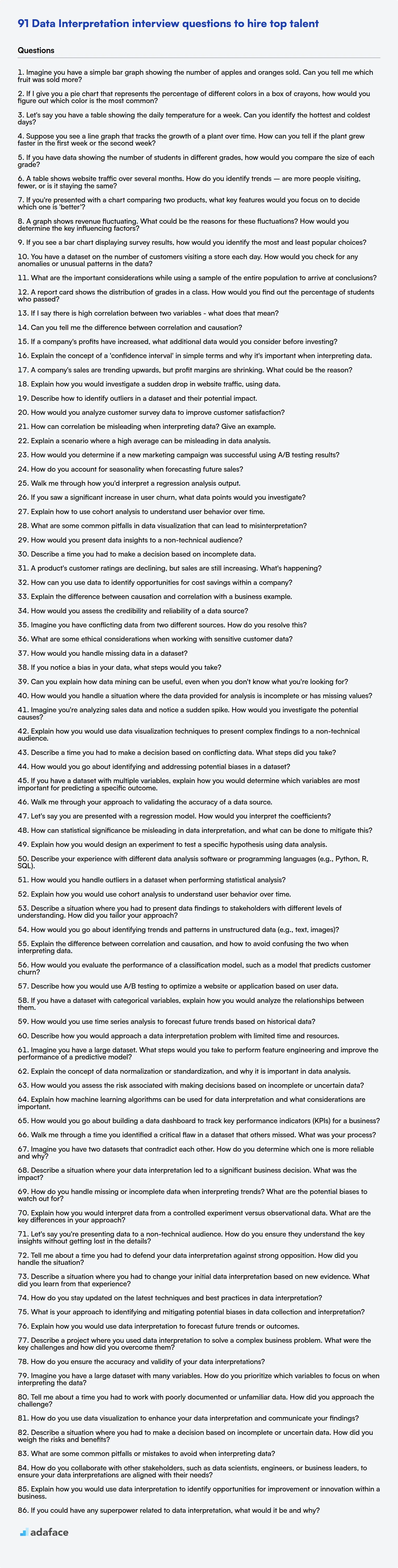
Data Interpretation Interview Questions FAQs
What are data interpretation interview questions?
Data interpretation interview questions assess a candidate's ability to analyze and draw meaningful conclusions from data. They help evaluate problem-solving and analytical skills.
Why are data interpretation skills important?
Data interpretation skills are important because they enable professionals to make informed decisions, identify trends, and gain insights from data, leading to improved business outcomes.
What are some basic data interpretation question topics?
Basic data interpretation questions cover topics such as reading charts and graphs, calculating percentages, and identifying trends from simple datasets.
How can I assess advanced data interpretation skills?
To assess advanced skills, use questions that involve complex datasets, statistical analysis, identifying biases, and providing actionable recommendations based on the findings.
What should I look for in a candidate's answer?
Look for clear explanations of the interpretation process, logical reasoning, attention to detail, and the ability to communicate findings in a concise and understandable manner.
Are there skills tests to augment the interview process?
Yes, skills tests can objectively assess a candidate's data interpretation capabilities. They provide a standardized way to evaluate skills before or during the interview process.
40 min skill tests.
No trick questions.
Accurate shortlisting.
We make it easy for you to find the best candidates in your pipeline with a 40 min skills test.
Try for freeRelated posts
Free resources

Join 1200+ companies in 80+ countries.
Try the most candidate friendly skills assessment tool today.

40 min tests.
No trick questions.
Accurate shortlisting.
No trick questions.
Accurate shortlisting.