
CSS interview questions for freshers
1. What is CSS, and why do we use it?
2. Explain the difference between inline, internal, and external CSS.
3. What is a CSS selector? Give some examples.
4. What are the different types of CSS selectors you know?
5. Explain the concept of CSS specificity. How does it determine which styles are applied?
6. What are the different CSS box model properties?
7. How can you center a div horizontally and vertically using CSS?
8. What is the difference between `margin` and `padding`?
9. What is the purpose of the `float` property? What are some common issues associated with it, and how can you solve them?
10. Explain the concept of the CSS `display` property and its different values (e.g., `block`, `inline`, `inline-block`, `none`).
11. How do you make a responsive website using CSS?
12. What are media queries, and how are they used in responsive design?
13. What's the difference between `em` and `rem` units in CSS?
14. What is the purpose of the `z-index` property?
15. What are CSS preprocessors? Name a few.
16. What is the difference between `position: relative`, `position: absolute`, `position: fixed`, and `position: static`?
17. How do you create a simple CSS animation?
18. What are CSS transitions?
19. How can you include a font in your webpage which is not a standard browser font?
20. What are pseudo-classes and pseudo-elements in CSS? Give examples.
21. How do you debug CSS? What tools can you use?
22. What is the `!important` rule in CSS, and when should you use it?
23. Explain the concept of inheritance in CSS.
24. How can you reset or normalize CSS styles across different browsers?
25. What are the advantages of using CSS frameworks like Bootstrap or Tailwind CSS?
26. Explain the difference between `visibility: hidden` and `display: none`.
27. Describe a situation where you might use `flexbox` or `grid` layout. What are the advantages of each?
28. How would you approach styling a webpage for different screen sizes (mobile, tablet, desktop) to ensure a consistent user experience?
29. What is the purpose of `object-fit` property?
CSS interview questions for juniors
1. What is the CSS box model, and how does it affect the layout of elements on a page?
2. Explain the difference between inline, block, and inline-block elements.
3. How do you link a CSS stylesheet to an HTML document?
4. What is the purpose of CSS selectors, and can you give examples of different types of selectors?
5. Describe the concept of CSS specificity and how it determines which styles are applied to an element.
6. What are the advantages of using external CSS files?
7. How do you center an element horizontally and vertically using CSS?
8. Explain the difference between padding and margin in CSS.
9. What are some common CSS properties used for controlling text styles, such as font size, color, and alignment?
10. How do you create a simple CSS rule to change the background color of a specific HTML element?
11. Explain the purpose of the `!important` rule in CSS and when it should be used.
12. What is the difference between relative and absolute positioning in CSS?
13. How can you use CSS to create a simple navigation menu?
14. Describe the concept of CSS inheritance and how it affects element styles.
15. What are media queries in CSS, and how are they used for responsive design?
16. How do you use CSS to hide an element from the page?
17. Explain the purpose of the CSS `float` property and how it affects the layout of elements.
18. What are some common CSS units of measurement, such as pixels, ems, and rems, and when would you use each?
19. How do you create rounded corners on an element using CSS?
20. Describe the difference between `id` and `class` selectors in CSS.
21. How can you apply different styles to an element based on its hover state?
22. Explain the purpose of the CSS `z-index` property and how it affects the stacking order of elements.
23. What is the purpose of CSS preprocessors like Sass or Less?
24. How do you use CSS to create a simple image gallery?
25. Describe the concept of responsive web design and how CSS plays a role in it.
26. What are CSS variables (custom properties), and how can they be used?
27. Explain what vendor prefixes are in CSS and provide some examples.
CSS intermediate interview questions
1. Explain the difference between 'visibility: hidden' and 'display: none'. When would you use one over the other?
2. How does CSS specificity work? Can you give an example of how to calculate it?
3. Describe the box model in CSS. What are its components, and how do they contribute to the overall size of an element?
4. What are pseudo-classes and pseudo-elements? Provide examples of each and explain their use cases.
5. Explain the concept of 'stacking context' in CSS. How is it created, and how does it affect element layering?
6. What are the different types of CSS selectors? Can you provide examples of attribute selectors and combinators?
7. How do you typically approach cross-browser compatibility issues in CSS?
8. Explain the use of the 'transform' property in CSS. How can you rotate, scale, skew, and translate elements?
9. What are the advantages of using CSS preprocessors like Sass or Less?
10. How can you create responsive images in CSS?
11. Describe the differences between 'absolute', 'relative', 'fixed', and 'static' positioning.
12. What is the purpose of the 'z-index' property? How does it relate to stacking context?
13. Explain how to use CSS transitions and animations. What are the key properties involved?
14. How do you vertically center an element in CSS? Describe different methods and their pros and cons.
15. What is the purpose of the 'object-fit' property in CSS? How does it work with different values like 'cover', 'contain', and 'fill'?
16. Explain the concept of 'Flexbox'. How does it simplify layout design compared to traditional methods?
17. What are the key properties used in Flexbox, such as 'justify-content', 'align-items', and 'flex-direction'?
18. Describe the use of CSS Grid layout. How does it differ from Flexbox, and when might you choose one over the other?
19. What are some of the common units used in CSS, such as 'px', 'em', 'rem', and 'vw/vh'? Explain the differences between them.
20. How can you optimize CSS for performance? What are some strategies to reduce file size and improve rendering speed?
21. Explain the concept of 'media queries' in CSS. How do you use them to create responsive designs for different screen sizes and devices?
22. What are custom properties (CSS variables)? How can they be used to improve maintainability and reusability of CSS code?
23. Describe the use of the 'calc()' function in CSS. What are some examples of how it can be used to perform calculations?
24. Explain the purpose of the 'content' property in CSS. How can it be used to insert generated content before or after elements?
25. How can you debug CSS issues effectively? What tools and techniques do you use?
26. What are logical properties and values in CSS? How do they contribute to internationalization?
27. Explain the difference between 'initial', 'inherit', 'unset', and 'revert' keywords in CSS.
28. What are CSS Modules, and how do they help with CSS scoping and avoiding naming collisions?
29. How do you handle different text direction (left-to-right vs. right-to-left) in CSS layouts?
CSS interview questions for experienced
1. Explain the concept of 'specificity' in CSS and how it's calculated. Give an example of a scenario where understanding specificity is crucial for debugging.
2. Describe different CSS box-sizing properties and how they affect the overall layout of an element.
3. How does CSS Grid differ from Flexbox, and when would you choose one over the other for layout design?
4. What are CSS custom properties (variables), and how can they be used to create more maintainable and dynamic stylesheets?
5. Explain the purpose and usage of the 'z-index' property. What are some common pitfalls to avoid when using it?
6. Describe different CSS units (e.g., px, em, rem, vw, vh) and explain when each one is most appropriate.
7. What are the advantages and disadvantages of using CSS preprocessors like Sass or Less?
8. Explain the concept of the 'CSS cascade' and how it determines which styles are applied to an element.
9. Describe different ways to optimize CSS performance, such as minification, concatenation, and lazy loading.
10. How can you create responsive images that adapt to different screen sizes and resolutions using CSS?
11. Explain the purpose and usage of CSS media queries. Give an example of how you would use them to create a responsive layout.
12. Describe different CSS pseudo-classes and pseudo-elements, and explain how they can be used to style elements based on their state or position.
13. How can you use CSS animations and transitions to create engaging and interactive user experiences?
14. Explain the concept of 'CSS Modules' and how they can be used to create more modular and maintainable stylesheets.
15. Describe different ways to handle cross-browser compatibility issues in CSS. How do you ensure your styles work correctly across different browsers and devices?
16. What are the advantages and disadvantages of using inline styles, internal stylesheets, and external stylesheets?
17. Explain the purpose and usage of the 'object-fit' property. How can it be used to control how images and videos are displayed within their containers?
18. Describe different CSS selectors (e.g., ID selectors, class selectors, attribute selectors) and explain when each one is most appropriate.
19. How can you use CSS to create a visually appealing and accessible website that is usable by people with disabilities?
20. Explain the concept of 'BEM' (Block, Element, Modifier) and how it can be used to create more organized and maintainable CSS code.
21. Describe different CSS layout techniques (e.g., floats, positioning, flexbox, grid) and explain when each one is most appropriate.
22. How do you approach debugging CSS issues? What tools and techniques do you use to identify and fix problems?
23. Explain the concept of 'CSS containment' and how it can improve rendering performance by isolating parts of the page.
24. Describe different ways to implement a dark mode toggle using CSS and JavaScript. What are some considerations for making it accessible and user-friendly?
25. How can you use CSS to create complex shapes and patterns without using images or SVG?
26. Explain the purpose and usage of the 'will-change' property. What are some potential performance implications of using it incorrectly?
27. Describe different approaches to writing CSS that is both maintainable and scalable for large projects. How do you organize your code and avoid common pitfalls?
28. How can you use CSS to implement advanced typography techniques, such as custom fonts, text effects, and responsive font sizes?

Hiring front-end developers requires recruiters and hiring managers to assess CSS skills accurately. Understanding a candidate's proficiency in CSS is important for building visually appealing and responsive web applications.
This blog post offers a curated list of CSS interview questions, covering various experience levels from freshers to experienced professionals, along with multiple-choice questions. The questions are designed to evaluate a candidate's understanding of CSS concepts, syntax, and practical application.
By leveraging these questions, you can build confidence in your hiring decisions and ensure you're selecting candidates with the appropriate CSS expertise; before interviews, consider using a skill assessment like our HTML/CSS online test to filter candidates based on their CSS skills.
Table of contents
CSS interview questions for freshers
CSS interview questions for juniors
CSS intermediate interview questions
CSS interview questions for experienced
CSS MCQ
Which CSS skills should you evaluate during the interview phase?
3 Tips for Using CSS Interview Questions
Streamline CSS Hiring with Skill Assessments
Download CSS interview questions template in multiple formats
CSS interview questions for freshers
1. What is CSS, and why do we use it?
CSS stands for Cascading Style Sheets. It is a stylesheet language used to describe the presentation of an HTML (or XML) document. In simple terms, it tells the browser how to display the elements on a webpage – things like colors, fonts, layout, and responsiveness.
We use CSS for several reasons:
- Separation of Concerns: It separates the content (HTML) from the presentation (CSS), making the code more organized and maintainable.
- Styling: CSS allows control over the look and feel of a website, ensuring a consistent and visually appealing user experience.
- Reusability: Styles can be defined once and applied to multiple pages, reducing code duplication.
- Responsiveness: CSS enables websites to adapt to different screen sizes and devices using techniques like media queries.
- Accessibility: Properly structured CSS can enhance the accessibility of a website for users with disabilities.
2. Explain the difference between inline, internal, and external CSS.
Inline CSS is applied directly to HTML elements using the style attribute. It has the highest precedence and affects only the specific element it's declared on. For example: <p style="color: blue;">This is blue text.</p>.
Internal CSS is defined within the <style> tag inside the <head> section of an HTML document. It applies to the entire page but has lower precedence than inline CSS. External CSS involves creating separate .css files and linking them to the HTML document using the <link> tag. This is the preferred method for styling entire websites, promoting code reusability and maintainability, and has lower precedence than internal CSS. For example: <link rel="stylesheet" href="style.css">
3. What is a CSS selector? Give some examples.
A CSS selector is a pattern used to select HTML elements you want to style. Selectors are the bridge between your CSS rules and the HTML content you want to format. They enable you to target specific elements or groups of elements on a webpage.
Examples of CSS selectors:
*(Universal selector): Selects all elements.p(Type selector): Selects all<p>elements..my-class(Class selector): Selects elements with the class "my-class".#my-id(ID selector): Selects the element with the ID "my-id".p a(Descendant selector): Selects all<a>elements that are descendants of<p>elements.p > a(Child selector): Selects all<a>elements that are direct children of<p>elements.a:hover(Pseudo-class selector): Selects<a>elements when the user hovers over them.[target="_blank"](Attribute selector): Selects all elements with atargetattribute equal to "_blank".
4. What are the different types of CSS selectors you know?
CSS selectors are used to target HTML elements you want to style. There are several types:
- Simple selectors: Target elements based on name, id, or class.
element: (e.g.,p) - Selects all<p>elements.#id: (e.g.,#myElement) - Selects the element withid="myElement"..class: (e.g.,.myClass) - Selects all elements withclass="myClass".
- Attribute selectors: Target elements based on the presence or value of an attribute.
[attribute]: (e.g.,[title]) - Selects all elements with atitleattribute.[attribute="value"]: (e.g.,[type="text"]) - Selects all elements withtype="text".
- Pseudo-classes: Target elements based on their state or position.
:hover: (e.g.,a:hover) - Selects links when hovered over.:first-child: (e.g.,li:first-child) - Selects the first<li>element within its parent.
- Pseudo-elements: Target specific parts of an element.
::before: (e.g.,p::before) - Inserts something before the content of each<p>element.::after: (e.g.,p::after) - Inserts something after the content of each<p>element.
- Combinators: Describe the relationship between selectors.
descendant selector(space): (e.g.,div p) - Selects all<p>elements inside<div>elements.child selector(>): (e.g.,div > p) - Selects all<p>elements that are direct children of<div>elements.adjacent sibling selector(+): (e.g.,h1 + p) - Selects the first<p>element that is placed immediately after<h1>elements.general sibling selector(~): (e.g.,h1 ~ p) - Selects all<p>elements that are preceded by an<h1>element.
5. Explain the concept of CSS specificity. How does it determine which styles are applied?
CSS specificity is a browser mechanism to determine which CSS rules apply to an element when multiple conflicting rules target the same element. It's essentially a weight that's assigned to different CSS declarations. The rule with the highest specificity wins and its styles are applied.
Specificity is calculated based on the following factors (highest to lowest): !important declarations, inline styles, IDs, classes/attributes/pseudo-classes, and elements/pseudo-elements. A more specific selector will override less specific selectors. If two selectors have the same specificity, the rule that appears later in the CSS will be applied. Example:
#myElement { color: blue; } /* ID selector */
.myClass { color: red; } /* Class selector */
In this example, #myElement will override .myClass because an ID selector has higher specificity.
6. What are the different CSS box model properties?
The CSS box model defines how the different parts of an element are combined to create the space it occupies on a page. The key properties are:
- content: The actual content of the element (text, images, etc.). Its dimensions are defined by
widthandheight. - padding: Space around the content. Controlled by
padding-top,padding-right,padding-bottom, andpadding-leftor the shorthandpadding. - border: A line that surrounds the padding (if any) and content. Controlled by
border-width,border-style, andborder-coloror the shorthandborder. - margin: Space outside the border, separating the element from other elements. Controlled by
margin-top,margin-right,margin-bottom, andmargin-leftor the shorthandmargin.
The total width of an element, when using the default box-sizing: content-box, is calculated as: width + padding-left + padding-right + border-left + border-right + margin-left + margin-right. Using box-sizing: border-box changes this calculation to include padding and border within the element's specified width and height.
7. How can you center a div horizontally and vertically using CSS?
There are multiple ways to center a div both horizontally and vertically using CSS. One common approach uses Flexbox.
To center a div using Flexbox, set the parent container's display property to flex, then use justify-content: center to center horizontally and align-items: center to center vertically. Here's an example:
.parent {
  display: flex;
  justify-content: center; /* Horizontal centering */
  align-items: center;    /* Vertical centering */
  height: 100vh; /* Make sure the parent takes up the full viewport height */
}

.child {
  /* Your child div styles here */
}
Alternatively, you can use Grid layout. Set the parent container's display to grid and use place-items: center. place-items is a shorthand for align-items and justify-content so the code is more concise:
.parent {
  display: grid;
  place-items: center;
  height: 100vh;
}
8. What is the difference between `margin` and `padding`?
In CSS, margin and padding are both used to create space around an element, but they differ in where that space is added.
margin creates space outside the element's border. It pushes the element away from other elements on the page. padding creates space inside the element's border, effectively increasing the element's size. It adds space between the element's content and its border. For example:
.element {
  margin: 20px; /* Space outside the border */
  padding: 20px; /* Space inside the border */
  border: 1px solid black;
}
9. What is the purpose of the `float` property? What are some common issues associated with it, and how can you solve them?
The float property in CSS is used to position an element to the left or right of its containing element, allowing other content (like text) to wrap around it. It's commonly used for creating layouts with images alongside text, or for creating multi-column layouts.
Common issues include the 'float drop' where elements are pushed down below floated elements due to insufficient space or margins, and 'containing element collapse' where a parent element doesn't properly expand to contain its floated children. Solutions involve using techniques like the clearfix hack (adding a class to the parent element with overflow: auto or using a pseudo-element ::after to clear the floats), setting a height on the parent element, or using modern layout techniques like Flexbox or Grid which often provide better control and avoid these issues. A simple clearfix example using overflow:
.clearfix {
  overflow: auto;
}
10. Explain the concept of the CSS `display` property and its different values (e.g., `block`, `inline`, `inline-block`, `none`).
The display property in CSS controls how an element is rendered in terms of layout. It essentially defines the element's box type. Some key values include:
block: The element takes up the full width available and starts on a new line. Examples:<div>,<p>,<form>. It respects width and height properties.inline: The element only takes up as much width as necessary and doesn't start on a new line. Width and height properties have no effect. Examples:<span>,<a>,<img>.inline-block: Similar to inline, but respects width and height properties. It flows inline with other content, but you can set its dimensions.none: The element is completely removed from the document flow and doesn't take up any space. It's as if the element doesn't exist in the DOM (different fromvisibility: hidden).
11. How do you make a responsive website using CSS?
To create a responsive website using CSS, use a combination of techniques. Primarily, utilize media queries to apply different styles based on screen size, orientation, resolution, or other device characteristics. For example:
@media (max-width: 768px) {
  .container { width: 100%; }
}
Also, employ flexible layouts using relative units like percentages or fr (fractional unit) in CSS Grid and flex-grow property in Flexbox, instead of fixed pixel values. Ensure images and other media scale appropriately using max-width: 100%; and height: auto;. Don't forget to set the viewport meta tag <meta name="viewport" content="width=device-width, initial-scale=1.0"> in your HTML.
12. What are media queries, and how are they used in responsive design?
Media queries are a CSS technique that allows you to apply different styles based on characteristics of the device or browser being used to view your content. These characteristics can include screen size, resolution, orientation (portrait or landscape), and even input type (touchscreen vs. mouse).
In responsive design, media queries are crucial for creating websites and applications that adapt seamlessly to various screen sizes and devices. By using media queries, you can define different CSS rules that are applied only when specific conditions are met. For example:
@media (max-width: 768px) {
  /* Styles for screens smaller than 768px wide */
  body { font-size: 14px; }
}
This will alter the body font size to 14 pixels on smaller screens.
13. What's the difference between `em` and `rem` units in CSS?
em and rem are relative CSS units, but they differ in their reference point.
em units are relative to the font size of the element itself (or its parent if the font size is not explicitly set on the element). This can lead to compounding issues if you're not careful, as nested elements can inherit and multiply the font size.
rem (root em) units, on the other hand, are relative to the font size of the root element (<html>). This provides a more predictable and consistent sizing across your website, as the unit's size is always tied to a single, known value (usually defined on the html element).
14. What is the purpose of the `z-index` property?
The z-index property in CSS controls the vertical stacking order of elements that overlap. Elements with a higher z-index value will appear in front of elements with a lower z-index value.
It only works on positioned elements (position: absolute, relative, fixed, or sticky). If elements have the same z-index value, the element that appears later in the HTML source code will be stacked on top.
15. What are CSS preprocessors? Name a few.
CSS preprocessors are scripting languages that extend CSS by allowing you to use features not available in standard CSS, such as variables, mixins, functions, and nesting. They are compiled into regular CSS that browsers can understand. This improves code organization, reusability, and maintainability.
Some popular CSS preprocessors include:
- Sass (SCSS/Sass): One of the most widely used preprocessors, known for its robust features and mature ecosystem.
- Less: Another popular option with a simpler syntax than Sass.
- Stylus: A flexible preprocessor that offers various syntax options.
16. What is the difference between `position: relative`, `position: absolute`, `position: fixed`, and `position: static`?
position is a CSS property that controls how an element is positioned on a webpage. The main values are:
static: This is the default value. The element is positioned according to the normal flow of the document.top,right,bottom, andleftproperties have no effect.relative: The element is positioned relative to its normal position.top,right,bottom, andleftproperties can be used to adjust its position without affecting the layout of other elements.absolute: The element is removed from the normal document flow and positioned relative to its nearest positioned ancestor (an ancestor with a position other thanstatic). If there's no positioned ancestor, it's positioned relative to the initial containing block (the<html>element).top,right,bottom, andleftproperties are used to specify the offset.fixed: The element is removed from the normal document flow and positioned relative to the viewport. It remains in the same position even when the page is scrolled.top,right,bottom, andleftproperties are used to specify the offset. Think of a persistent header that stays at the top of the screen.
17. How do you create a simple CSS animation?
To create a simple CSS animation, you typically use the @keyframes rule to define the animation's sequence of styles and the animation property to apply the animation to an element.
First, define the animation using @keyframes, specifying the styles at different points in the animation (e.g., from, to, or percentages like 0%, 50%, 100%). Then, apply the animation to an HTML element using the animation property, which includes settings like animation-name, animation-duration, animation-iteration-count, and animation-timing-function. Here is an example:
@keyframes example {
  from {background-color: red;}
  to {background-color: yellow;}
}

div {
  width: 100px;
  height: 100px;
  background-color: red;
  animation-name: example;
  animation-duration: 4s;
  animation-iteration-count: infinite;
}
18. What are CSS transitions?
CSS Transitions allow you to smoothly change CSS property values over a specified duration. Instead of instantly applying a new style, a transition animates the change from the old value to the new value, creating a visual effect.
Essentially, you define which CSS properties should transition, the duration of the transition, and optionally, a timing function to control the transition's speed curve. Key properties involved include:
transition-property: Specifies the CSS property to transition.transition-duration: Specifies the duration of the transition.transition-timing-function: Specifies the speed curve of the transition (e.g.,ease,linear,ease-in-out).transition-delay: Specifies a delay before the transition starts.
For example:
.element {
  transition-property: background-color, width;
  transition-duration: 0.5s, 1s;
  transition-timing-function: ease-in-out;
}

.element:hover {
  background-color: red;
  width: 200px;
}
19. How can you include a font in your webpage which is not a standard browser font?
To include a font in your webpage that isn't a standard browser font, you can use the @font-face CSS at-rule. This allows you to specify a name for the font and point to the font file (e.g., .woff, .woff2, .ttf, .otf). First, you define the @font-face rule within your CSS:
@font-face {
  font-family: 'MyCustomFont';
  src: url('path/to/my-custom-font.woff2') format('woff2'),
       url('path/to/my-custom-font.woff') format('woff');
  font-weight: normal;
  font-style: normal;
}
Then, you can use MyCustomFont in your CSS rules like any other font:
p {
  font-family: 'MyCustomFont', sans-serif;
}
Make sure to include appropriate font files for different browsers and consider using tools like Google Fonts or Font Squirrel to generate optimized font formats.
20. What are pseudo-classes and pseudo-elements in CSS? Give examples.
Pseudo-classes and pseudo-elements in CSS are used to style elements based on their state or specific parts of their content, respectively. Pseudo-classes select elements based on a state they are in, such as :hover (when the mouse is over an element), :active (when an element is being clicked), :focus (when an element has focus), or :first-child (the first element of its type within a parent). For example, a:hover { color: red; } changes the color of a link to red when hovered over.
Pseudo-elements, on the other hand, create virtual elements to style specific parts of an element's content, such as ::before and ::after (which insert content before or after the element's content), ::first-line (the first line of text in an element), or ::first-letter (the first letter of text in an element). For example, p::first-letter { font-size: 200%; } makes the first letter of every paragraph twice as big. Note the double colon :: notation (though a single colon : often still works, especially for older pseudo-elements).
21. How do you debug CSS? What tools can you use?
Debugging CSS involves a few key strategies and tools. Most modern browsers have excellent developer tools, accessible by right-clicking on an element and selecting 'Inspect' or 'Inspect Element'. These tools allow you to:
- Inspect Element: Examine the applied CSS rules for any element and see how they cascade and are overridden.
- Modify Styles: Live-edit CSS rules and see the changes reflected in the browser immediately. This is invaluable for experimenting and pinpointing problematic styles.
- Check Computed Styles: View the final computed styles of an element after all CSS rules have been applied. This helps identify which styles are actually taking effect.
- Use the Box Model: Visualize the box model (content, padding, border, margin) of an element to understand spacing issues.
- Source Maps: If using preprocessors like Sass or Less, source maps allow you to debug the original source code instead of the compiled CSS.
- Linter: Use a linter like Stylelint that will help you identify errors early on.
Common debugging approaches include commenting out sections of CSS to isolate the source of the issue, using !important (though sparingly) to force a style, and double-checking for typos or syntax errors. Using a systematic approach will help you find the problem more efficiently.
22. What is the `!important` rule in CSS, and when should you use it?
The !important rule in CSS is a way to override the standard cascading order. When !important is added to a CSS property's value, that style will always be applied, regardless of where that rule appears in the CSS document, or the specificity of other rules that might apply to that element.
Using !important should be reserved for specific situations where overriding styles is genuinely necessary, such as:
- User Stylesheets: To ensure user-defined styles take precedence.
- Utility Classes: In CSS frameworks or libraries when you need to guarantee a particular style is applied (use sparingly).
- Fixing Specificity Issues: As a last resort to resolve problems with CSS specificity, but refactoring CSS is usually preferred.
23. Explain the concept of inheritance in CSS.
Inheritance in CSS is a mechanism that allows certain CSS properties to be passed down from parent elements to their child elements. Not all CSS properties are inherited by default. For example, properties like color, font-size, and font-family are inherited, while properties like border, margin, and padding are not.
Inheritance helps avoid redundant code by setting a property once on a parent element and having it automatically applied to all its descendants. The inherit keyword can be used to explicitly force a property to inherit its value from its parent, regardless of whether it inherits by default or not. Example: border: inherit;
24. How can you reset or normalize CSS styles across different browsers?
To reset or normalize CSS styles across different browsers, you can use either a CSS reset or a CSS normalization stylesheet. A CSS reset, like Eric Meyer's reset.css or normalize.css, aims to remove all default browser styling. It zeroes out margins, paddings, font sizes, and other inconsistencies, giving you a clean slate. A normalization stylesheet, such as Normalize.css, attempts to make the default styles more consistent across browsers while preserving useful defaults rather than completely removing them.
Both approaches usually involve setting properties like margin: 0; padding: 0; border: 0; font-size: 100%; for most or all elements, often using the universal selector *. You include the chosen stylesheet as the first CSS file in your project to ensure it overrides the browser's default styles before any of your custom styles are applied.
25. What are the advantages of using CSS frameworks like Bootstrap or Tailwind CSS?
CSS frameworks like Bootstrap and Tailwind CSS offer several advantages. They drastically speed up development by providing pre-built components and styles, reducing the need to write CSS from scratch. This results in consistent design across the application, improving user experience.
Furthermore, they often incorporate responsive design principles, making websites adaptable to different screen sizes. Popular frameworks have large communities, offering ample documentation, support, and readily available solutions to common problems. Frameworks often include utilities for layout and spacing such as d-flex or margin-top-2 (example from Tailwind) reducing the need to write custom CSS for simple tasks.
26. Explain the difference between `visibility: hidden` and `display: none`.
visibility: hidden and display: none are both CSS properties used to hide elements on a webpage, but they differ in how they affect the layout. visibility: hidden hides the element, but it still occupies space in the document layout, so other elements will still be positioned as if it were visible. The element is essentially invisible, but the space it would have occupied remains.
display: none completely removes the element from the document layout. It's as if the element doesn't exist in the HTML structure at all. Other elements will reflow to fill the space that the hidden element would have occupied. This is the key difference: visibility: hidden hides the element but maintains its space, while display: none removes the element from the layout entirely.
27. Describe a situation where you might use `flexbox` or `grid` layout. What are the advantages of each?
I would use flexbox for one-dimensional layouts, like a navigation bar or a row of equally sized buttons. The advantage of flexbox is its simplicity for arranging items along a single axis (either horizontally or vertically) and its easy alignment capabilities. For example:
.nav {
  display: flex;
  justify-content: space-around; /* Distribute items evenly */
  align-items: center; /* Vertically center items */
}
On the other hand, I'd use grid for two-dimensional layouts, like a complex website layout with headers, sidebars, content areas, and footers. The main advantage of grid is its ability to create complex, responsive layouts by defining rows and columns. It is especially suitable when elements need to be aligned in both directions, or when managing different screen sizes. For instance, building a card layout with each card having an image on top, a title in the middle, and a description at the bottom can also easily be done with grid.
28. How would you approach styling a webpage for different screen sizes (mobile, tablet, desktop) to ensure a consistent user experience?
I would use a responsive design approach, primarily relying on CSS media queries. I'd start with a mobile-first strategy, designing the core layout and functionality for the smallest screens first. Then, using @media rules in CSS, I'd progressively enhance the design for larger screens like tablets and desktops, adjusting layout, font sizes, and spacing as needed.
Specifically, I'd define breakpoints (e.g., for phones, tablets, and desktops) and use media queries to apply different styles within those breakpoints. For example: @media (min-width: 768px) { /* Styles for tablets and larger */ }. I would consider using flexible grids (like CSS Grid or Flexbox) and relative units (like em, rem, and vw) to ensure elements scale smoothly across different screen sizes. Testing on different devices and using browser developer tools is crucial to refine the design and ensure a consistent experience.
29. What is the purpose of `object-fit` property?
The object-fit CSS property specifies how the content of a replaced element (like <img> or <video>) should be resized to fit its container. It controls how the image or video is scaled and positioned within the element's box.
Common values include:
fill: The default. The content is stretched or squashed to fit the container.contain: The content is scaled to fit within the container while preserving its aspect ratio. May result in empty space.cover: The content is scaled to fill the container while preserving its aspect ratio. Content may be clipped.none: The content is displayed at its original size, ignoring the container's dimensions.scale-down: Scales down the content to fit the container while preserving aspect ratio only if the object is larger than container, if not, displays it at original size.
CSS interview questions for juniors
1. What is the CSS box model, and how does it affect the layout of elements on a page?
The CSS box model describes how elements are rendered on a webpage. It essentially dictates that every HTML element is treated as a rectangular box, and this box is composed of several layers. These layers, from inside to outside, are: content, padding, border, and margin.
The box model affects layout because the total width and height of an element are calculated based on the dimensions of these layers. For example, if you set an element's width to 100px and add 20px of padding on each side, the element will actually take up 140px of horizontal space. Understanding this is crucial for predicting how elements will interact and fit together within a page layout. Also, the box-sizing property can be used to alter the box model behavior to include the padding and border in the element's specified width and height.
2. Explain the difference between inline, block, and inline-block elements.
Inline elements flow within the text; they only take up as much width as necessary. Examples include <span>, <a>, and <img>. They don't start on a new line, and you can't set their width or height directly (though padding and margins affect their layout). Block elements, on the other hand, take up the full width available and always start on a new line. Examples include <div>, <p>, <h1>-<h6>, and <form>. You can set their width and height.
Inline-block elements are a hybrid. They flow like inline elements (don't start on a new line), but you can set their width and height like block elements. Effectively, they're like having a block element contained within a line of text. Example usages are to create navigation menu items horizontally or align images in a gallery.
3. How do you link a CSS stylesheet to an HTML document?
You can link a CSS stylesheet to an HTML document using the <link> tag within the <head> section of your HTML file. The <link> tag specifies the relationship between the current document and an external resource, and is commonly used for linking CSS stylesheets. The rel attribute should be set to stylesheet to indicate the type of link, and the href attribute should point to the path of your CSS file.
Here's an example:
<head>
  <link rel="stylesheet" href="path/to/your/style.css">
</head>
4. What is the purpose of CSS selectors, and can you give examples of different types of selectors?
CSS selectors are used to target specific HTML elements on a webpage to apply styles. They define which elements the CSS rules will apply to. Without selectors, styles would be applied globally, making it impossible to style specific elements.
Examples of different types of selectors include:
- Element selectors: Select elements based on their tag name (e.g.,
p,h1,div). - ID selectors: Select an element based on its unique
idattribute (e.g.,#myElement). - Class selectors: Select elements based on their
classattribute (e.g.,.myClass). - Attribute selectors: Select elements based on the presence or value of an attribute (e.g.,
[type="text"]). - Pseudo-classes: Select elements based on a certain state (e.g.,
:hover,:focus). - Pseudo-elements: Style specific parts of an element (e.g.,
::before,::after). - Combinators: Select elements based on their relationship to other elements. (e.g.,
div p,div > p)
5. Describe the concept of CSS specificity and how it determines which styles are applied to an element.
CSS specificity is the set of rules a browser uses to determine which CSS declarations are applied to an element when multiple conflicting rules apply. It's essentially a weight that is assigned to different CSS selectors. When styles conflict, the browser applies the style with the highest specificity.
Specificity is calculated based on different categories of selectors:
- Inline styles: Styles applied directly within an HTML element using the
styleattribute have the highest specificity. - IDs: Selectors that target an element by its ID (e.g.,
#myElement). - Classes, attributes, and pseudo-classes: Selectors like
.myClass,[type="text"], and:hover. - Elements and pseudo-elements: Selectors like
p,div, and::before. - Universal selector and combinators: The universal selector (
*) and combinators like+,>, and~have no specificity value (always zero).
Also, the !important declaration overrides all other specificity rules (but should be used sparingly).
When calculating, more specific selectors will always override less specific ones. For example, an ID selector will always override a class selector, regardless of the order they are declared in the CSS file.
6. What are the advantages of using external CSS files?
Using external CSS files offers several advantages. First, it promotes code reusability. Styles can be defined once and applied across multiple HTML pages, ensuring consistency in design and reducing redundancy. This simplifies website maintenance and updates since changes to the CSS file are reflected across the entire site.
Second, external CSS files contribute to improved website performance. Browsers cache external CSS files, meaning that once a user has visited one page on your site, the CSS doesn't need to be re-downloaded for subsequent pages. This leads to faster loading times and a better user experience.
7. How do you center an element horizontally and vertically using CSS?
There are several ways to center an element horizontally and vertically using CSS. One common approach is using Flexbox. Set the display property of the parent element to flex, then use justify-content: center for horizontal centering and align-items: center for vertical centering.
Another approach is using Grid. Set the parent element's display to grid and then use place-items: center. A third way is using absolute positioning combined with transforms, setting the element's position to absolute, top and left to 50%, and then using transform: translate(-50%, -50%) to adjust the element to be centered relative to its own dimensions. Here's an example of using Flexbox:
.parent {
  display: flex;
  justify-content: center; /* Horizontal centering */
  align-items: center; /* Vertical centering */
  height: 100vh; /* Ensure the parent takes up the full viewport height*/
}

.child {
  /* Styles for the child element */
}
8. Explain the difference between padding and margin in CSS.
Padding and margin are both CSS box model properties that control the spacing around an element, but they affect different areas. Padding is the space inside an element, between the content and its border. It increases the overall size of the element. Margin, on the other hand, is the space outside the element's border, separating it from other elements on the page.
In essence, padding creates space within an element, while margin creates space between elements. Changing padding affects the element's background and potentially its dimensions, while changing margin only affects its position relative to other elements. padding: 10px; will add 10px of space between the content and the border on all sides. margin: 10px; will add 10px of space outside of the border, separating the element from other elements.
9. What are some common CSS properties used for controlling text styles, such as font size, color, and alignment?
Common CSS properties for controlling text styles include:
font-size: Specifies the size of the text. Examples:12px,1em,larger.color: Sets the text color. Examples:red,#FF0000,rgb(255, 0, 0).font-family: Defines the font to be used. Example:Arial, sans-serif.text-align: Controls the horizontal alignment of text. Values:left,right,center,justify.font-weight: Sets the boldness of the text. Values:normal,bold,bolder,lighter, or numeric values like100to900.font-style: Used to make text italic. Values:normal,italic,oblique.line-height: Defines the space between lines of text. Examples:1.5,20px.text-decoration: Adds decorations to text. Values:none,underline,overline,line-through.letter-spacing: Adjusts the space between letters.word-spacing: Adjusts the space between words.text-transform: Controls the capitalization of text. Values:uppercase,lowercase,capitalize.
10. How do you create a simple CSS rule to change the background color of a specific HTML element?
To change the background color of a specific HTML element using CSS, you can target the element using a selector (e.g., ID, class, tag name) and then use the background-color property.
For example, if you want to change the background color of an element with the ID myElement to blue, you would use the following CSS rule:
#myElement {
  background-color: blue;
}
If you are using a class selector, it would be:
.myClass {
  background-color: blue;
}
11. Explain the purpose of the `!important` rule in CSS and when it should be used.
The !important rule in CSS is used to override all other style declarations for a specific property on a specific element. It essentially tells the browser to give a particular style declaration the highest precedence, regardless of its origin in the cascade (e.g., inline styles, external stylesheets, user agent stylesheets).
!important should be used sparingly and only when absolutely necessary. Overusing it can make debugging CSS very difficult and can lead to unexpected styling issues. Common legitimate use cases include overriding styles in third-party libraries that you cannot directly modify, or providing user-specific styles to ensure accessibility preferences are respected. It's generally better to rely on CSS specificity and the cascade to manage styles effectively, rather than relying heavily on !important.
12. What is the difference between relative and absolute positioning in CSS?
Relative positioning adjusts an element's position relative to its normal position in the document flow. It doesn't affect the layout of surrounding elements; it just visually shifts the element. You use properties like top, right, bottom, and left to specify the offset. The space the element originally occupied is preserved.
Absolute positioning, on the other hand, removes the element from the normal document flow entirely. The element is then positioned relative to its nearest positioned ancestor (an ancestor with a position value other than static). If there is no positioned ancestor, it's positioned relative to the initial containing block (the <html> element). Other elements will behave as if the absolutely positioned element doesn't exist. Again, top, right, bottom, and left are used to specify the offset.
13. How can you use CSS to create a simple navigation menu?
To create a simple navigation menu with CSS, you typically start with an unordered list (<ul>). Remove the default list styles using list-style: none; and any default margins or padding on the <ul> and <li> elements.
Then style the <li> elements (often displayed inline using display: inline; or display: inline-block;) and/or the anchor tags (<a>) within them to control the appearance of the menu items. Set background colors, text colors, padding, margins, and borders as desired. You can use CSS pseudo-classes like :hover to provide visual feedback on mouseover. A basic example of the CSS is:
ul {
  list-style: none;
  padding: 0;
  margin: 0;
}

li {
  display: inline;
  margin-right: 20px;
}

a {
  text-decoration: none;
  color: black;
  padding: 5px 10px;
  border: 1px solid lightgray;
}

a:hover {
  background-color: lightblue;
}
14. Describe the concept of CSS inheritance and how it affects element styles.
CSS inheritance is a mechanism where certain CSS properties applied to an element are passed down to its descendants (child elements). Not all CSS properties are inherited; for example, properties like width, margin, and padding are not inherited, while properties like color, font, and text-align are typically inherited.
When a property is inherited, the child element receives the value of that property from its parent, unless the child element has a more specific style rule defined for that same property. Inheritance helps to avoid redundant CSS rules and enables consistent styling across a website. For example, setting color: blue; on the <body> element will make all text blue unless overridden by more specific CSS rules applied to specific elements like <h1> or <p>.
15. What are media queries in CSS, and how are they used for responsive design?
Media queries in CSS are a powerful feature that allows you to apply different styles to your webpage based on certain characteristics of the device or screen being used to view it. They essentially act as conditional statements that check for things like screen size, resolution, orientation (portrait or landscape), and even input types (touchscreen or mouse).
They are crucial for responsive design because they enable you to tailor the layout and appearance of your website to provide an optimal viewing experience across a wide range of devices, from desktops and laptops to tablets and smartphones. Here's a simple example:
@media (max-width: 768px) {
  /* Styles for screens smaller than 768px wide */
  body { font-size: 14px; }
}
16. How do you use CSS to hide an element from the page?
There are several ways to hide an element using CSS:
display: none;: This completely removes the element from the document flow. It will not take up any space on the page, and it will not be announced to screen readers.visibility: hidden;: This hides the element, but it still takes up space in the document flow. Screen readers will typically announce the element, but it won't be visible.opacity: 0;: This makes the element transparent. It still takes up space and remains interactive. Settingopacity: 0on an element does not affect its children.width: 0; height: 0; overflow: hidden;: This method effectively collapses the element to nothing, but it's less reliable thandisplay: noneorvisibility: hidden.position: absolute; left: -9999px;: This moves the element off-screen.
17. Explain the purpose of the CSS `float` property and how it affects the layout of elements.
The float property in CSS is used to position an element to the left or right side of its container, allowing other content to wrap around it. This is often used to create layouts where text flows around images or to create multi-column layouts. When an element is floated, it's taken out of the normal document flow (though it still affects the position of other content) and shifted to the specified side until it touches the edge of its containing block or another floated element.
The main effects of using float are:
- Elements are removed from the normal document flow.
- The containing element doesn't necessarily expand to contain floated children.
- Text and inline elements wrap around the floated element.
- Requires
clearproperty on sibling elements to manage the layout when adjacent to a floated element.
18. What are some common CSS units of measurement, such as pixels, ems, and rems, and when would you use each?
Common CSS units include: px (pixels), em, rem, vw, vh, and % (percentage).
- px (pixels): Absolute unit, representing a fixed value on the screen. Use for precise control when the size must be exact, like for borders or very small elements.
- em: Relative to the font-size of the parent element. Useful for creating scalable designs where the size of elements is proportional to the text size of their parent. If the parent element has a font-size of 16px, then
1emis equal to 16px. - rem: Relative to the font-size of the root element (usually
<html>). Preferred overemfor overall scalability and easier management of sizes, as it avoids compounding issues with nested elements. Setting the root element's font-size allows you to easily adjust the size of all elements usingremunits. - vw/vh: Relative to 1% of the viewport's width or height, respectively. Use when you want an element's size to scale relative to the screen size.
- % (percentage): Relative to the size of the parent element. Commonly used for widths and heights to create responsive layouts.
19. How do you create rounded corners on an element using CSS?
To create rounded corners on an element using CSS, you use the border-radius property. This property allows you to control the radius of the corners.
For example, border-radius: 10px; will create rounded corners with a radius of 10 pixels on all four corners. You can also specify different radii for each corner using shorthand properties like border-top-left-radius, border-top-right-radius, border-bottom-right-radius, and border-bottom-left-radius. If you want to make the element a perfect circle use: border-radius: 50%;
20. Describe the difference between `id` and `class` selectors in CSS.
In CSS, id and class selectors are used to target HTML elements for styling, but they differ in their specificity and intended usage. An id selector, denoted by a # symbol (e.g., #myElement), should be unique within a single HTML document. It is used to target only one specific element, and it has a higher specificity than a class selector.
A class selector, denoted by a . symbol (e.g., .myClass), can be applied to multiple elements within an HTML document. It is used to group elements that share similar styling properties. Because multiple elements can share the same class, this provides a more flexible and reusable approach to styling. For example, multiple buttons can have the same style applied to them using the same class selector. class selectors have lower specificity than id selectors.
21. How can you apply different styles to an element based on its hover state?
You can apply different styles to an element based on its hover state using CSS. The :hover pseudo-class is used to select an element when the user mouses over it. You can define different styles within the :hover block that will be applied when the element is hovered over.
For example:
a {
  color: blue;
}

a:hover {
  color: red;
  text-decoration: underline;
}
In this example, the link's color will change to red and it will be underlined when the user hovers over it.
22. Explain the purpose of the CSS `z-index` property and how it affects the stacking order of elements.
The z-index CSS property controls the vertical stacking order of elements that overlap. It only works on positioned elements (position: absolute, relative, fixed, or sticky). Elements with a higher z-index value are rendered on top of elements with a lower z-index value. If elements have the same z-index or no z-index specified, the stacking order is determined by their order in the HTML source code (elements appearing later in the code are stacked on top).
The z-index property can accept integer values, including negative values and zero. It's important to note that z-index creates stacking contexts. A stacking context is formed by the root element of a document, any element with a position value (other than static) and a z-index value other than auto, and some other CSS properties. Elements within a stacking context are stacked relative to each other, and the stacking context as a whole is stacked in the parent context.
23. What is the purpose of CSS preprocessors like Sass or Less?
CSS preprocessors like Sass and Less enhance CSS development by adding features not natively available in CSS. Their main purpose is to make CSS more maintainable, scalable, and readable. They achieve this through features like:
- Variables: Store reusable values like colors and fonts.
- Nesting: Mimic HTML structure for better organization.
- Mixins: Define reusable blocks of CSS properties.
- Functions: Perform calculations and manipulations.
- Operators: Perform arithmetic operations.
Ultimately, they allow developers to write CSS in a more programmatic way, which is then compiled into standard CSS that browsers can understand. This improves workflow and code quality.
24. How do you use CSS to create a simple image gallery?
To create a simple image gallery with CSS, you can use a combination of HTML for the image structure and CSS for styling and layout. Wrap your images in a container (e.g., a <div>) and apply CSS to this container to control the display. You can use display: flex or display: grid to arrange the images horizontally or in a grid-like structure.
To make the gallery visually appealing you can control the image size, add spacing using margin or padding, and include hover effects with CSS transitions. Use object-fit: cover to make sure that all images have the same aspect ratio, even if the original images are different sizes. Here is an example of setting up the image container:
.gallery {
 display: flex;
 flex-wrap: wrap; /* Allow images to wrap to the next line */
 justify-content: space-evenly; /* Distribute images evenly */
}

.gallery img {
 width: 200px; /* Set a fixed width */
 height: 150px; /* Set a fixed height */
 object-fit: cover; /* Maintain aspect ratio */
 margin: 10px;
 border: 1px solid #ccc;
}
25. Describe the concept of responsive web design and how CSS plays a role in it.
Responsive web design is an approach to web development that aims to create web pages that look good and function well on all devices, from desktop computers to smartphones and tablets. It's about adapting the website's layout, content, and functionality to the screen size and orientation of the device being used.
CSS is crucial in responsive web design. Media queries, a CSS feature, allow us to apply different styles based on device characteristics such as screen width, height, orientation, and resolution. We can use flexible grids (e.g., using percentages or fr units in CSS Grid), and flexible images (setting max-width: 100%; height: auto;) to ensure elements resize appropriately. Some key CSS concepts:
@mediaqueriesviewportmeta tag- Flexible grid layouts (CSS Grid, Flexbox)
- Fluid images and other media
26. What are CSS variables (custom properties), and how can they be used?
CSS variables, also known as custom properties, are entities defined by CSS authors that contain specific values to be reused throughout a document. They are declared using --variable-name: value; syntax.
CSS variables offer several benefits:
- Reusability: Define a value once and use it multiple times.
- Maintainability: Change a value in one place, and it updates everywhere it's used.
- Theming: Easily switch between different themes by updating variable values.
- Dynamic Updates: Can be modified using JavaScript, enabling interactive styling. For example:
document.documentElement.style.setProperty('--main-bg-color', 'blue');
27. Explain what vendor prefixes are in CSS and provide some examples.
Vendor prefixes are a way for browser makers to add support for new CSS features before those features are fully standardized. This allows developers to experiment with and use these features, while also signaling that the implementation might change in the future. They are essentially browser-specific additions to CSS that ensure that experimental or non-standard features don't clash with future official CSS standards.
Some examples of vendor prefixes include:
-webkit-: Used by Chrome, Safari, and other WebKit-based browsers.-moz-: Used by Firefox.-ms-: Used by Internet Explorer and Edge (older versions).-o-: Used by Opera (older versions).
CSS intermediate interview questions
1. Explain the difference between 'visibility: hidden' and 'display: none'. When would you use one over the other?
'visibility: hidden' and 'display: none' are both CSS properties that hide elements, but they do so in different ways. 'visibility: hidden' hides the element, but it still takes up space in the document layout. Think of it like making something transparent; you can't see it, but it's still there affecting the flow of elements. 'display: none', on the other hand, removes the element from the document flow entirely. It's as if the element never existed in the first place, and other elements will reflow to fill its space.
You'd use 'visibility: hidden' when you want to hide an element temporarily without disrupting the layout. For example, you might use it for a modal that you want to fade in and out, preserving the space it will occupy. You'd use 'display: none' when you want to completely remove an element from the page, freeing up its space. This is useful for conditionally rendering elements based on user interaction or screen size.
2. How does CSS specificity work? Can you give an example of how to calculate it?
CSS specificity determines which CSS rule is applied if multiple rules conflict. Specificity is essentially a weight that's applied to a given CSS declaration, determined by the types of selectors that match the element.
Specificity is calculated based on these categories:
- Inline styles: (e.g.,
style="...") - Highest specificity. Represented as1,0,0,0` - IDs: Number of ID selectors. Represented as
0,1,0,0 - Classes, attributes, and pseudo-classes: Number of class selectors, attribute selectors (e.g.,
[type="text"]), and pseudo-classes (e.g.,:hover). Represented as0,0,1,0 - Elements and pseudo-elements: Number of element selectors (e.g.,
p,div) and pseudo-elements (e.g.,::before). Represented as0,0,0,1
For example, consider these rules:
body p {color: green;} /* specificity: 0,0,0,2 */
.container p {color: blue;} /* specificity: 0,0,1,1 */
#content p {color: purple;} /* specificity: 0,1,0,1 */
style="color:red" /* specificity 1,0,0,0 */
If the HTML is <body id="content"><div class="container"><p>This is a paragraph.</p></div></body>, the purple rule (#content p) wins over the blue (.container p) and green (body p) because 0,1,0,1 is more specific than 0,0,1,1 and 0,0,0,2. Inline style (style="color:red") will win against any other css rules with selectors.
3. Describe the box model in CSS. What are its components, and how do they contribute to the overall size of an element?
The CSS box model describes the rectangular boxes that are generated for elements in the document tree and laid out according to the visual formatting model. It essentially dictates how the content of an HTML element is structured and sized on a web page. The box model consists of these components:
- Content: The actual text, images, or other media content of the element.
- Padding: The space between the content and the border.
padding: 10px;would add 10 pixels of space around the content. - Border: A line that surrounds the padding and content.
border: 1px solid black;would create a 1-pixel black border. - Margin: The space outside the border, used to create space between the element and other elements.
margin: 20px;would add 20 pixels of space around the element.
The overall size of an element, calculated using the standard box model, is determined by the sum of the content's width/height, the padding, the border, and the margin. Specifically, Total Width = width + padding-left + padding-right + border-left + border-right + margin-left + margin-right. The same applies to height. The box-sizing property can change this behavior, but the default box-sizing: content-box follows the calculation above.
4. What are pseudo-classes and pseudo-elements? Provide examples of each and explain their use cases.
Pseudo-classes and pseudo-elements are CSS selectors that style elements based on their state or position in the document tree, rather than based on the element's actual tag or attributes. Pseudo-classes target elements based on state or relation to other elements, such as :hover (style when hovered), :active (style when clicked), :first-child (style the first child element), or :nth-child(n) (style the nth child element). Pseudo-elements, on the other hand, create virtual elements within the selected element to style specific parts of it, such as ::before (insert something before the content), ::after (insert something after the content), ::first-line (style the first line of text), or ::first-letter (style the first letter of text).
For example:
- Pseudo-class:
a:hover { color: red; } ``` This styles the link text red when the mouse hovers over it.
- Pseudo-element:
p::first-line { font-weight: bold; } ``` This styles the first line of every paragraph with bold text. Pseudo-classes are used for dynamic styling and state management, while pseudo-elements are generally used for adding cosmetic elements or styling specific portions of an element's content.
5. Explain the concept of 'stacking context' in CSS. How is it created, and how does it affect element layering?
In CSS, a stacking context is a three-dimensional conceptualization of HTML elements along an imaginary z-axis relative to the viewer, which determines the order in which elements are rendered. Think of it as elements being stacked on top of each other. The stacking order is predictable within each stacking context.
Stacking contexts are created by several CSS properties:
- The root element (
<html>) - Elements with a
positionvalue other thanstatic(e.g.,relative,absolute,fixed,sticky) and az-indexvalue other thanauto. - Elements with a
z-indexvalue other thanauto. - Elements with
opacityless than 1. - Elements with
transform,filter,clip-path,mask,mask-image,mask-bordervalues other thannone. - Elements with
mix-blend-modevalues other thannormal. - Elements with
isolationset toisolate. - Elements with
will-changespecifying any property that would create a stacking context. - Elements with
containset tolayout, orpaint, or a composite value that includes either of them.
When a new stacking context is created, it acts as a self-contained unit. The z-index values of its child elements are interpreted only within that context. This means that a child element with a high z-index within one stacking context will not necessarily appear above elements in a different stacking context, even if those elements have lower z-index values. The parent stacking context determines the overall layering.
6. What are the different types of CSS selectors? Can you provide examples of attribute selectors and combinators?
CSS selectors are used to target HTML elements you want to style. There are several types, including:
- Type selectors: Selects elements by their tag name (e.g.,
p,h1,div). - Class selectors: Selects elements by their class attribute (e.g.,
.my-class). - ID selectors: Selects elements by their ID attribute (e.g.,
#my-id). - Attribute selectors: Selects elements based on the presence or value of their attributes (e.g.,
[type="text"],[data-value]). Example:a[href^="https"]selects all<a>elements whosehrefattribute starts with "https". - Pseudo-classes: Selects elements based on their state or position (e.g.,
:hover,:first-child). - Pseudo-elements: Selects specific parts of an element (e.g.,
::before,::after).
Combinators define the relationship between selectors:
- Descendant combinator: Selects elements that are descendants of another element (e.g.,
div p). - Child combinator: Selects elements that are direct children of another element (e.g.,
div > p). - Adjacent sibling combinator: Selects elements that are immediately preceded by another element (e.g.,
h1 + p). - General sibling combinator: Selects elements that are preceded by another element (e.g.,
h1 ~ p). Example:div + pselects a<p>element that is directly after a<div>.
7. How do you typically approach cross-browser compatibility issues in CSS?
I typically approach cross-browser compatibility issues in CSS by first identifying the specific problem browsers and CSS properties causing the inconsistency. I use browser developer tools to inspect the rendered styles and pinpoint discrepancies. A common starting point is checking caniuse.com to understand browser support for different CSS features.
Once identified, I apply several techniques such as: vendor prefixes (-webkit-, -moz-, -ms-, -o-), using CSS resets or normalizers (like Normalize.css) to provide a consistent baseline, feature queries (@supports) to conditionally apply styles based on browser support, and progressive enhancement (designing for modern browsers and then adding fallbacks for older ones). Occasionally, polyfills might be needed for JavaScript-based CSS features.
8. Explain the use of the 'transform' property in CSS. How can you rotate, scale, skew, and translate elements?
The transform property in CSS allows you to modify the coordinate space of an element. This enables you to rotate, scale, skew, or translate elements, changing their appearance without affecting the document flow (in most cases). You apply different transformations by specifying transformation functions as values for the transform property. Multiple transform functions can be combined, applied from left to right.
To achieve various transformations, you can use these functions:
- rotate(angle): Rotates the element clockwise by the specified angle (e.g.,
transform: rotate(45deg);). - scale(x, y): Scales the element by the given factors along the X and Y axes. If only one value is provided, it's used for both axes (e.g.,
transform: scale(1.5);ortransform: scale(2, 0.5);). - skew(x-angle, y-angle): Skews the element by the specified angles along the X and Y axes (e.g.,
transform: skew(30deg, 20deg);). - translate(x, y): Moves the element by the specified distances along the X and Y axes (e.g.,
transform: translate(50px, 100px);).
9. What are the advantages of using CSS preprocessors like Sass or Less?
CSS preprocessors like Sass and Less offer several advantages over traditional CSS. They introduce features like variables, nesting, mixins, and functions, which allow for more organized, maintainable, and reusable code. By using variables, you can easily manage and update consistent values throughout your stylesheets. Nesting simplifies the structure and reflects the HTML hierarchy, making styles easier to read and understand. Mixins allow you to define reusable blocks of code that can be included in multiple CSS rules, reducing redundancy.
Furthermore, preprocessors enhance code organization and collaboration. Features like imports and partials enable you to split your stylesheets into smaller, manageable files, making it easier to work in teams and maintain large projects. They also support features like operations (e.g. width: $base-width / 2;) which can be very useful.
10. How can you create responsive images in CSS?
You can create responsive images in CSS using a few techniques. The most common involves the srcset and sizes attributes within the <img> tag. The srcset attribute defines a list of different image sources along with their widths or pixel density descriptors (e.g., image-small.jpg 300w, image-large.jpg 1200w, image-2x.jpg 2x). The sizes attribute defines media conditions (media queries) and corresponding image sizes (e.g., (max-width: 600px) 100vw, (max-width: 1200px) 50vw, 1200px). The browser then selects the most appropriate image based on the screen size and resolution.
Alternatively, you can use the <picture> element, which offers more control. Inside <picture>, you define multiple <source> elements, each with a media attribute (for media queries) and a srcset attribute (for the image source). The <img> tag is used as a fallback if none of the <source> conditions match. Also, CSS properties like max-width: 100%; and height: auto; on the <img> element ensure the image scales proportionally within its container.
11. Describe the differences between 'absolute', 'relative', 'fixed', and 'static' positioning.
In CSS, the position property controls how an element is positioned within its containing element. Here's a breakdown of the different values:
static: This is the default value. The element is positioned according to the normal flow of the document.top,right,bottom, andleftproperties have no effect.relative: The element is positioned relative to its normal position in the document flow. Settingtop,right,bottom, andleftproperties will shift the element from that normal position.absolute: The element is positioned relative to its nearest positioned ancestor (i.e., an ancestor with apositionother thanstatic). If there's no positioned ancestor, it's positioned relative to the initial containing block (usually the<html>element). Absolute elements are removed from the normal document flow, so they don't affect the position of other elements.fixed: The element is positioned relative to the viewport (the browser window). It stays in the same place even when the page is scrolled. Like absolute elements, fixed elements are removed from the normal document flow.
12. What is the purpose of the 'z-index' property? How does it relate to stacking context?
The z-index property in CSS controls the vertical stacking order of elements that might overlap. It specifies the order in which elements are rendered on the z-axis (the axis that extends towards the viewer). Elements with a higher z-index value will appear in front of elements with a lower z-index value. z-index only works on positioned elements (elements with a position value other than static).
Stacking context is a three-dimensional conceptualization of HTML elements along an imaginary z-axis relative to the viewer, which determines which elements appear in front of others. Every HTML element belongs to a stacking context. The root element (html) forms the root stacking context. When an element with a position value of absolute, relative, fixed, or sticky and a z-index value other than auto is encountered, or when certain other CSS properties like opacity (less than 1), transform, filter, isolation: isolate, or mix-blend-mode (other than normal) are used, a new stacking context is formed. The z-index values of elements within the same stacking context are compared to determine their stacking order within that context. Stacking contexts can be nested, and the z-index of an element only has meaning within its own stacking context. Essentially, a parent stacking context can 'truncate' or 'isolate' its children's z-index from affecting elements outside of it.
13. Explain how to use CSS transitions and animations. What are the key properties involved?
CSS transitions and animations both create visual effects, but they differ in control and complexity. Transitions smoothly change property values over a specified duration, triggered by a state change (e.g., :hover). Key properties include:
transition-property: Specifies which CSS properties will transition.transition-duration: Defines the transition's length in seconds (s) or milliseconds (ms).transition-timing-function: Controls the speed curve of the transition (e.g.,ease,linear,ease-in-out).transition-delay: Sets a delay before the transition starts.
Animations provide more control using keyframes that define intermediate states. They are independent of state changes. Key properties include:
animation-name: Links the animation to a set of@keyframes.animation-duration: Sets the animation's total duration.animation-timing-function: Determines the speed curve.animation-delay: Sets a delay before the animation begins.animation-iteration-count: Specifies how many times the animation should repeat (e.g.,infinite).animation-direction: Sets the direction of the animation (e.g.,normal,reverse,alternate).animation-fill-mode: Determines styles applied before and after the animation (e.g.,forwards,backwards,both).@keyframes: Defines the animation's stages, specifying property values at different points in the animation's duration using percentages (e.g.,0%,50%,100%).
14. How do you vertically center an element in CSS? Describe different methods and their pros and cons.
There are several ways to vertically center an element with CSS. A common method is using Flexbox. By setting display: flex and align-items: center on the parent container, the child element will be vertically centered. This method is simple and effective for single-line content, but might require adjustments for multi-line content or more complex layouts. Another approach involves using Grid. Setting display: grid and place-items: center on the parent achieves vertical and horizontal centering.
Other options include using absolute positioning and transforms. Set the element to position: absolute, then top: 50% and transform: translateY(-50%). This centers the element relative to its positioned ancestor. However, this method requires setting the parent's position and might cause issues if the element's height is unknown. The vertical-align: middle property works for inline elements (including inline-block or table-cell elements) and requires setting a height on the parent element. The pros/cons of each approach depend on the specific layout requirements and browser compatibility needs.
15. What is the purpose of the 'object-fit' property in CSS? How does it work with different values like 'cover', 'contain', and 'fill'?
The object-fit property in CSS specifies how the content of a replaced element, such as an <img> or <video>, should be resized to fit its container. It controls how the image or video fills the box it's placed in. Different values dictate different resizing behaviors:
cover: Resizes the content to cover the entire container, potentially cropping the content to avoid letterboxing or pillarboxing. Maintains aspect ratio.contain: Resizes the content to fit within the container while preserving its aspect ratio. This may result in letterboxing or pillarboxing.fill: Stretches or squishes the content to fill the container completely, disregarding its aspect ratio. The content will likely be distorted.none: The content is not resized and overflows the container if its original size exceeds the container's dimensions.scale-down: Behaves likenoneif the content is smaller than the container, otherwise behaves likecontain.
16. Explain the concept of 'Flexbox'. How does it simplify layout design compared to traditional methods?
Flexbox is a CSS layout model that provides an efficient way to arrange, align, and distribute space among items in a container, even when their size is unknown or dynamic. It simplifies layout design by offering a one-dimensional layout system, which is ideal for arranging items in rows or columns.
Compared to traditional methods like floats or positioning, Flexbox offers better control over alignment, ordering, and spacing. It handles issues like vertical centering and responsive design more easily. For example, with Flexbox, you can use justify-content: center to horizontally center items and align-items: center to vertically center them within the container. This removes the need for complex and often fragile workarounds required by older layout techniques. Key Flexbox properties are:
display: flex;ordisplay: inline-flex;flex-direction: row | column | row-reverse | column-reverse;justify-content: flex-start | flex-end | center | space-between | space-around | space-evenly;align-items: stretch | flex-start | flex-end | center | baseline;flex-wrap: nowrap | wrap | wrap-reverse;
17. What are the key properties used in Flexbox, such as 'justify-content', 'align-items', and 'flex-direction'?
Flexbox uses several key properties to control the layout of items within a container. justify-content defines how items are aligned along the main axis. Common values include flex-start, flex-end, center, space-between, and space-around. align-items determines how items are aligned along the cross axis. Possible values are flex-start, flex-end, center, baseline, and stretch. flex-direction establishes the main axis, and therefore the direction flex items are placed in the flex container. Values include row, column, row-reverse, and column-reverse.
18. Describe the use of CSS Grid layout. How does it differ from Flexbox, and when might you choose one over the other?
CSS Grid Layout is a two-dimensional layout system for the web, allowing you to control both rows and columns. It's excellent for structuring entire page layouts or complex sections with clear relationships between elements. Flexbox, on the other hand, is primarily a one-dimensional layout system, ideal for distributing space among items in a single row or column.
Choose Grid when you need precise control over both rows and columns simultaneously, such as creating a magazine-like layout. Use Flexbox for arranging items along a single axis and managing alignment and distribution of space, for example, in navigation menus or simple component layouts. Flexbox is also better suited when the content size is unknown or dynamic as it can more easily adapt. Here's a short example:
/* Grid example */
.grid-container {
 display: grid;
 grid-template-columns: 1fr 1fr 1fr;
 grid-gap: 10px;
}

/* Flexbox example */
.flex-container {
 display: flex;
 justify-content: space-between; /* Distribute items evenly */
}
19. What are some of the common units used in CSS, such as 'px', 'em', 'rem', and 'vw/vh'? Explain the differences between them.
CSS uses various units to specify lengths and sizes. Some common units include:
px(pixels): An absolute unit that represents a fixed value on the screen. It's generally considered a reliable unit, but can be problematic for responsive design because its size doesn't change relative to other elements.em: A relative unit based on the font size of the element itself. For example, if an element has a font size of 16px,1emwould be equal to16px. It allows for scalability of the element's dimensions based on its font-size.rem(root em): A relative unit based on the font size of the root element (<html>). This makes it easier to create a consistent design where the size of all elements is relative to a single font size. It avoids the compounding issues ofem.vw(viewport width): A relative unit representing 1% of the viewport's width.vh(viewport height): A relative unit representing 1% of the viewport's height.
The key difference lies in their reference point. px is absolute, while em is relative to the element's font size, rem is relative to the root element's font size, and vw/vh are relative to the viewport dimensions. Using relative units such as em, rem, vw, and vh is important for responsive layouts that adapt to different screen sizes. Using absolute units like px may cause layout issues in different screen resolutions.
20. How can you optimize CSS for performance? What are some strategies to reduce file size and improve rendering speed?
Optimizing CSS for performance involves reducing file size and improving rendering speed. Some strategies include:
- Minification and Compression: Remove unnecessary characters (whitespace, comments) and use gzip or Brotli compression on the server. Tools like CSSNano or online minifiers can help.
- Code Review and Refactoring: Identify and remove duplicate or redundant CSS rules. Use shorthand properties (e.g.,
margin: 10px 5px;) and consolidate selectors. - Efficient Selectors: Avoid overly specific or complex selectors. Use class-based selectors instead of deeply nested or ID-based selectors. The browser evaluates selectors from right to left, so aim for simple rightmost keys.
- Vendor Prefixing: Use a tool like Autoprefixer to automatically add necessary vendor prefixes based on browser support. This avoids manually adding and maintaining prefixes that are no longer needed.
- Reduce HTTP Requests: Combine multiple CSS files into a single file to reduce the number of HTTP requests.
- Critical CSS: Inline the CSS necessary for above-the-fold content to improve initial page load time. Load the remaining CSS asynchronously. Tools can automate critical CSS extraction.
rel="preload": Userel="preload"to tell the browser to download CSS files sooner.- Avoid
@import: Avoid using@importas it creates serial downloads of CSS files. Use<link>tags in the<head>instead. - Use
will-changeSparingly: Usewill-changeto inform the browser of upcoming changes to an element's properties, allowing it to optimize rendering. However, overuse can lead to performance issues.
21. Explain the concept of 'media queries' in CSS. How do you use them to create responsive designs for different screen sizes and devices?
Media queries in CSS are a powerful tool that allows you to apply different styles to your webpage based on various characteristics of the device or screen being used to view it. This is the cornerstone of responsive web design, allowing your site to adapt to different screen sizes, resolutions, orientations (portrait or landscape), and even device capabilities.
They are used with the @media rule, followed by the condition you want to test for. For example:
@media (max-width: 768px) { /* Styles for screens smaller than 768px */
  body { font-size: 14px; }
}
Common uses include adjusting font sizes, hiding or showing elements, changing layouts (e.g., switching from a multi-column layout to a single-column layout on smaller screens), and optimizing images for different resolutions. By using media queries thoughtfully, you can create a seamless and user-friendly experience across a wide range of devices.
22. What are custom properties (CSS variables)? How can they be used to improve maintainability and reusability of CSS code?
CSS custom properties, also known as CSS variables, are entities defined by CSS authors that contain specific values to be reused throughout a document. They are declared using --property-name: property_value; and accessed using var(--property-name). They allow you to define values in one place and reuse them throughout your stylesheets.
Custom properties improve maintainability and reusability by:
- Centralized Control: Changes to a value only need to be made in one place, automatically updating all instances where the variable is used.
- Theming: Easily create different themes by changing the values of a few key variables.
- Readability: Using meaningful variable names improves code readability.
- Dynamic Updates: Can be dynamically updated using JavaScript, enabling interactive styles.
- Reduced Repetition: Avoid repeating the same values throughout your CSS, reducing the risk of errors and inconsistencies. For example:
:root { --main-color: #007bff; } a { color: var(--main-color); }
23. Describe the use of the 'calc()' function in CSS. What are some examples of how it can be used to perform calculations?
The calc() CSS function allows you to perform calculations directly within your CSS code. This is particularly useful for responsive design and creating dynamic layouts. It can perform addition (+), subtraction (-), multiplication (*), and division (/).
Some examples of calc() usage include:
width: calc(100% - 20px);(Creating a width that is 100% of the parent container minus 20 pixels for padding or margin.)font-size: calc(1em + 2px);(Dynamically increasing the font size based on the parent'semvalue.)height: calc(100vh - 50px);(Setting a height that is 100% of the viewport height minus 50 pixels for a header.)margin-left: calc(50% - 100px);(Centering an element with a fixed width.)
24. Explain the purpose of the 'content' property in CSS. How can it be used to insert generated content before or after elements?
The content property in CSS is used to insert generated content into a document. It is typically used with the ::before and ::after pseudo-elements to add content before or after an element's existing content. The content property can insert text strings, images, or even counter values.
To insert content before or after an element, you would use the ::before or ::after pseudo-element in conjunction with the content property. For example:
p.note::before {
  content: "Note: ";
  font-weight: bold;
}
This example would add the text "Note: " (in bold) before every paragraph with the class "note".
25. How can you debug CSS issues effectively? What tools and techniques do you use?
Debugging CSS effectively involves a combination of browser developer tools and systematic techniques. The primary tool is the browser's DevTools (available in Chrome, Firefox, Safari, and Edge). I use the Elements panel to inspect the HTML structure and applied CSS rules in real-time. This allows me to see which styles are affecting an element and where they're coming from (stylesheet, inline, etc.). I can also modify styles directly in the DevTools to experiment with different solutions and identify the source of the issue.
Specific techniques I employ include:
- Inspecting elements: Right-click and "Inspect" to see the applied CSS.
- Checking the box model: Understanding margins, padding, borders, and content area.
- Using the Computed tab: To see the final computed styles after cascading.
- Disabling styles: Toggling CSS rules on and off to isolate problematic styles.
- Searching for typos: Carefully reviewing CSS syntax for errors.
- Commenting out sections of CSS: To isolate which part of the stylesheet is causing the problem.
console.log()with Javascript to check for classname assignment.
26. What are logical properties and values in CSS? How do they contribute to internationalization?
Logical properties and values in CSS allow developers to control layout based on the flow of content rather than physical directions (top, right, bottom, left). This is crucial for internationalization (i18n) because different languages and writing systems have different directions (e.g., left-to-right, right-to-left, top-to-bottom).
Instead of using physical properties like margin-left or border-right, you use logical properties like margin-inline-start and border-inline-end. These properties automatically adapt to the writing mode and direction of the content. For example, margin-inline-start will be the left margin in a left-to-right language and the right margin in a right-to-left language. Using logical properties ensures that the layout remains consistent and readable regardless of the language being displayed, making it easier to support multiple languages in your web application. inset-inline-start, inset-block-end, padding-block-start are other examples.
27. Explain the difference between 'initial', 'inherit', 'unset', and 'revert' keywords in CSS.
In CSS, initial, inherit, unset, and revert are keywords that control how a property's value is determined, particularly regarding inheritance and default values.
initial: Sets the property to its default value as defined in the CSS specification.inherit: Forces the property to take the computed value from its parent element. If no value is specified on the parent, it continues up the chain until a value is found or the document root is reached.unset: Acts asinheritif the property is naturally inherited and asinitialif it isn't. It's like a conditionalinheritorinitial.revert: Reverts the property's value to the value established by the user-agent stylesheet (browser default styles) if no author-level or user-level style is applied. If author-level styles are present, it reverts to the author-level. It's like undoing author or user styles.
28. What are CSS Modules, and how do they help with CSS scoping and avoiding naming collisions?
CSS Modules are a system for writing modular and reusable CSS. They automatically scope CSS class names locally by transforming class names during the build process. This means that instead of having global CSS class names, CSS Modules generate unique class names, effectively avoiding naming collisions.
When you import a CSS Module into a JavaScript file, you receive an object where the keys are the original CSS class names, and the values are the unique, transformed class names. For example, if you have a CSS Module with a class .button, importing it might give you an object like { button: 'MyComponent_button__3Jk2' }. You then use this generated class name in your JSX or template. By doing so, you avoid style conflicts with other parts of your application or third-party libraries.
29. How do you handle different text direction (left-to-right vs. right-to-left) in CSS layouts?
CSS provides the direction and unicode-bidi properties to handle different text directions. The direction property sets the base text direction (ltr for left-to-right, which is the default, and rtl for right-to-left). The unicode-bidi property is used in conjunction with direction to control how embedded text with different directions is handled. A common value for unicode-bidi is embed, which creates an embedding context.
For example, to set the text direction of an entire element to right-to-left, you would use:
.rtl-element {
  direction: rtl;
  unicode-bidi: embed; /* Or another suitable value like isolate */
}
It's also important to consider logical properties (e.g., margin-inline-start instead of margin-left) for layout to adapt to different text directions effectively. Flexbox and Grid layouts generally handle text direction well, but you might need to use logical properties for margins, padding, and borders.
CSS interview questions for experienced
1. Explain the concept of 'specificity' in CSS and how it's calculated. Give an example of a scenario where understanding specificity is crucial for debugging.
Specificity in CSS determines which CSS rule is applied if multiple rules target the same HTML element. It's essentially a weight that is assigned to a given CSS declaration, based on the type of selectors used. The browser calculates specificity using four components (conceptually represented as A, B, C, D): A for inline styles, B for IDs, C for classes/attributes/pseudo-classes, and D for elements/pseudo-elements. The selector with the higher specificity wins.
For example, suppose you have two rules: #header .title { color: blue; } and .title { color: red; }. The first rule (ID selector and class selector) has higher specificity (0, 1, 1, 0) than the second rule (class selector) (0, 0, 1, 0), and thus the text will be blue, regardless of the order in which these rules are declared. Without understanding specificity, one might incorrectly assume that the text should be red due to CSS cascading, and spend considerable time debugging.
2. Describe different CSS box-sizing properties and how they affect the overall layout of an element.
The box-sizing CSS property controls how the total width and height of an element are calculated. The two main values are:
content-box(default): Thewidthandheightproperties apply only to the content area of the box. Padding and border are added on top of this specified width and height, increasing the element's overall size.border-box: Thewidthandheightproperties include the content, padding, and border. The element's overall size remains constant, and the content area shrinks to accommodate padding and border. This is often more intuitive to work with, as setting a width of 100px results in a box that is actually 100px wide, including padding and border. Usingborder-boxoften simplifies layout calculations, especially when dealing with responsive designs.
3. How does CSS Grid differ from Flexbox, and when would you choose one over the other for layout design?
CSS Grid and Flexbox are both powerful layout tools, but they excel in different areas. Flexbox is primarily designed for one-dimensional layouts, either in a row or a column. It's great for distributing space among items along a single axis. CSS Grid, on the other hand, is a two-dimensional layout system, allowing you to control both rows and columns simultaneously.
Choose Flexbox when you need to align or distribute items along a single axis (horizontally or vertically). It is useful for navigation menus, control bars, or distributing items in a list. Grid is better when you need to create complex, two-dimensional layouts like entire webpage structures, intricate forms, or designs with overlapping elements. If you need fine-grained control over both rows and columns at the same time, Grid is generally the better choice. Example: display: grid; grid-template-columns: 1fr 1fr 1fr;
4. What are CSS custom properties (variables), and how can they be used to create more maintainable and dynamic stylesheets?
CSS custom properties (also known as CSS variables) are entities defined by CSS authors that contain specific values to be reused throughout a document. They are declared using the --* notation (e.g., --main-color: #007bff;) and accessed using the var() function (e.g., color: var(--main-color);).
Using custom properties enhances maintainability by allowing you to define a value once and reuse it throughout your stylesheet. To update that value, you only need to change it in one place, which reduces the risk of errors and makes it easier to keep your styles consistent. They also enable dynamic stylesheets by allowing you to modify styles via JavaScript, responsive design based on media queries, or even user interaction, leading to flexible and themable designs.
Example:
:root {
  --main-color: #333;
  --font-size: 16px;
}

body {
  color: var(--main-color);
  font-size: var(--font-size);
}
5. Explain the purpose and usage of the 'z-index' property. What are some common pitfalls to avoid when using it?
The z-index CSS property controls the stacking order of elements that overlap. A higher z-index value means the element will appear in front of elements with lower z-index values. z-index only works on positioned elements (i.e., elements with a position value of relative, absolute, fixed, or sticky).
Common pitfalls include forgetting that z-index only works on positioned elements, creating stacking contexts unintentionally, and using excessively high z-index values. Stacking contexts can be created by elements with position: absolute|relative and z-index value other than auto, as well as certain other properties. Relying on very large z-index values (like 9999) can lead to maintainability issues. It's generally better to manage stacking contexts carefully and use z-index values that are relative to each other within those contexts. Also, remember that the z-index applies to the whole element, not just a part of it.
6. Describe different CSS units (e.g., px, em, rem, vw, vh) and explain when each one is most appropriate.
CSS units can be absolute or relative. Absolute units like px (pixels) are fixed sizes, making them predictable but less flexible for responsive design. They are appropriate when you need precise control over an element's size, like defining a border width or when working with fixed-size containers. Relative units adapt to different screen sizes and user preferences.
em is relative to the font size of the element itself, or the parent element if the element's font-size isn't explicitly set. rem (root em) is relative to the font size of the root element (usually html), providing a consistent baseline across the entire page. Use em for component-level sizing, where elements should scale relative to their text size, and rem for overall layout and consistent spacing. vw (viewport width) and vh (viewport height) are percentages of the viewport's width and height respectively. They're suitable for creating elements that take up a specific proportion of the screen, such as a full-screen header or a section that always fills the viewport. Other relative units include % (percentage, relative to the parent element's size) and ch (width of the "0" character), use when you need to base the dimensions of your elements on the content it contains.
7. What are the advantages and disadvantages of using CSS preprocessors like Sass or Less?
CSS preprocessors like Sass or Less offer several advantages. They introduce features not natively available in CSS, such as variables, nesting, mixins, and functions, promoting code reusability and maintainability. This leads to more organized and efficient stylesheets. For example, using variables, you can define a color once and reuse it throughout your stylesheet:
$primary-color: #007bff;

.button {
  background-color: $primary-color;
}
However, there are also disadvantages. Using a preprocessor adds a compilation step to your workflow, requiring additional tools and potentially increasing build times. Debugging can be more complex as you are working with preprocessor code that needs to be mapped back to the generated CSS. Also, the initial learning curve can be a barrier for some developers.
8. Explain the concept of the 'CSS cascade' and how it determines which styles are applied to an element.
The CSS cascade is the algorithm that determines which CSS rules are ultimately applied to an HTML element when multiple conflicting styles exist. It's essentially a set of rules that the browser uses to resolve these conflicts and decide which style should 'win'. The cascade considers several factors in order:
- Origin and Importance: Styles come from different origins (browser defaults, user styles, author styles). Author styles (defined by the website developer) generally override user styles, which override browser defaults.
!importantdeclarations override normal declarations from the same origin. - Specificity: This determines which CSS rule is more specific. Inline styles are the most specific, followed by IDs, classes/attributes/pseudo-classes, and then element selectors. For example,
#myElementis more specific than.myClass, which is more specific thanp. - Source Order: If rules have the same origin, importance, and specificity, the rule that appears later in the CSS stylesheet (or within
<style>tags) takes precedence. The later the rule, the higher its priority. For external stylesheets, the one linked last in the HTML will have higher priority for equal specificity rules.
9. Describe different ways to optimize CSS performance, such as minification, concatenation, and lazy loading.
CSS performance can be improved through several techniques. Minification reduces file size by removing whitespace and comments. Concatenation combines multiple CSS files into a single file, reducing the number of HTTP requests. Lazy loading (though less common for CSS directly) can be implemented by only loading CSS needed for the initial view and deferring the loading of CSS for other parts of the page.
Additionally, using efficient CSS selectors can impact performance. Avoid overly specific selectors. Browser rendering performance can be improved by understanding how browsers parse CSS rules, so aim for styles that promote efficient re-rendering and repainting, such as using transform and opacity instead of top/left or display: none/block, respectively.
10. How can you create responsive images that adapt to different screen sizes and resolutions using CSS?
To create responsive images with CSS, you can use the srcset and sizes attributes in the <img> tag along with the <picture> element. srcset allows you to specify different image sources for different screen resolutions or pixel densities. The sizes attribute defines the image's display size at different media queries, enabling the browser to select the most appropriate image from the srcset. The <picture> element acts as a container for multiple <source> elements, each specifying media conditions and corresponding image sources, along with a fallback <img> tag for older browsers.
Alternatively, you can use CSS's max-width: 100%; and height: auto; on the <img> tag. This will make the image scale down to fit its container, preventing it from overflowing on smaller screens. However, it doesn't optimize image delivery based on resolution, which can impact performance. Using srcset and sizes (or the <picture> element) is generally the better approach for true responsiveness and performance.
11. Explain the purpose and usage of CSS media queries. Give an example of how you would use them to create a responsive layout.
CSS media queries are a powerful tool in web development that allow you to apply different styles to your website based on characteristics of the user's device or browser, such as screen size, resolution, orientation, and more. They enable you to create responsive designs that adapt seamlessly to various devices, providing an optimal viewing experience across desktops, tablets, and smartphones.
For example, to make a layout responsive, you could use media queries to adjust the number of columns in a grid based on screen width:
.grid {
 display: grid;
 grid-template-columns: repeat(auto-fit, minmax(200px, 1fr)); /* Default: Columns adapt to available space */
}

/* For screens smaller than 768px, switch to a single column layout */
@media (max-width: 768px) {
 .grid {
 grid-template-columns: 1fr; /* Single column */
 }
}
12. Describe different CSS pseudo-classes and pseudo-elements, and explain how they can be used to style elements based on their state or position.
CSS pseudo-classes and pseudo-elements are used to style elements based on their state or position in the document tree. Pseudo-classes target elements based on their state, such as :hover (when the mouse hovers over an element), :active (when an element is being clicked), :focus (when an element has focus), :visited (for visited links), and :first-child or :last-child (based on their position among siblings). For example, a:hover { color: red; } changes the link color on hover.
Pseudo-elements, on the other hand, create virtual elements within an existing element, allowing you to style specific parts of it. Common examples include ::before (inserts content before the element's content), ::after (inserts content after), ::first-line (styles the first line of text), and ::first-letter (styles the first letter). For instance, p::first-letter { font-size: 200%; } styles the first letter of every paragraph. Note the double colon :: notation for pseudo-elements.
13. How can you use CSS animations and transitions to create engaging and interactive user experiences?
CSS animations and transitions enhance user experiences by adding visual feedback and dynamic effects. Transitions smoothly change CSS properties over a specified duration, triggered by pseudo-classes like :hover or :focus. For example, a button's background color could transition on hover, providing clear interaction cues.
Animations offer more control with keyframes, allowing complex sequences of property changes. Keyframes define the styles at different points in the animation. The animation property then controls the animation's name, duration, iteration count, and more. For instance, you can create a loading spinner or a subtle background shimmer. Using animation-delay and animation-iteration-count: infinite can create looping animations. Combining these techniques strategically can guide the user's attention and make interfaces feel more responsive and intuitive.
14. Explain the concept of 'CSS Modules' and how they can be used to create more modular and maintainable stylesheets.
CSS Modules are a system that automatically scopes CSS class names locally by default. This means that class names are transformed to be unique, avoiding naming collisions across different components or modules in a large project. This is typically done by appending a hash or some other unique identifier to the class name during the build process.
Using CSS Modules leads to more modular and maintainable stylesheets because:
- No more global scope: You don't have to worry about accidentally styling elements in unrelated parts of your application.
- Explicit dependencies: Each component only includes the CSS it needs.
- Improved code reuse: Components become more self-contained and reusable.
- Easier refactoring: Changes to CSS in one component are less likely to affect other parts of the application. For example, given a CSS module file named
button.module.csswith a class.myButton, the actual class name used in the DOM might be something likebutton_myButton__3lkjn.
15. Describe different ways to handle cross-browser compatibility issues in CSS. How do you ensure your styles work correctly across different browsers and devices?
To handle cross-browser compatibility in CSS, several strategies can be employed. One common technique is using CSS resets or normalizers (like Normalize.css) to establish a consistent baseline style across browsers. Another approach involves using vendor prefixes for newer or experimental CSS properties (e.g., -webkit-, -moz-, -ms-, -o-) to ensure wider support, although this is becoming less important as browsers converge on standards. Feature detection with @supports can selectively apply styles based on browser support. Older browsers may require polyfills or shims for newer CSS features. Browser-specific hacks, while generally discouraged, can sometimes be necessary for addressing specific rendering differences; conditional CSS comments (for IE) were historically used, but are now largely obsolete.
Ensuring styles work correctly across browsers involves rigorous testing on different browsers (Chrome, Firefox, Safari, Edge, and older versions where necessary) and devices (desktops, tablets, phones). Tools like BrowserStack or Sauce Labs facilitate this. Automated testing and visual regression testing can also help identify discrepancies. Following web standards and validating CSS code helps prevent many compatibility issues. Responsive design principles ensure adaptability across various screen sizes, which is crucial for device compatibility.
16. What are the advantages and disadvantages of using inline styles, internal stylesheets, and external stylesheets?
Advantages of inline styles are their high specificity and portability, making them quick for testing or overriding other styles. A disadvantage is that they must be applied to each element individually, which makes maintenance and consistency difficult. Internal stylesheets are useful for single-page websites, allowing styles to be defined within the HTML document, but they can clutter the HTML and aren't reusable across multiple pages.
External stylesheets promote code reusability and maintainability since styles are defined in separate .css files. They also enable browser caching, improving page load times across a website. The main disadvantage is that the browser needs to load the external CSS file before rendering the page, which could cause a slight delay. Also, specificity can be more complex to manage than with inline styles.
17. Explain the purpose and usage of the 'object-fit' property. How can it be used to control how images and videos are displayed within their containers?
The object-fit CSS property specifies how the content of a replaced element (like <img> or <video>) should be resized to fit its container. It provides control over how the image or video is scaled and positioned within its box, preventing distortion or unwanted cropping. Common values include:
fill: (default) The content is resized to fill the container. This might distort the image if the aspect ratio doesn't match.contain: The content is scaled to fit within the container while preserving its aspect ratio. Empty space may appear.cover: The content is scaled to fill the container while preserving its aspect ratio. The content will be cropped if necessary.none: The content is displayed at its original size. If it's larger than the container, it will overflow.scale-down: Behaves likenoneorcontain, depending on which would result in a smaller image.
18. Describe different CSS selectors (e.g., ID selectors, class selectors, attribute selectors) and explain when each one is most appropriate.
CSS selectors target HTML elements to apply styles. ID selectors (#id) are highly specific, targeting a single, unique element on the page. Use them when you want to style a specific element and avoid accidental styling of others. Class selectors (.class) target all elements with a specific class. They're great for applying the same style to multiple elements. Attribute selectors ([attribute], [attribute="value"]) select elements based on the presence or value of an attribute. They're useful for styling elements based on specific attribute values, like styling all input fields of type="text" or [data-theme="dark"].
Other selectors include type selectors (e.g., p, div) that target all elements of a specific type, and pseudo-classes (e.g., :hover, :active) that target elements based on their state. Type selectors are useful for default styling of elements, while pseudo-classes allow you to change styles based on user interaction or element state. For example, a:hover { color: red; } changes the color of a link to red when the user hovers over it. Consider CSS specificity when using different selectors to avoid unexpected styling conflicts.
19. How can you use CSS to create a visually appealing and accessible website that is usable by people with disabilities?
To create a visually appealing and accessible website with CSS, focus on semantic HTML structure first as this helps screen readers. Use CSS for visual presentation only, separating content from design. Ensure sufficient color contrast between text and background for readability (WCAG 2.1 AA requires a contrast ratio of at least 4.5:1 for normal text). Avoid using color alone to convey meaning; use text labels or icons alongside color. Utilize relative units like em or rem for font sizes to allow users to adjust text size in their browsers. Provide clear focus styles for interactive elements like links and buttons to indicate the currently selected element when navigating with a keyboard.
For usability, avoid relying solely on hover states for important information or functionality, as it's inaccessible to touch screen and keyboard-only users. Use ARIA attributes judiciously to enhance the semantic information conveyed to assistive technologies, but only when native HTML elements are insufficient. Test your website with various assistive technologies, such as screen readers, to ensure its accessibility. Follow accessibility guidelines like WCAG to ensure compliance with accessibility standards.
20. Explain the concept of 'BEM' (Block, Element, Modifier) and how it can be used to create more organized and maintainable CSS code.
BEM (Block, Element, Modifier) is a CSS naming convention that helps create modular and reusable code. A Block represents an independent component (e.g., form). An Element is a part of a block that has no standalone meaning and is semantically tied to its block (e.g., form__input). A Modifier defines different states or variations of a block or element (e.g., form__input--disabled or form--theme-dark).
Using BEM improves code maintainability by enforcing a clear structure and reducing CSS specificity issues. The naming convention promotes modularity, making it easier to reuse components across different parts of a project and preventing style conflicts. Example:
.form { /* Block */ }
.form__input { /* Element */ }
.form__input--disabled { /* Modifier */ }
21. Describe different CSS layout techniques (e.g., floats, positioning, flexbox, grid) and explain when each one is most appropriate.
CSS offers several layout techniques, each suited for different scenarios. Floats position elements to the left or right within their container, allowing text to wrap around them. They were commonly used for creating multi-column layouts before more modern solutions, but can be tricky to manage due to issues like collapsing containers. Positioning (relative, absolute, fixed, sticky) controls element placement relative to their normal position or a containing block. Absolute and fixed positioning take elements out of the normal document flow, useful for overlays or specific UI elements. Flexbox (Flexible Box Layout) is a one-dimensional layout model ideal for distributing space among items in a single row or column. It excels at aligning and distributing space within a container, making it perfect for navigation bars, image galleries, or any layout where elements need to dynamically adjust to fit available space. Grid (CSS Grid Layout) is a two-dimensional layout system, providing powerful control over rows and columns. It's best for complex layouts with multiple rows and columns where precise control over element placement is needed, such as website page structures with headers, footers, sidebars, and content areas.
22. How do you approach debugging CSS issues? What tools and techniques do you use to identify and fix problems?
When debugging CSS, I typically start with the browser's developer tools. I inspect the element in question to examine the applied styles, paying close attention to the cascade (specificity, inheritance, and source order). I use the 'Computed' tab to see the final styles applied and identify where they originate. Common issues I look for are typos in CSS rules, incorrect selectors, unintended inheritance, and conflicting styles.
I also use techniques such as: * Commenting out sections of CSS to isolate the problematic code. * Applying temporary background-color or border styles to visualize element boundaries and identify layout issues. * Testing in different browsers to check for compatibility problems. * Using !important sparingly for quick fixes during debugging, while understanding its implications. * Validating CSS using online validators to catch syntax errors.
23. Explain the concept of 'CSS containment' and how it can improve rendering performance by isolating parts of the page.
CSS containment is a technique that allows developers to isolate parts of a webpage, limiting the impact of style, layout, and paint calculations to specific DOM subtrees. By applying the contain property to an element, you can tell the browser that changes within that element should not affect the rest of the page, and vice-versa. This isolation helps the browser optimize rendering by avoiding unnecessary recalculations and repaints of unrelated page sections.
There are several contain property values, each offering a different level of isolation: layout, paint, size, and strict (which combines all three). For example, contain: paint tells the browser that the element's content won't paint outside its bounds, allowing the browser to skip repainting unrelated areas when the element changes. Using containment judiciously can significantly improve rendering performance, especially on complex web pages with many dynamic elements.
24. Describe different ways to implement a dark mode toggle using CSS and JavaScript. What are some considerations for making it accessible and user-friendly?
There are several ways to implement a dark mode toggle. One common method involves using a CSS class on the body element (e.g., dark-theme) and toggling that class with JavaScript. CSS variables (custom properties) can then be used to define different color schemes based on the presence of this class. Another approach uses prefers-color-scheme media query to detect user's system preference and apply appropriate styles. JavaScript can then override the system preference and persist user choice in localStorage. CSS can be written to target both light and dark modes using the @media (prefers-color-scheme: dark) rule.
For accessibility and user-friendliness, ensure sufficient contrast ratios between text and background colors in both modes. Use semantic HTML to improve accessibility and provide a clear visual indication of the toggle's state (e.g., using an icon and text label). Store the user's preference in localStorage to persist the selected mode across sessions, and respect the user's system-level preference by default. Consider using aria-label and aria-checked attributes on the toggle for screen reader users. Test both modes thoroughly with accessibility tools and real users.
25. How can you use CSS to create complex shapes and patterns without using images or SVG?
CSS offers several techniques to create complex shapes and patterns. border-radius can create circles and ovals. Combining multiple box-shadow properties can mimic layers or repeated elements for patterns. CSS gradients (linear, radial, conic) enable smooth color transitions and can be combined for intricate effects. transform (rotate, skew, scale) can manipulate elements into different shapes.
Pseudo-elements (::before, ::after) are crucial. You can style these and position them absolutely to overlap or extend the original element, effectively adding extra shape layers. Clipping and masking are also powerful for revealing specific portions of an element or applying complex shapes to its boundaries. For example, to create a triangle, you could set width and height to 0 and style the border properties, using different color values for each border to reveal the triangle shape. Code like this border-left: 50px solid transparent; border-right: 50px solid transparent; border-bottom: 100px solid red; height: 0; width: 0; will create an upwards pointing red triangle.
26. Explain the purpose and usage of the 'will-change' property. What are some potential performance implications of using it incorrectly?
The will-change CSS property hints to the browser about elements that are expected to change. This allows the browser to optimize for these changes ahead of time, potentially improving performance, particularly during animations or transitions. Common values include transform, opacity, scroll-position, and contents. Setting will-change creates a new stacking context.
Incorrect usage, such as applying will-change to too many elements or using the will-change: auto (default value) incorrectly, can lead to excessive memory consumption and reduced performance. The browser may allocate resources that are never needed, ultimately making the page slower.
27. Describe different approaches to writing CSS that is both maintainable and scalable for large projects. How do you organize your code and avoid common pitfalls?
For maintainable and scalable CSS in large projects, several approaches are effective. One key strategy is using a modular architecture like BEM (Block, Element, Modifier). BEM provides clear naming conventions, making styles predictable and reusable. For example, a button might be .button, .button__text, and .button--disabled. This approach enhances readability and reduces specificity issues.
Another useful technique is to leverage CSS preprocessors like Sass or Less. These allow for features like variables, mixins, and nesting, which can DRY up your code and improve organization. Avoid deeply nested selectors to prevent specificity problems. Consider using CSS-in-JS solutions for component-based architectures, where CSS is scoped to individual components. Tools like Stylelint can also automate code style checks to enforce consistency and prevent common pitfalls.
28. How can you use CSS to implement advanced typography techniques, such as custom fonts, text effects, and responsive font sizes?
CSS enables advanced typography through several features. Custom fonts are implemented using @font-face to define font properties (name, source URL), then applying the font family to elements via font-family. Text effects like shadows use text-shadow, gradients leverage background-clip: text with gradient backgrounds, and transformations such as rotation use transform: rotate().
Responsive font sizes can be achieved with vw units (viewport width), em units relative to the parent element's font size, or rem units relative to the root element's font size. Media queries adjust font sizes based on screen size:
@media (max-width: 600px) {
  body {
    font-size: 16px;
  }
}
CSS MCQ
Question 1.
Which of the following CSS selectors has the HIGHEST specificity?
Options:
Question 2.
Consider the following HTML structure:
<div id="parent">
  <div id="child1" style="margin-bottom: 50px;">Child 1</div>
  <div id="child2" style="margin-top: 30px;">Child 2</div>
</div>
What is the top margin of Child 2 relative to the top of the parent element, assuming the parent element has no padding or border?
Options:
Question 3.
Which CSS rule correctly targets all paragraph elements that are the first child of their parent element?
Options:
Question 4.
Consider the following HTML structure and CSS rules:
<div class="container">
  <div class="item item1">Item 1</div>
  <div class="item item2">Item 2</div>
</div>
.container {
  position: relative;
  width: 200px;
  height: 200px;
}

.item {
  position: absolute;
  width: 100px;
  height: 100px;
}

.item1 {
  background-color: red;
  z-index: 2;
}

.item2 {
  background-color: blue;
  z-index: 1;
}
Which item will appear on top?
Options:
Question 5.
Which CSS property is used to control what happens when the content of an element exceeds its allocated space?
Options:
Question 6.
Which CSS property is used to control the direction of items within a flex container?
Options:
Question 7.
When using CSS Grid, if you place content into a grid cell that is outside of the explicitly defined grid (using grid-template-rows and grid-template-columns), how does the grid container handle the creation of new rows to accommodate this content?
Options:
Options:
Question 8.
Which of the following statements best describes the difference between vh and vw units in CSS?
Options:
Question 9.
Which CSS property is used to gradually change the style of an element over a specified duration when a different style is applied?
Options:
Question 10.
Which CSS feature allows you to apply different styles based on the device's screen size or orientation?
Options:
Options:
Question 11.
Which CSS property is used to define a 3D transformation on an element, allowing it to be rotated, scaled, or translated in three-dimensional space?
Options:
Question 12.
Consider the following CSS and HTML code:
<div style="font-family: Arial;">
  <h1>This is a heading</h1>
  <p style="font-family: 'Times New Roman';">This is a paragraph.</p>
</div>
Which font family will the <h1> element inherit?
Options:
Question 13.
Consider the following CSS:
:root {
  --primary-color: blue;
}

.container {
  --primary-color: green;
}

.text {
  color: var(--primary-color);
}
If a .text element is a direct child of a .container element, what color will the text be?
Options:
Question 14.
Which CSS media feature would you use to apply styles specifically to devices that support a pointing device (like a mouse or trackpad), but not touch input?
Options:
Question 15.
Which of the following is the primary benefit of using CSS image sprites?
Options:
Question 16.
What is the key difference between using opacity: 0 and visibility: hidden in CSS?
Options:
Question 17.
How can you use CSS to specify different background images for different screen sizes using media queries?
Options:
Question 18.
Which CSS property is used to specify whether table cells should have borders that are separated or collapsed?
Options:
Question 19.
Which CSS property is used to control the stacking order of elements that have been positioned with position: absolute, position: relative, position: fixed, or position: sticky?
Options:
Question 20.
Which of the following statements best describes the functionality of CSS animations?
Options:
Question 21.
Which CSS pseudo-element is typically used to insert generated content after an element's content?
Options:
Question 22.
What is the key difference between using display: none and visibility: hidden in CSS?
Options:
Question 23.
Consider the following CSS and HTML:
body {
  color: blue;
}

.container {
  color: green !important;
}

span {
  color: red;
}
<div class="container">
  <span>This is a text.</span>
</div>
What color will the text "This is a text." be?
Options:
Question 24.
How can you apply specific CSS styles only when a webpage is being printed?
Options:
Question 25.
Given the following CSS and HTML:
#outer {
 color: blue;
}

.inner {
 color: green !important;
}

#outer div {
 color: red;
}
<div id="outer">
 <div class="inner">Hello World</div>
</div>
What color will the 'Hello World' text be?
options:
Options:
Which CSS skills should you evaluate during the interview phase?
While a single interview can't reveal everything about a candidate, focusing on key CSS skills will help you assess their ability to build and maintain effective stylesheets. Prioritizing these core competencies ensures you're evaluating the candidate's practical knowledge and problem-solving skills in CSS. These skills are non-negotiable for a CSS developer.
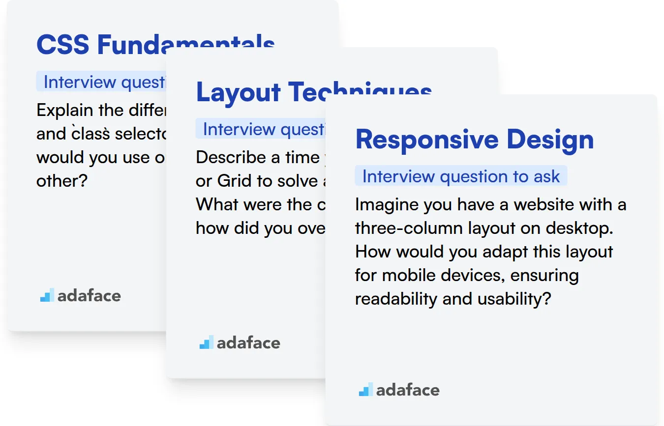
CSS Fundamentals
Gauge a candidate's grasp on CSS basics with an online assessment. An HTML/CSS test is a great way to filter candidates who have fundamental CSS knowledge.
To assess their understanding of CSS fundamentals, pose a practical scenario.
Explain the difference between id and class selectors in CSS. When would you use one over the other?
Look for the candidate to articulate that id selectors are unique identifiers, while class selectors can be applied to multiple elements. A good candidate will also mention specificity and when using id selectors might be appropriate.
Layout Techniques
Screen candidates quickly with assessment tests that cover Flexbox and Grid layouts. Test their practical knowledge on how to implement different types of layouts.
Ask a question about their experience with Flexbox or Grid in a real-world project.
Describe a time you used Flexbox or Grid to solve a layout problem. What were the challenges and how did you overcome them?
The candidate should be able to describe the problem they were trying to solve, the specific Flexbox or Grid properties they used, and any difficulties they encountered along the way. A strong answer shows experience and problem-solving skills.
Responsive Design
Use online assessments to evaluate candidates on the proper use of media queries for creating responsive designs. An HTML/CSS test can reveal their depth of expertise.
Present the candidate with a hypothetical design scenario and ask how they would make it responsive.
Imagine you have a website with a three-column layout on desktop. How would you adapt this layout for mobile devices, ensuring readability and usability?
The ideal response should mention using media queries to adjust the layout, potentially stacking the columns vertically, and optimizing images for smaller screens. Bonus points if they mention accessibility considerations.
3 Tips for Using CSS Interview Questions
Before you put your newfound knowledge into practice, here are a few tips to help you get the most out of your CSS interviews. These tips will ensure you gather the right information to make informed hiring decisions.
1. Prioritize Skills Assessments Before Interviews
Save valuable interview time by using skills assessments early in the hiring process. These assessments efficiently filter candidates based on their practical CSS abilities, allowing you to focus on the most promising individuals.
Adaface provides a range of front end developer tests, including HTML & CSS online tests, and JavaScript online tests. These tests evaluate a candidate's understanding of CSS concepts and their ability to apply them in real-world scenarios.
By using skills assessments, you can quickly identify candidates who possess the required CSS expertise, reducing the time spent on interviewing unqualified individuals. This streamlined approach helps you make data-driven decisions and improves the overall quality of your hires.
2. Outline Focused Interview Questions
Time is limited in an interview, so make every question count. Focus on the most relevant CSS concepts for the role, maximizing your ability to assess candidates on the most important skills.
Consider exploring related topics during the interview. For instance, you might want to check out HTML interview questions to check on overall front end skills. Alternatively, soft skills such as communication can also be checked.
Selecting a focused set of CSS questions ensures you gain valuable insights into a candidate's capabilities within the given time frame. The questions should cover the important aspects for the role.
3. Always Ask Follow-Up Questions
Don't rely solely on initial answers; delve deeper with follow-up questions. This is to uncover the true depth of a candidate's knowledge and to verify the authenticity of their responses.
For example, if a candidate explains the concept of CSS specificity, follow up with a question like, 'Can you describe a situation where you encountered an issue with specificity and how you resolved it?' This allows you to evaluate their practical experience and problem-solving abilities.
Streamline CSS Hiring with Skill Assessments
If you're aiming to hire candidates with strong CSS skills, accurately evaluating their abilities is key. Using dedicated skill tests is the most effective way to ensure they possess the required expertise. Explore Adaface's HTML CSS Online Test or the broader Front End Developer Test to assess candidate proficiency.
Once you've identified top performers with skill assessments, you can confidently shortlist candidates for interviews. Take the next step by signing up for the Adaface platform and discovering how to hire the right fit.
JavaScript, HTML/CSS & React Online Test
45 mins | 15 MCQs and 1 Coding Question
The JavaScript, HTML/CSS & React Test uses scenario-based MCQs to evaluate candidates on their proficiency in JavaScript programming language, HTML/CSS markup, and React library. The test assesses candidates' understanding of topics such as DOM manipulation, event handling, component lifecycle, state management, props and rendering, and CSS styling. Candidates are evaluated on their ability to use these technologies to solve real-world problems and develop responsive and interactive web applications.
Try JavaScript, HTML/CSS & React Online Test
Download CSS interview questions template in multiple formats
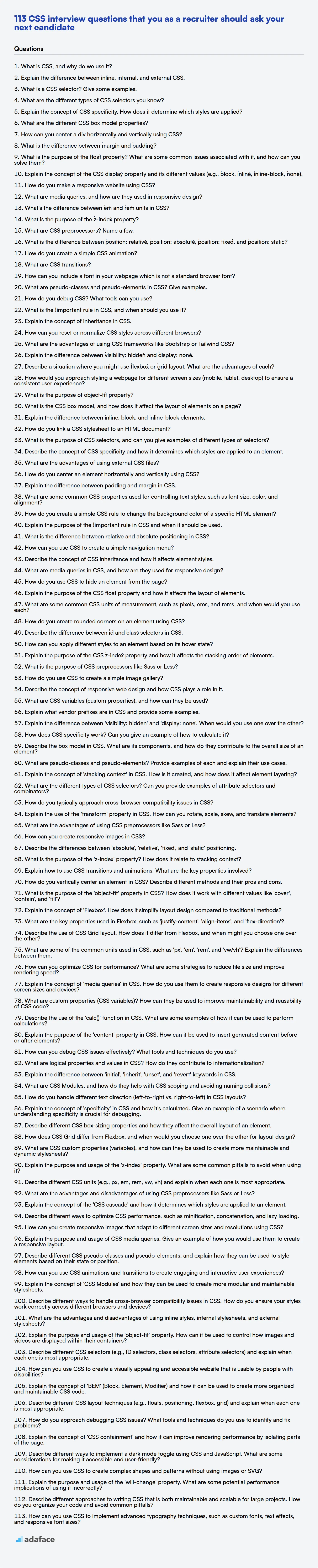
CSS Interview Questions FAQs
What are some important CSS concepts to test during an interview?
Key concepts include the box model, selectors, specificity, positioning, and layout techniques like Flexbox and Grid. Understanding of responsive design principles and browser compatibility is also important.
How can I assess a candidate's understanding of CSS architecture?
Ask about their experience with CSS methodologies like BEM, OOCSS, or Atomic CSS. Inquire about how they structure CSS in large projects and manage maintainability.
What are some good behavioral CSS interview questions to ask?
Questions about how they approach debugging CSS issues, how they stay up-to-date with the latest CSS trends, and how they collaborate with other developers and designers are helpful.
Why is it important to test for responsive design knowledge in CSS interviews?
Responsive design is a skill for creating websites that adapt to different screen sizes. Candidates should know about media queries and mobile-first design principles.
How can I determine if a candidate understands CSS performance optimization?
Ask about techniques for minimizing CSS file size, reducing render-blocking CSS, and optimizing CSS selectors for better performance. Knowledge of tools like CSSNano or PurgeCSS is a plus.
What are some common mistakes to avoid when writing CSS?
Avoid using !important excessively, avoid deeply nested selectors, don't neglect browser compatibility, and avoid inline styles.
40 min skill tests.
No trick questions.
Accurate shortlisting.
We make it easy for you to find the best candidates in your pipeline with a 40 min skills test.
Try for freeRelated posts
Free resources

Join 1200+ companies in 80+ countries.
Try the most candidate friendly skills assessment tool today.

40 min tests.
No trick questions.
Accurate shortlisting.
No trick questions.
Accurate shortlisting.