
Web Design interview questions for freshers
1. What's the difference between a good website and a GREAT website?
2. If a user says a website is 'bad', what are some things that might make them say that?
3. Can you tell me about a website you really like, and why you like it?
4. What do you know about making websites work well on phones and tablets (responsive design)?
5. Have you ever made a website? What tools did you use?
6. What is HTML, and what does it do?
7. What is CSS, and what is it used for?
8. What is Javascript and how do you use it in web design?
9. Can you explain what 'user experience' (UX) means?
10. Why is it important for a website to be easy to use?
11. What does the term 'accessibility' mean in web design and why is it important?
12. What are some things that make a website secure?
13. What is a 'wireframe,' and why might we use one?
14. If a client wants their website to be 'modern', what does that mean to you?
15. What are some common design mistakes you see on websites?
16. How do you keep learning about new things in web design?
17. How do you stay organized when working on a web design project?
18. Tell me about a time you had to solve a problem while designing a website.
19. How do you handle feedback from a client when they don't like something you designed?
20. What is a website grid system and why is it useful?
21. What do you know about website color palettes and typography?
22. What is the difference between 'front-end' and 'back-end' web development?
23. What are some different types of websites (like blogs, e-commerce, etc.)?
24. How do you test a website to make sure it works correctly?
25. What is SEO, and how does it relate to web design?
26. Can you describe your design process from start to finish?
Web Design interview questions for juniors
1. What is the difference between responsive and adaptive web design, and when would you choose one over the other?
2. Explain the concept of 'user-centered design' in simple terms.
3. What are some basic principles of visual hierarchy, and how do they help improve a website's usability?
4. If a client says 'make it pop,' what steps would you take to understand their request and implement it effectively?
5. Describe your experience with using a grid system in web design.
6. What is the importance of white space (or negative space) in web design?
7. How do you approach choosing the right typography for a website project?
8. Explain the difference between UI (User Interface) and UX (User Experience) design.
9. What are some common accessibility issues in web design, and how can you address them?
10. How do you stay updated with the latest web design trends and technologies?
11. Describe a time you received feedback on a design and how you incorporated it.
12. What is a mood board, and how is it helpful in the design process?
13. How would you explain the importance of website loading speed to a client?
14. What are the benefits of designing a website for mobile-first?
15. Explain the concept of 'call to action' (CTA) and provide some examples.
16. What is the difference between a wireframe and a prototype?
17. What are some common design tools or software you have experience with?
18. How do you ensure cross-browser compatibility in your designs?
19. What is the purpose of using alt text for images on a website?
20. Explain the importance of color theory in web design.
21. Describe your process for designing a website's navigation.
22. What are some things to consider when designing forms on a website?
23. How do you approach designing for different screen sizes and resolutions?
24. Explain the difference between raster and vector graphics, and when would you use each?
25. What are some basic principles of animation in web design?
26. How do you measure the success of a website design?
27. What are some strategies for creating visually appealing content layouts?
28. Explain the concept of 'user flow' and its importance in web design.
29. How do you handle conflicting design opinions from stakeholders?
30. Describe a design project you are particularly proud of and why.
Web Design intermediate interview questions
1. How do you ensure cross-browser compatibility in your web designs, and what tools do you use for testing?
2. Describe your process for creating a responsive website design.
3. Explain the difference between UX and UI design, and provide examples of each.
4. What are some common web accessibility issues, and how can you address them in your designs?
5. How do you optimize website performance in terms of speed and user experience?
6. What are your favorite web design trends, and how do you decide when to incorporate them into your projects?
7. Explain the importance of using a design system, and describe your experience with building or using one.
8. How do you approach designing for different screen sizes and devices?
9. Describe your experience with wireframing and prototyping tools.
10. What is your process for gathering user feedback and incorporating it into your designs?
11. How do you stay up-to-date with the latest web design technologies and trends?
12. Explain the concept of 'mobile-first' design and its importance.
13. How do you handle conflicting design opinions from stakeholders?
14. What are some best practices for designing effective call-to-action buttons?
15. Describe your understanding of information architecture and its role in web design.
16. How do you approach designing for users with disabilities?
17. What are some techniques for creating visually appealing and engaging web designs?
18. Explain the role of typography in web design.
19. How do you balance aesthetic appeal with usability in your designs?
20. Describe your experience with different content management systems (CMS).
21. How do you measure the success of a web design project?
Web Design interview questions for experienced
1. Describe a time you had to defend a design decision to a stakeholder who disagreed. How did you approach the situation, and what was the outcome?
2. What is your process for ensuring accessibility (WCAG) in your web designs? Can you provide specific examples of techniques you've used?
3. How do you stay up-to-date with the latest web design trends and technologies? Share specific resources or methods you use.
4. Explain your experience with user testing and how you incorporate user feedback into your design process. What's your favorite method?
5. Describe a situation where you had to work with a very tight deadline. How did you prioritize tasks and ensure quality in your design?
6. What are your preferred tools and techniques for creating responsive web designs? What are the pros and cons of each?
7. How do you approach designing for different cultural contexts and languages? Give an example of a project where you had to consider localization.
8. Explain your understanding of web performance optimization and how you incorporate it into your design process. What metrics do you track?
9. Describe a project where you had to balance user needs with business goals. How did you navigate the conflicting priorities?
10. What is your experience with designing for e-commerce websites? What are some key considerations for creating a successful online store?
11. How do you handle designing for content-heavy websites? What strategies do you use to ensure a good user experience?
12. Explain your approach to designing interactive elements and micro-interactions. Provide examples of effective micro-interactions you've created.
13. Describe a time you had to redesign an existing website. What was your process for evaluating the existing design and identifying areas for improvement?
14. What is your understanding of design systems and how have you used them in your work? What are the benefits of using design systems?
15. How do you ensure consistency across different pages and sections of a website? What tools and techniques do you use to maintain consistency?
16. Explain your approach to designing for mobile-first. What are some challenges and best practices for mobile design?
17. Describe a situation where you had to collaborate with developers to implement your designs. How did you ensure your design vision was accurately translated into code?
18. What is your experience with designing for different types of users (e.g., novice users, expert users)? How do you tailor your designs to meet their specific needs?
19. How do you measure the success of a web design? What metrics do you use to track performance and user engagement?
20. Explain your understanding of information architecture and how you approach organizing content on a website. Provide an example of a project where you improved the information architecture of a site.
21. Describe your experience with A/B testing and how you use it to optimize your designs. What are some key considerations for running effective A/B tests?
22. What are some common web design mistakes you see experienced designers make, and how do you avoid them?
23. Can you describe a time when a design you created significantly improved a website's key performance indicators (KPIs)? What were the specific results, and how did your design contribute to the improvement?

Hiring web designers can be tricky because it involves understanding a mix of artistic talent and technical expertise. It's a bit like trying to find someone who can paint a beautiful picture while also knowing the science of how the paint sticks to the canvas, and this post will simplify that process for you, unlike assessing skills required for front end developers.
This blog post offers a curated list of interview questions tailored for web designers of all experience levels, from freshers to experienced professionals, including multiple-choice questions (MCQs) to test their knowledge. The questions cover a spectrum of topics testing HTML, CSS, Javascript, and other relevant technologies.
Use these questions to identify candidates who not only possess the required skills but also align with your team's vision, and before your interviews, consider using Adaface's web developer online test to screen candidates.
Table of contents
Web Design interview questions for freshers
Web Design interview questions for juniors
Web Design intermediate interview questions
Web Design interview questions for experienced
Web Design MCQ
Which Web Design skills should you evaluate during the interview phase?
Hire Top Web Design Talent with Skills Tests and Targeted Interview Questions
Download Web Design interview questions template in multiple formats
Web Design interview questions for freshers
1. What's the difference between a good website and a GREAT website?
A good website meets basic requirements: it's functional, loads quickly, and provides information. A GREAT website, however, goes beyond that. It anticipates user needs, provides a seamless and enjoyable experience, and leaves a lasting positive impression. This often involves a deep understanding of user behavior and a focus on accessibility and usability. Great websites are typically well-maintained, optimized for performance and SEO, and are constantly being improved based on user feedback and analytics.
Key differentiators include:
- User Experience (UX): Intuitive navigation, clear calls to action, and visually appealing design.
- Content Strategy: Engaging, relevant, and valuable content that keeps users coming back.
- Performance: Fast loading times, responsive design, and optimal performance across devices.
- Accessibility: Adherence to accessibility standards (e.g., WCAG) to ensure usability for everyone.
- Analytics & Iteration: Constant monitoring of website performance and user behavior, with ongoing improvements based on data.
2. If a user says a website is 'bad', what are some things that might make them say that?
A user might say a website is 'bad' for a variety of reasons related to usability, performance, design, and content. These include:
- Poor Usability: Difficult navigation, confusing layout, broken links, forms that don't work, or a lack of clear calls to action.
- Slow Performance: Long loading times, laggy interactions, or frequent errors during use.
- Unattractive Design: Outdated visual design, inconsistent branding, or poor use of color and typography.
- Irrelevant or Poor Content: Inaccurate information, grammatical errors, or a lack of useful content.
- Security Issues: Lack of HTTPS, suspicious links, or perceived data breaches.
- Accessibility Problems: Difficult to use for people with disabilities (e.g., poor screen reader compatibility, lack of alt text on images).
- Mobile Incompatibility: Website not optimized for viewing or interacting with on mobile devices.
3. Can you tell me about a website you really like, and why you like it?
I really like GitHub. It's an invaluable tool for software development and collaboration. I appreciate its user-friendly interface for version control using Git. It allows easy tracking of changes, branching, and merging, which are essential for managing code effectively.
Beyond version control, GitHub facilitates open-source contributions and community building. I find the ability to explore public repositories, contribute to projects, and learn from other developers extremely useful. The issue tracking system and pull request workflows streamline collaboration on complex projects. For example git commit -m "fixed a bug" or git push origin main
4. What do you know about making websites work well on phones and tablets (responsive design)?
Responsive design is about creating websites that adapt to different screen sizes and devices (phones, tablets, desktops). This ensures a good user experience regardless of how the site is accessed. Key techniques include:
Flexible grids: Using relative units (like percentages) instead of fixed pixels for layout, so elements resize proportionally.
Flexible images: Making images scale with the layout using CSS
max-width: 100%;andheight: auto;.Media queries: Applying different CSS rules based on screen size, orientation (portrait or landscape), and other device characteristics. For example:
@media (max-width: 768px) {
  .menu { display: none; }
}
This CSS would hide the element with the class 'menu' on screens smaller than 768 pixels wide.
Viewport meta tag: Ensures proper scaling on mobile devices:
<meta name="viewport" content="width=device-width, initial-scale=1.0">
5. Have you ever made a website? What tools did you use?
Yes, I have created several websites. I've used a variety of tools, depending on the project's complexity. For simpler static sites, I typically use HTML, CSS, and JavaScript. To make my workflow easier, I also utilize frameworks like Bootstrap or Tailwind CSS. For more complex, dynamic websites, I've used backend technologies such as Node.js with frameworks like Express and databases like MongoDB or PostgreSQL. For front-end frameworks, I generally prefer React or Vue.js. For hosting, I've used services like Netlify, Vercel, or AWS.
My workflow usually involves using a code editor like VS Code, version control with Git and GitHub, and build tools such as Webpack or Parcel. I also use Chrome's developer tools for debugging and testing. Here are some code snippets to illustrate:
// Example React component
function MyComponent() {
  return (
    <div>
      <h1>Hello, World!</h1>
    </div>
  );
}
/* Example CSS styling */
body {
  font-family: sans-serif;
  background-color: #f0f0f0;
}
6. What is HTML, and what does it do?
HTML stands for HyperText Markup Language. It's the standard markup language for creating web pages.
HTML provides the structure and content of a webpage. It uses elements, represented by tags, to define different parts of the page, such as headings, paragraphs, images, links, and more. Browsers interpret these tags to display the webpage to the user. Example: <h1>This is a heading</h1> creates a main heading, and <p>This is a paragraph.</p> creates a paragraph of text.
7. What is CSS, and what is it used for?
CSS stands for Cascading Style Sheets. It's a stylesheet language used to describe the presentation of a document written in HTML or XML (including XML dialects such as SVG, MathML or XHTML).
Essentially, CSS defines how HTML elements should be displayed on screen, on paper, or in other media. This includes things like:
- Layout (positioning of elements)
- Colors (text and background)
- Fonts (typeface and size)
- Spacing (margins and padding)
@mediaqueries for responsive design
8. What is Javascript and how do you use it in web design?
JavaScript is a high-level, interpreted programming language primarily used to add interactivity and dynamic behavior to websites. It enables you to manipulate the Document Object Model (DOM), handle events, and create asynchronous requests to servers.
In web design, JavaScript is used for:
- Adding interactive elements: Handling button clicks, form submissions, and animations.
- DOM manipulation: Modifying the structure, style, and content of HTML elements dynamically.
- AJAX (Asynchronous JavaScript and XML): Fetching data from servers without reloading the entire page, improving user experience.
- Form validation: Checking user input on the client-side before submitting forms.
- Creating Single Page Applications (SPAs): Frameworks like React, Angular, and Vue.js rely heavily on JavaScript for building complex, interactive web applications.
- Example:
document.getElementById("myButton").addEventListener("click", function() {
 alert("Button was clicked!");
});
9. Can you explain what 'user experience' (UX) means?
User experience (UX) encompasses a person's emotions, attitudes, and perceptions about using a particular product, system or service. It's about how easy, efficient, and enjoyable it is to use something, going beyond just functionality to focus on the overall feeling the user gets. A good UX makes a product intuitive and satisfying, while a bad UX can lead to frustration and abandonment.
10. Why is it important for a website to be easy to use?
Website usability is crucial because it directly impacts user satisfaction and business goals. When a website is easy to use, users are more likely to find what they need quickly and efficiently, leading to a positive experience. This can increase engagement, reduce bounce rates, and improve conversion rates (e.g., sales, sign-ups). Ultimately, a user-friendly website fosters trust and encourages repeat visits.
Conversely, a difficult or confusing website can frustrate users, leading them to abandon the site in favor of a competitor. Poor usability can damage a brand's reputation and negatively impact search engine rankings. Investing in usability improvements ensures that the website serves its intended purpose and provides value to both the users and the business.
11. What does the term 'accessibility' mean in web design and why is it important?
Accessibility in web design means creating websites that are usable by everyone, including people with disabilities. This includes people with visual, auditory, motor, or cognitive impairments. An accessible website is designed and developed in a way that removes barriers that prevent people with disabilities from interacting with or accessing the content. It is about inclusivity, ensuring equal access and opportunity for all users, regardless of their abilities or disabilities.
Accessibility is important for several reasons: it's the right thing to do ethically, it expands your potential audience, it can improve SEO, and in many regions, it is legally required. By adhering to accessibility standards like WCAG, websites become more usable for everyone, including users with slow internet connections, older users, or those using mobile devices in bright sunlight. It also promotes better coding practices and overall website quality.
12. What are some things that make a website secure?
A secure website employs several key measures. HTTPS (SSL/TLS) encrypts communication between the user's browser and the server, protecting data in transit. Strong password policies and secure authentication mechanisms, like multi-factor authentication (MFA), prevent unauthorized access. Regular security audits and penetration testing help identify and address vulnerabilities.
Further, implementing proper input validation and output encoding prevents common web vulnerabilities like cross-site scripting (XSS) and SQL injection. Keeping all software, including the server operating system, web server, and content management system (CMS), up-to-date with the latest security patches is crucial. A Web Application Firewall (WAF) can also help filter malicious traffic.
13. What is a 'wireframe,' and why might we use one?
A wireframe is a basic visual representation of a website or application, outlining the structure, content, and functionality. Think of it as a blueprint, focusing on the layout and user flow rather than the visual design. It's typically low-fidelity, using simple shapes and placeholders for images and text.
Wireframes are used to plan and test the user interface early in the design process. They help stakeholders visualize the product, identify potential usability issues, and ensure everyone is aligned on the scope and functionality before committing to more detailed design work. This saves time and resources by catching problems early on and making necessary adjustments more efficiently.
14. If a client wants their website to be 'modern', what does that mean to you?
When a client says 'modern' website, I understand it as a site that is user-friendly, visually appealing, technically sound, and up-to-date with current web standards. This often includes a responsive design (works well on all devices), fast loading times, clean and intuitive navigation, and accessibility features. A modern site usually incorporates a clean design aesthetic, often with subtle animations and interactive elements to enhance user engagement.
Technically, a modern site would likely be built using current technologies like HTML5, CSS3 (possibly with a preprocessor like Sass), and JavaScript frameworks like React, Angular, or Vue.js. It would also prioritize security (HTTPS, protection against common vulnerabilities) and SEO (search engine optimization) best practices.
15. What are some common design mistakes you see on websites?
Some common design mistakes include poor navigation, making it difficult for users to find what they're looking for. This often manifests as inconsistent menus, unclear labeling, or a lack of search functionality. Another frequent issue is neglecting mobile responsiveness, leading to a frustrating experience for users on smaller screens due to unreadable text, broken layouts, or slow loading times. Ignoring accessibility guidelines, such as providing alternative text for images or ensuring sufficient color contrast, is also a significant oversight, as it excludes users with disabilities.
Additionally, walls of text without visual breaks (like images, headings, or bullet points) can overwhelm users and make it hard to digest information. Slow page load speeds, often caused by unoptimized images or excessive JavaScript, can significantly increase bounce rates. Finally, inconsistent branding across the website can erode trust and make it harder for users to recognize the site.
16. How do you keep learning about new things in web design?
I stay updated in web design through a mix of online resources and community engagement. I regularly read industry blogs like CSS-Tricks and Smashing Magazine to understand new trends, techniques, and best practices. I also follow key influencers and designers on platforms like Twitter and Medium for insights and inspiration. I try to devote time each week to exploring new frameworks or libraries like React or Vue.js by building small personal projects or completing online tutorials.
Actively participating in the design community is also essential. I attend online webinars and workshops to learn from experts. I also visit websites like Stack Overflow to help others resolve issues and learn from the questions and answers. This mix of self-directed learning and community involvement helps me stay current with the ever-evolving landscape of web design.
17. How do you stay organized when working on a web design project?
To stay organized on web design projects, I use a combination of tools and processes. I start by clearly defining the project scope, goals, and deliverables with the client. Then, I create a project plan using a tool like Trello or Asana to track tasks, deadlines, and team assignments. Version control (Git) is essential for managing code and design assets; I create branches for new features and bug fixes. For design files, I use a naming convention that is easily searchable. Finally, I schedule regular check-ins with the team and client to address any issues promptly.
Specifically, I utilize a detailed file structure for each project, separating assets (images, fonts, etc.), code (HTML, CSS, JavaScript), and documentation. When working with CSS, I adopt a methodology such as BEM or SMACSS to keep the code modular and maintainable. I prefer using a design system to ensure consistency across the project and save time. It is critical to document design decisions, API endpoints, and any non-standard implementation choices.
18. Tell me about a time you had to solve a problem while designing a website.
During the development of an e-commerce website, we encountered a significant performance issue with the product filtering feature. The initial implementation involved querying the database directly for each filter applied (e.g., price range, color, size). This resulted in slow loading times, especially when users applied multiple filters simultaneously.
To address this, we implemented a multi-faceted approach:
- Caching: Implemented caching of filter options to reduce database queries.
- Optimized Queries: Rewrote the database queries to be more efficient, using indexes and optimized
WHEREclauses. - Asynchronous Loading: Implemented asynchronous loading of filter results, allowing the page to load initially and then update with the filtered results. We also made use of a service worker to cache api responses for the filter options. This drastically improved the user experience and reduced the server load.
19. How do you handle feedback from a client when they don't like something you designed?
When a client doesn't like a design, my first step is to actively listen and understand their concerns. I ask clarifying questions to pinpoint the specific elements they dislike and the reasons behind their feedback. It's crucial to remain objective and avoid taking it personally. Instead, I focus on viewing their feedback as valuable input for improvement.
Next, I collaborate with the client to find a solution that addresses their concerns while staying true to the project's goals and constraints. This might involve revisiting the initial requirements, exploring alternative design options, or making adjustments to the existing design. Throughout the process, I maintain open communication and keep the client informed of the progress until we reach a mutually satisfactory outcome. I aim to find a balance between the client's needs and design principles and best practices.
20. What is a website grid system and why is it useful?
A website grid system is a structure comprised of intersecting horizontal and vertical lines that create a framework for arranging content on a web page. It's essentially a layout blueprint that helps designers organize elements in a consistent and visually appealing manner. Common grid systems include 12-column or 16-column layouts.
Grid systems are useful because they promote consistency and order in web design. They simplify the design process, making it easier to create responsive layouts that adapt to different screen sizes. By providing a pre-defined structure, they ensure that elements are aligned and spaced correctly, leading to a more professional and user-friendly website. Popular CSS frameworks like Bootstrap and Foundation incorporate grid systems to streamline web development. These systems often utilize CSS techniques like float, flexbox, or grid to achieve their layout.
21. What do you know about website color palettes and typography?
Website color palettes are the set of colors used in a website's design, influencing user experience and brand perception. Effective palettes often leverage color theory principles (e.g., complementary, analogous, triadic) and consider accessibility guidelines like sufficient contrast for readability. Tools like Adobe Color, Coolors, and Paletton can help generate and test color schemes.
Typography involves selecting and arranging fonts to make written language legible, readable, and visually appealing. Key considerations include font pairing (e.g., serif for body text, sans-serif for headings), font size, line height, letter spacing, and ensuring the fonts are web-safe or loaded correctly using @font-face or services like Google Fonts. Good typography improves readability and reinforces the brand's visual identity.
22. What is the difference between 'front-end' and 'back-end' web development?
Front-end web development focuses on the user interface and user experience (UI/UX) of a website or web application. It involves using technologies like HTML, CSS, and JavaScript to create the visual elements and interactive features that users directly interact with. Essentially, it's everything the user sees and touches in the browser.
Back-end web development, on the other hand, deals with the server-side logic, databases, and infrastructure that power the front-end. It involves using languages like Python, Java, or Node.js to handle data processing, user authentication, and server management. The back-end ensures that the website functions correctly and securely behind the scenes, managing the data and business logic required for the front-end to operate seamlessly.
23. What are some different types of websites (like blogs, e-commerce, etc.)?
Some different types of websites include:
- Blogs: Regularly updated websites, usually run by an individual or small group, written in an informal or conversational style.
- E-commerce: Websites that enable the buying and selling of goods or services online.
- Portfolios: Showcase creative work, often used by designers, photographers, and artists.
- Forums: Online discussion sites where people can hold conversations in the form of posted messages.
- Wikis: Collaborative websites that allow users to create and edit content.
- News: Provide current events and information.
- Social Media: Platforms for connecting and sharing content with others.
- Educational: Provide online learning resources and courses.
24. How do you test a website to make sure it works correctly?
Testing a website involves various approaches to ensure functionality, usability, performance, and security. I would start by testing core functionality like links, forms, and navigation on different browsers and devices. This includes checking for broken links, form validation, and responsive design.
Next, I'd focus on usability, ensuring the site is intuitive and easy to use. Performance testing involves checking page load times and server response. I'd also perform security testing to identify vulnerabilities, looking for things like XSS or SQL injection issues. Tools like browser developer tools, Lighthouse, and OWASP ZAP can be helpful for specific tasks. Automated testing with tools like Selenium or Cypress can also be implemented for regression and functional testing.
25. What is SEO, and how does it relate to web design?
SEO, or Search Engine Optimization, is the practice of enhancing a website to improve its visibility in search engine results pages (SERPs) like Google. The goal is to attract more organic (non-paid) traffic to your site.
SEO and web design are deeply intertwined. Good web design considers SEO best practices. For instance:
- Site Structure: A well-organized website with a clear hierarchy helps search engines crawl and index content effectively.
- Mobile-Friendliness: Google prioritizes mobile-friendly websites, influencing rankings.
- Page Speed: Faster loading times improve user experience and are a ranking factor.
- Content Optimization: Design should accommodate keyword-rich content, properly formatted headings, and alt text for images to improve search engine understanding.
- URL Structure: Clean and descriptive URLs are better for SEO.
26. Can you describe your design process from start to finish?
My design process typically starts with understanding the problem and gathering requirements. I collaborate with stakeholders to define the scope, goals, and constraints. Next, I move into the design phase, where I brainstorm potential solutions, create sketches or wireframes, and develop a high-level architecture. This phase often involves iterating and refining the design based on feedback. Once the design is finalized, I proceed with implementation, which includes coding, testing, and deployment. Throughout the entire process, I prioritize clear communication, collaboration, and continuous improvement.
Specifically, regarding software design, I often start by defining the use cases and user stories. Then, I will create a class diagram that outlines the system's major classes, attributes and operations. Next, I think about the interfaces and APIs required. Finally, I will break down the design into smaller, manageable modules. This allows for easier implementation, testing, and maintenance of the software. I also always take security and scalability into account during design.
Web Design interview questions for juniors
1. What is the difference between responsive and adaptive web design, and when would you choose one over the other?
Responsive design uses flexible grids and media queries to adapt a website's layout to different screen sizes. The same code base is used across all devices, and the design adjusts dynamically based on the viewport size. Adaptive design, on the other hand, uses multiple fixed layouts tailored to specific screen sizes or device types. It detects the device or screen size and serves the appropriate layout.
You'd choose responsive design when you need a single codebase that works seamlessly across a wide range of devices and resolutions, and when content is relatively consistent across platforms. Adaptive design is preferable when you want to create highly customized experiences for specific device types, when you need greater control over the design for each device, or when you are supporting older browsers that don't handle media queries well. Adaptive may also be chosen when you want to specifically optimize for mobile performance and data usage in specific scenarios.
2. Explain the concept of 'user-centered design' in simple terms.
User-centered design (UCD) means designing something with the end-user in mind at every stage. Instead of just focusing on what's technically possible or what we think users want, we involve users directly in the design process. This includes understanding their needs, goals, and limitations through research and feedback.
Essentially, it's about making things that are easy to use, effective, and enjoyable for the people who will actually be using them. Key activities include user research, prototyping, and usability testing. The goal is to iterate based on user feedback to create a product that truly meets user needs.
3. What are some basic principles of visual hierarchy, and how do they help improve a website's usability?
Visual hierarchy is the arrangement of elements in a way that implies importance. It guides the user's eye to the most important information first. Basic principles include: Size (larger elements attract more attention), Color & Contrast (brighter or contrasting colors stand out), Proximity (elements grouped together are perceived as related), Typography (font size, weight, and style influence readability and importance), and Whitespace (using space to separate and emphasize elements).
By implementing these principles, a website's usability improves because users can quickly scan the page and understand the key information, calls to action, and overall purpose. This reduces cognitive load, makes the site easier to navigate, and ultimately enhances the user experience. For example, a large, brightly colored button with clear text (call to action) immediately directs the user's attention.
4. If a client says 'make it pop,' what steps would you take to understand their request and implement it effectively?
When a client says 'make it pop,' I see it as a vague but important piece of feedback, indicating a desire for increased visual impact or excitement. My first step is to clarify their specific vision. I'd ask questions like: 'What currently feels flat or unengaging?', 'What elements should be more prominent?', 'Are there specific examples of designs that 'pop' in the way you envision?', and 'What feeling or message should this 'pop' convey?'. Understanding their subjective interpretation is crucial.
Once I have a clearer understanding, I'd explore several design techniques. This might involve adjusting color palettes for higher contrast or introducing a vibrant accent color, implementing subtle animations or transitions to draw the eye, refining typography for greater legibility and visual interest (perhaps using a bolder font or varying font sizes), adjusting the layout to create more visual hierarchy, or strategically using whitespace to emphasize key elements. I'd present a few different options, explaining the rationale behind each, and iterate based on their feedback to achieve the desired 'pop' effect, ensuring it aligns with their brand and goals. I will also ask the client their budget to ensure all changes are feasible.
5. Describe your experience with using a grid system in web design.
I have used grid systems extensively in web design to create structured and responsive layouts. My experience includes working with CSS Grid and frameworks like Bootstrap and Materialize CSS, which provide pre-built grid systems. I commonly use grids to organize content into rows and columns, ensuring consistent spacing and alignment across different screen sizes.
Specifically, I've implemented responsive designs using media queries in conjunction with grid classes, adjusting column widths and order based on viewport size. I'm comfortable with concepts like grid areas, grid-template-columns, grid-gap, and justify-content for fine-tuning grid layouts. I also have experience troubleshooting grid issues related to conflicting styles or incorrect grid configurations.
6. What is the importance of white space (or negative space) in web design?
White space, or negative space, is crucial in web design for several reasons. It improves readability and comprehension by creating visual breathing room around elements, preventing a cluttered and overwhelming user experience. Adequate white space guides the user's eye, highlighting important content and establishing a clear visual hierarchy.
Furthermore, white space contributes significantly to the overall aesthetic appeal and perceived professionalism of a website. It can create a sense of elegance, sophistication, and trustworthiness. A well-balanced use of white space demonstrates attention to detail and enhances the user's engagement with the content, leading to a more positive and effective online experience.
7. How do you approach choosing the right typography for a website project?
When choosing typography for a website, I consider several factors. First, readability is paramount; the font should be easy to read on different screen sizes and resolutions. I look at x-height, letter spacing, and overall clarity. Second, brand personality comes into play. The font should align with the brand's identity and convey the right tone (e.g., modern, classic, playful). This involves considering serif vs. sans-serif, font weight, and style.
Third, accessibility is crucial. I ensure sufficient contrast between text and background colors and avoid using fonts that are too light or thin. I also consider the font's licensing and ensure it's suitable for web use and that I have the necessary permissions. Finally, I typically select a font pairing (e.g., one for headings and another for body text) to create visual hierarchy and interest. I use tools like Google Fonts and Font Pair to explore options and test different combinations before making a final decision.
8. Explain the difference between UI (User Interface) and UX (User Experience) design.
UI (User Interface) design focuses on the look and feel of a product. It's about the visual elements, like buttons, typography, color palettes, and overall layout. The primary goal of UI is to create an interface that is aesthetically pleasing and easy to navigate. UI designers are concerned with how the product looks.
UX (User Experience) design, on the other hand, is a broader concept that encompasses the entire experience a user has with a product, from initial discovery to long-term use. UX considers usability, accessibility, and overall satisfaction. It involves understanding user needs, conducting research, and designing a product that is not only visually appealing but also intuitive, efficient, and enjoyable to use. UX designers are concerned with how the product works and feels.
9. What are some common accessibility issues in web design, and how can you address them?
Common accessibility issues in web design include missing alt text for images, which prevents screen readers from describing the image content. Address this by adding descriptive alt text to all <img> tags. Insufficient color contrast between text and background is another issue, making it difficult for users with low vision to read the content. Use tools to check color contrast ratios and ensure they meet WCAG guidelines. Also, keyboard navigation should be fully supported, which means all interactive elements are reachable and operable using the keyboard alone. Use semantic HTML and ensure focus indicators are visible.
Another common problem is relying solely on color to convey information. Always provide alternative cues, such as text labels or icons, in addition to color. Poor form label association is also problematic; ensure labels are correctly associated with form fields using the <label> tag's for attribute and the input's id attribute. Finally, ensure the page structure uses proper headings (<h1> to <h6>) to provide a clear outline for screen reader users and improve overall navigability.
10. How do you stay updated with the latest web design trends and technologies?
I stay updated with web design trends and technologies through a variety of resources. I regularly read industry blogs and publications like CSS-Tricks, Smashing Magazine, and A List Apart. Following key influencers and designers on platforms like Twitter and Dribbble also helps me stay informed about emerging styles and techniques.
To keep up with the technological side, I explore new frameworks and libraries through their official documentation and tutorials (e.g., React, Vue, Angular). I also participate in online communities and forums like Stack Overflow and Reddit's r/webdev to learn from others' experiences and troubleshoot challenges. Attending webinars and online conferences is another avenue I use to deepen my knowledge of specific topics.
11. Describe a time you received feedback on a design and how you incorporated it.
During a recent project to redesign our company's landing page, I initially focused on a minimalist aesthetic with a heavy emphasis on large imagery. The initial feedback from the marketing team was that the design, while visually appealing, didn't effectively communicate our key value propositions and felt too generic. They suggested incorporating more concise text highlighting our unique selling points and adding customer testimonials to build trust.
I took this feedback and iterated on the design. I added a clear headline and concise bullet points outlining our core services. I also integrated a carousel of customer testimonials, making them prominent on the page. The revised design, which directly addressed the marketing team's concerns, performed significantly better in A/B testing, demonstrating the value of incorporating their feedback. It led to a 15% increase in conversion rates.
12. What is a mood board, and how is it helpful in the design process?
A mood board is a visual tool used in the design process to explore and communicate design ideas and concepts. It's a collage of images, textures, colors, typography, and words that represent the overall style and feel a designer wants to achieve for a project.
Mood boards are helpful because they:
- Establish a visual direction early in the project.
- Communicate the design vision to stakeholders.
- Generate inspiration and explore different styles.
- Help maintain a consistent look and feel throughout the project.
- Serve as a point of reference during the design process.
13. How would you explain the importance of website loading speed to a client?
Website loading speed is crucial for several reasons. First, users expect a fast experience. Slow loading times lead to frustration, causing them to abandon your site and potentially go to a competitor. This directly impacts your bounce rate and conversion rates, affecting sales and lead generation.
Second, search engines like Google consider loading speed as a ranking factor. A faster site is more likely to rank higher in search results, driving more organic traffic. Slow speed can also hinder the crawling and indexing of your site by search engine bots, negatively impacting your SEO. Ultimately, a faster website provides a better user experience, improves search engine visibility, and helps achieve your business goals.
14. What are the benefits of designing a website for mobile-first?
Designing a website mobile-first offers several benefits. Primarily, it ensures a better user experience for the majority of users, as mobile devices account for a significant portion of web traffic. By prioritizing the mobile experience, you're forced to focus on the essential content and functionality, resulting in a cleaner and more streamlined design. This approach also leads to improved performance on mobile devices, as websites are built with smaller screen sizes and limited bandwidth in mind, further improving user satisfaction and SEO.
Moreover, a mobile-first design approach often translates to a more responsive and adaptable website overall. This is because the design is built from the ground up to be flexible and accommodating to different screen sizes. It can also lead to better SEO rankings, as Google prioritizes mobile-friendly websites. This translates to a website that is more accessible, user-friendly, and performant across all devices, ultimately improving engagement and conversion rates.
15. Explain the concept of 'call to action' (CTA) and provide some examples.
A call to action (CTA) is a prompt designed to encourage an immediate response or action from the audience. It's a crucial element in marketing and design, guiding users towards a specific goal, whether it's making a purchase, signing up for a newsletter, or learning more about a product or service. CTAs are typically visually prominent and use persuasive language to motivate the desired behavior.
Examples include buttons labeled "Shop Now," "Sign Up Free," "Learn More," "Download Now," or "Contact Us." Effective CTAs are clear, concise, and create a sense of urgency or value. A good CTA clarifies what the user will get by taking the specified action.
16. What is the difference between a wireframe and a prototype?
A wireframe is a basic visual guide representing the skeletal framework of a website or application. It focuses on layout, structure, and information architecture, without any styling or interactivity. Think of it as a blueprint.
A prototype, on the other hand, is a mid-to-high fidelity representation of the final product. It simulates user interaction, allowing users to experience the flow and functionality. Prototypes can range from simple click-through demos to more complex, interactive simulations.
17. What are some common design tools or software you have experience with?
I have experience with a variety of design tools. For UI/UX design, I've worked with Figma, Sketch, and Adobe XD to create wireframes, prototypes, and final designs. I'm also familiar with Adobe Photoshop and Illustrator for image editing and vector graphics creation.
While not strictly design tools, I also use tools like InVision for prototyping and collaboration, and Zeplin for design handoff to developers. For data visualization, I've used tools like Tableau and Google Data Studio. My choice of tool often depends on the specific project requirements and team preferences.
18. How do you ensure cross-browser compatibility in your designs?
To ensure cross-browser compatibility, I use several strategies. Firstly, I start with a solid foundation of HTML, CSS, and JavaScript that adheres to web standards. I use a CSS reset (like Normalize.css) to minimize browser inconsistencies in default styling. I also use tools like Autoprefixer to automatically add vendor prefixes for CSS properties, ensuring wider browser support. Thorough testing on multiple browsers (Chrome, Firefox, Safari, Edge) and devices (real or using browserstack) is crucial throughout the development process.
Additionally, I use progressive enhancement, building a baseline experience that works for all browsers, then enhancing it for modern browsers. I also employ feature detection (using Modernizr or similar techniques) to apply browser-specific styles or functionality only when supported. Regular updates to my knowledge of browser-specific bugs and workarounds are essential, along with leveraging online resources like caniuse.com to determine feature support across browsers.
19. What is the purpose of using alt text for images on a website?
The primary purpose of alt text (alternative text) for images is to provide a textual description of an image for users who cannot see it. This includes individuals who are visually impaired and use screen readers, as well as users who have images disabled in their browser or are experiencing slow network connections where images fail to load.
Alt text also significantly improves website accessibility and SEO. Search engines use alt text to understand the content of an image, which helps in indexing the image and the overall page. A well-written alt text can contribute to better search engine rankings and a more inclusive user experience.
20. Explain the importance of color theory in web design.
Color theory is crucial in web design because it significantly impacts user experience and perception. Effective use of color can guide users through a website, highlight important elements, and create a specific mood or emotion that aligns with the brand. Poor color choices, on the other hand, can lead to visual fatigue, confusion, and ultimately, a negative user experience, causing visitors to leave.
Specifically, color theory helps designers:
- Establish brand identity: Consistent color palettes reinforce brand recognition.
- Improve usability: Color contrast ensures readability and accessibility.
- Create visual hierarchy: Strategic color usage draws attention to key elements.
- Evoke emotions: Colors have psychological associations that can influence user feelings and behavior.
- Increase conversions: Well-chosen colors can encourage users to take desired actions, such as making a purchase or signing up for a newsletter.
21. Describe your process for designing a website's navigation.
My process for designing website navigation starts with understanding the target audience and their goals. I conduct user research to identify their needs and expectations. This research informs the creation of user personas and user journeys, which help me understand how users will interact with the site. Next, I define the site's information architecture, creating a hierarchical structure that organizes content logically and intuitively using card sorting and tree testing.
Based on the information architecture, I design the navigation menu using best practices for usability such as clear and concise labels, visual hierarchy, and consistency across the site. I prioritize key pages and ensure easy access to important content. I also consider mobile responsiveness, designing a navigation system that works well on smaller screens, often involving a hamburger menu or similar pattern. Finally, I conduct usability testing to evaluate the effectiveness of the navigation and make necessary adjustments based on user feedback.
22. What are some things to consider when designing forms on a website?
When designing forms, consider usability and accessibility first. Make sure the form is easy to understand and fill out quickly. Only ask for necessary information. Clearly label all fields and provide helpful error messages that are easy to understand.
Other key considerations include input validation (both client-side and server-side), security (protecting sensitive data like passwords and credit card details), and responsive design (making the form work well on different screen sizes). Form should consider keyboard accessibility and screen reader compatibility. You can also implement form analytics tracking to understand user behavior.
23. How do you approach designing for different screen sizes and resolutions?
I typically use a combination of responsive design principles and media queries to create layouts that adapt to various screen sizes and resolutions. This involves using flexible grids, relative units (like percentages or em), and appropriately sized images. Media queries allow me to apply different styles based on screen width, height, device orientation, and resolution.
I also consider the viewport meta tag to ensure the page scales correctly on mobile devices. For more complex layouts, I might use CSS frameworks like Bootstrap or Materialize, which provide pre-built responsive components. Testing on different devices and using browser developer tools to emulate various screen sizes is crucial to ensuring a consistent and user-friendly experience across all platforms.
24. Explain the difference between raster and vector graphics, and when would you use each?
Raster graphics are made of pixels (a grid of colored squares), while vector graphics are made of paths defined by mathematical equations. Raster images lose quality when scaled up because the pixels become larger and more noticeable. Vector graphics, on the other hand, can be scaled infinitely without losing quality because the mathematical equations are recalculated at any size.
Use raster graphics for photos and images with complex color gradations and textures, where photorealistic details are important. Use vector graphics for logos, illustrations, icons, and text, where sharp lines, scalability, and smaller file sizes are desired. For example, a .jpg or .png image of a cat uses raster graphics; a .svg logo for a company uses vector graphics.
25. What are some basic principles of animation in web design?
Animation in web design enhances user experience and engagement. Some basic principles include:
- Easing: Controls the acceleration and deceleration of animations, making them feel more natural. Avoid linear movement.
- Timing and Spacing: Adjusting the duration and distance of animations impacts perceived speed and weight. Pay attention to the gaps between animations as well.
- Follow Through and Overlap: Elements don't stop simultaneously; some continue moving slightly after others have stopped, and different parts of an element move at different rates.
- Anticipation: Preparing the user for an action, like a slight pullback before a jump.
- Purposeful Motion: Animations should serve a clear function, like providing feedback or guiding the user's attention and not merely be decorative. Aim for a smooth 60fps.
26. How do you measure the success of a website design?
Website design success is measured using a combination of quantitative and qualitative metrics. Key indicators include: conversion rate (percentage of visitors completing a desired action), bounce rate (percentage of visitors leaving after viewing only one page), time on site (average duration of a visitor's session), page views per session, and user satisfaction (measured through surveys, feedback forms, or usability testing). Improved search engine rankings (SERP) and organic traffic also indicate a successful design that is search engine optimized.
Ultimately, a successful website design aligns with business goals. For example, an e-commerce website's success can be gauged by an increase in sales or average order value, while a lead generation site's success can be measured by the number of qualified leads generated. Qualitative data like user feedback and brand perception play a role in comprehensively evaluating the success of a website design. Technical performance, such as page load speed and mobile responsiveness, is also important for user experience and overall success.
27. What are some strategies for creating visually appealing content layouts?
Several strategies can enhance visual appeal in content layouts. Employing a clear visual hierarchy is key; guide the user's eye with size, color, and contrast. Use whitespace effectively to avoid clutter and improve readability. Choose a consistent color palette and typography that aligns with the brand or content's purpose. Maintain a balanced layout, considering the principles of symmetry or asymmetry for visual interest.
Consider using grids to maintain structure and alignment. Incorporate high-quality images or illustrations to break up text and add visual interest. Ensure responsiveness across different devices. A strong layout considers accessibility for all users, including proper color contrast and alternative text for images. Use different font weights and sizes to create hierarchy.
28. Explain the concept of 'user flow' and its importance in web design.
User flow refers to the steps a user takes on a website or app to complete a specific task, from the entry point to the final interaction. It maps out the user's journey, highlighting potential paths and decision points. Understanding user flows is crucial in web design because it helps designers anticipate user needs, identify potential usability issues, and optimize the overall user experience.
By visualizing user flows, designers can ensure a logical and intuitive navigation structure. This process can reveal friction points like confusing navigation, unnecessary steps, or missing information. Improving user flows leads to increased user satisfaction, higher conversion rates, and a more effective website or application.
29. How do you handle conflicting design opinions from stakeholders?
When facing conflicting design opinions, I prioritize understanding the rationale behind each viewpoint. I actively listen to stakeholders, asking clarifying questions to identify the core concerns and goals driving their suggestions. I then facilitate a collaborative discussion, focusing on objective criteria like user needs, business goals, technical feasibility, and accessibility guidelines to evaluate each option.
If a consensus cannot be reached, I propose exploring alternative solutions that address the underlying concerns of all parties involved. This might involve prototyping different approaches or conducting user testing to gather data that informs the decision. Ultimately, the goal is to find a solution that balances competing priorities and delivers the best possible outcome for the project and its users. If the conflict persists, I would seek guidance from a senior member or project owner.
30. Describe a design project you are particularly proud of and why.
I'm particularly proud of a web application I designed for managing internal IT support tickets. The previous system was a mess of spreadsheets and email chains, leading to missed tickets and slow response times. My design focused on creating a centralized, user-friendly interface where employees could easily submit tickets, track their progress, and communicate with IT staff.
The key features included automated ticket routing based on category, real-time notifications, and a comprehensive knowledge base to help users resolve common issues themselves. What made me proud was the significant improvement in efficiency and user satisfaction after its implementation. Ticket resolution time decreased by 40%, and employee satisfaction surveys showed a marked increase in positive feedback regarding IT support. I used React for the frontend, Node.js with Express for the backend, and MongoDB for the database. I also integrated a third-party API for sending SMS notifications, enhancing the overall user experience.
Web Design intermediate interview questions
1. How do you ensure cross-browser compatibility in your web designs, and what tools do you use for testing?
To ensure cross-browser compatibility, I adhere to web standards (HTML, CSS, JavaScript) and use a CSS reset (like Normalize.css) to minimize browser inconsistencies. I also employ progressive enhancement, providing a baseline experience for older browsers while enhancing it for modern ones. Feature detection (using Modernizr) helps apply browser-specific styling or functionality only when supported. Polyfills are used to provide missing functionality in older browsers. For CSS, I use vendor prefixes judiciously, often with tools like Autoprefixer.
For testing, I use a combination of real browsers (Chrome, Firefox, Safari, Edge, and even older versions via browser emulators or virtual machines) and browser testing services like BrowserStack or Sauce Labs. I use developer tools built into browsers for debugging and responsive design testing. Additionally, I validate my HTML and CSS code using online validators to catch any syntax errors that might cause compatibility issues.
2. Describe your process for creating a responsive website design.
My process for creating a responsive website design starts with understanding the target audience and their devices. I begin with a mobile-first approach, designing for the smallest screen first and then progressively enhancing the design for larger screens. This ensures a solid foundation for all users. Key steps include:
- Planning & Content Strategy: Defining content priorities and user flows.
- Wireframing & Prototyping: Creating basic layouts and interactions for different screen sizes.
- Design & Development: Implementing the visual design and front-end code using HTML, CSS (including media queries), and JavaScript. I use a CSS framework like Bootstrap or Tailwind CSS to streamline development and ensure consistency. I also use
metaviewport tag for proper scaling across devices. Testing on real devices is crucial throughout the process and also for using browser developer tools for debugging.
3. Explain the difference between UX and UI design, and provide examples of each.
UX (User Experience) design focuses on the overall feel of the experience, ensuring it's useful, usable, desirable, findable, accessible, and credible. It's about the user's journey and problem-solving. For example, UX designers conduct user research, create user personas, and design user flows for an e-commerce website to make the purchasing process smooth and efficient. They might analyze where users drop off in the checkout flow and redesign that step to improve conversion rates.
UI (User Interface) design, on the other hand, is concerned with the look and feel of the interface. It focuses on the visual elements that users interact with, such as buttons, icons, typography, and colors. UI designers ensure that the interface is aesthetically pleasing and easy to navigate. For example, UI designers might design the specific look of a button, choosing its color, shape, and text, and ensuring it's consistent with the overall brand style guide. This might include defining CSS styles like background-color: #007bff; color: white; border-radius: 5px; for a primary button.
4. What are some common web accessibility issues, and how can you address them in your designs?
Some common web accessibility issues include: insufficient color contrast, making it difficult for users with low vision to read text; lack of alternative text for images, preventing screen reader users from understanding the image content; keyboard navigation issues, making it impossible for users who cannot use a mouse to navigate the site; missing or unclear form labels, creating confusion for all users, especially those using assistive technologies; and poor heading structure, which hinders screen reader users from understanding the page's layout and content organization.
To address these, ensure sufficient color contrast using tools like WebAIM's Contrast Checker. Provide descriptive alt text for all images. Design for keyboard navigation by ensuring a logical tab order and providing clear focus indicators. Use semantic HTML for forms with properly associated labels and use appropriate heading levels (H1-H6) to create a clear document structure. For example, using <label> tag with for attribute associated to a input element by id. Also, use ARIA attributes when necessary to provide additional context for assistive technologies where semantic HTML falls short.
5. How do you optimize website performance in terms of speed and user experience?
Optimizing website performance involves several strategies focused on both speed and user experience. Key areas include: Reducing HTTP requests by combining files, using CSS sprites, and inlining critical CSS; Optimizing images through compression, using appropriate formats (WebP), and responsive images with the srcset attribute; Leveraging browser caching by setting proper cache headers; Minifying CSS, JavaScript, and HTML to reduce file sizes; and Using a Content Delivery Network (CDN) to distribute content geographically. Furthermore, optimizing the Critical Rendering Path helps in faster initial rendering, and employing lazy loading for non-critical resources improves perceived performance. Finally, using performance monitoring tools like Google PageSpeed Insights and Lighthouse helps identify areas for improvement.
From a user experience perspective, ensure the site is mobile-friendly and responsive. Good site navigation is also key. Use clear calls to action. Ensure the site is accessible to people with disabilities. Optimize font loading to avoid FOIT/FOUT. Ensure the website is properly optimized for mobile use, and is responsive to different device sizes. Overall, prioritize providing value to the user as quickly and efficiently as possible, focusing on tasks the user came to the website to perform.
6. What are your favorite web design trends, and how do you decide when to incorporate them into your projects?
I appreciate minimalist design, dark mode interfaces, and the continued evolution of micro-interactions. I also find the use of variable fonts and the exploration of more organic layouts to be interesting trends. When deciding to incorporate a trend, I always consider the client's brand identity, target audience, and the overall goals of the project. A trend shouldn't be implemented just for the sake of it; it needs to enhance the user experience and support the project's objectives.
Before implementing a trend, I often create prototypes to test its usability and visual appeal within the context of the specific design. This allows me to evaluate whether the trend truly adds value or if it distracts from the core message. For example, before implementing dark mode, I would assess color contrast and readability to ensure accessibility standards are met. Ultimately, the decision to incorporate a trend comes down to a balance between innovation and practical functionality.
7. Explain the importance of using a design system, and describe your experience with building or using one.
Design systems are crucial for maintaining consistency and efficiency in product development. They provide a standardized library of reusable components, patterns, and guidelines, ensuring a unified user experience across different platforms and products. This reduces design debt, speeds up development cycles, and improves collaboration between designers and developers. Using a design system helps to ensure brand consistency and makes it easier to scale design efforts as the organization grows.
I've worked with design systems in several projects. Specifically, I've used Material UI and Ant Design extensively in React projects. I contributed to customizing components to align with specific brand requirements, adhering to guidelines for accessibility and theming. I also documented the system usage and contribution guidelines, ensuring consistency and ease of onboarding for new team members.
8. How do you approach designing for different screen sizes and devices?
I typically follow a responsive design approach, using techniques like fluid grids, flexible images, and media queries. Fluid grids ensure that the layout adapts proportionally to different screen widths. Flexible images scale accordingly to fit their containers. Media queries allow me to apply different styles based on device characteristics like screen size, resolution, and orientation.
I prioritize mobile-first design, creating the core experience for smaller screens first and then progressively enhancing it for larger screens. This helps ensure a good user experience across all devices. Also, I use tools like browser developer tools and online emulators to test and refine the design on various devices and screen sizes.
9. Describe your experience with wireframing and prototyping tools.
I have experience using wireframing and prototyping tools like Figma, Miro, and Adobe XD. I've used these tools to create low-fidelity wireframes to quickly visualize initial concepts and user flows, as well as high-fidelity prototypes to simulate the user experience and gather feedback.
My workflow usually involves starting with basic sketches, then moving to digital wireframes with tools like Figma to define the layout and information architecture. From there, I can build interactive prototypes using the same tools, adding animations and transitions to mimic the actual application behavior. This allows me to test usability and iterate on designs before development begins, saving time and resources in the long run. I am also familiar with collaborative features in these tools, enabling efficient teamwork and stakeholder feedback integration.
10. What is your process for gathering user feedback and incorporating it into your designs?
My process for gathering user feedback involves a multi-faceted approach. I start by identifying the target users and the key aspects of the design I want to get feedback on. Then I employ various methods like user interviews, surveys, usability testing, and A/B testing to collect both qualitative and quantitative data. I also actively monitor user reviews and social media to understand user sentiment.
Once I have gathered the feedback, I analyze it to identify patterns and prioritize areas for improvement. I then iterate on my designs, incorporating the feedback and validating the changes through further testing. This iterative process ensures that the final design meets the needs and expectations of the users.
11. How do you stay up-to-date with the latest web design technologies and trends?
I stay current with web design technologies and trends through a variety of methods. I regularly read industry blogs and publications like CSS-Tricks, Smashing Magazine, and A List Apart. I also follow key influencers and developers on platforms like Twitter and LinkedIn to see what they're working on and discussing.
Additionally, I dedicate time to exploring new frameworks, libraries, and tools as they emerge. I'll often work through tutorials or small personal projects to get hands-on experience and understand the practical applications. For example, recently I spent time learning more about serverless functions and different approaches to design systems. I also attend webinars and online conferences when possible to learn from experts and see real-world case studies.
12. Explain the concept of 'mobile-first' design and its importance.
Mobile-first design is an approach where a website or application is first designed and developed for mobile devices (smartphones, tablets) and then progressively enhanced for larger screens like desktops. It prioritizes the mobile experience due to the increasing prevalence of mobile internet usage.
Its importance stems from several factors: Improved user experience for the majority of users, better search engine rankings (Google prioritizes mobile-friendly sites), faster loading times on mobile devices (crucial for user retention), and simpler progressive enhancement to desktop, rather than dealing with complicated responsive downscaling. This often leads to a more streamlined and performant user interface.
13. How do you handle conflicting design opinions from stakeholders?
When faced with conflicting design opinions, I prioritize understanding the reasoning behind each perspective. I actively listen, ask clarifying questions, and acknowledge the validity of different viewpoints. My goal is to facilitate a collaborative discussion where stakeholders can openly share their concerns and ideas. I try to find common ground and identify shared objectives.
Next, I try to resolve conflicting opinions through data and user feedback. If available, A/B testing, user research, and analytics can provide objective insights to inform the design decisions. When data is not available, I would propose creating prototypes to visually represent different solutions and gather feedback from users or conduct design reviews. Ultimately, the goal is to arrive at a decision that best aligns with the project goals and user needs, even if it requires compromise or iteration.
14. What are some best practices for designing effective call-to-action buttons?
Effective call-to-action (CTA) buttons are crucial for driving conversions. Best practices include using action-oriented language like "Shop Now," "Learn More," or "Get Started." The button's design should stand out visually through contrasting colors and sufficient size, making it easily noticeable. Placement is also important; position the CTA where it naturally follows the user's flow on the page.
Consider these points: ensure the button copy is concise and creates a sense of urgency or value. A/B testing different button variations (text, color, size, placement) is vital for optimizing performance. Finally, maintain consistency with your brand's design language and ensure the CTA is mobile-friendly, adapting to smaller screen sizes for a seamless user experience.
15. Describe your understanding of information architecture and its role in web design.
Information architecture (IA) is the practice of organizing and structuring content to help users find information and complete tasks easily. In web design, IA focuses on creating a clear, logical structure for the website, including navigation, labeling, search, and content organization. A well-defined IA ensures users can efficiently find what they're looking for, leading to improved user experience and website effectiveness.
The role of IA is crucial in web design because it acts as the blueprint for the website's organization. It considers user needs, business goals, and content strategy to create a system that is both user-friendly and aligns with the website's objectives. IA impacts usability, search engine optimization (SEO), and overall user satisfaction. Without effective IA, users can become frustrated, leading to high bounce rates and decreased engagement.
16. How do you approach designing for users with disabilities?
When designing for users with disabilities, I prioritize accessibility from the very beginning, not as an afterthought. I follow established guidelines like WCAG (Web Content Accessibility Guidelines) to ensure compliance and strive for an inclusive design that accommodates a wide range of needs.
My approach involves understanding different types of disabilities (visual, auditory, motor, cognitive) and their specific challenges. This involves researching assistive technologies, conducting user testing with people with disabilities, and incorporating features like alternative text for images, keyboard navigation, sufficient color contrast, and semantic HTML. I also ensure that the design is flexible and adaptable to different devices and screen sizes, enabling users to customize their experience. Regularly evaluating and iterating on the design based on user feedback is crucial for continuous improvement.
17. What are some techniques for creating visually appealing and engaging web designs?
Visually appealing web designs leverage several techniques. A well-chosen color palette, appropriate typography, and consistent use of visual hierarchy guide the user's eye. High-quality images and videos are crucial for engagement. White space is important for readability and provides visual breathing room, while micro-interactions and subtle animations can add delight and feedback.
Other aspects include: responsive design (adapting to different screen sizes), intuitive navigation (easy to find information), and a clear call to action. Accessibility considerations (e.g., alt text for images, sufficient color contrast) not only broaden the audience but also improve the overall user experience. Consider using tools such as Figma to prototype the UI first.
18. Explain the role of typography in web design.
Typography plays a crucial role in web design as it directly impacts readability, accessibility, and overall user experience. It's not just about making text look pretty; it's about ensuring that content is easily digestible and engaging. Good typography establishes a visual hierarchy, guiding the user's eye through the page and highlighting important information. It also contributes to the site's branding and reinforces its message by conveying tone and personality through font choices, sizing, spacing, and other stylistic elements.
Poor typography can lead to a frustrating user experience, making it difficult to read content and negatively impacting engagement. Conversely, well-chosen and carefully implemented typography can greatly enhance a website's aesthetic appeal and usability, increasing the likelihood that visitors will stay longer and interact more effectively with the information presented. Ultimately, effective typography should be invisible in the sense that it serves its purpose without calling undue attention to itself.
19. How do you balance aesthetic appeal with usability in your designs?
Balancing aesthetics and usability involves prioritizing user needs while creating a visually pleasing design. I aim to understand the target audience and their goals through research and testing. This informs the design decisions, ensuring the aesthetic elements support usability rather than detracting from it. For instance, color choices should enhance readability and navigation, not just look good.
I achieve this balance by employing techniques like iterative design and user feedback. I start with a functional prototype and gradually introduce aesthetic enhancements, constantly testing and refining the design based on user interactions. A/B testing different design variations helps determine which elements are both visually appealing and effective in achieving the desired user experience. Ultimately, a successful design seamlessly integrates aesthetics and usability to create a positive and efficient user journey.
20. Describe your experience with different content management systems (CMS).
I have experience working with several content management systems (CMS). Primarily, I've used WordPress extensively for building and managing websites, including theme customization, plugin integration, and content creation. I am familiar with implementing SEO best practices within WordPress, managing user roles, and maintaining website security.
Additionally, I have some experience with other CMS platforms such as Drupal and Joomla, mainly focused on content migration and basic site maintenance. I'm also familiar with headless CMS solutions like Contentful and Strapi, where I've worked on integrating content APIs with front-end frameworks like React. My experience includes building websites with custom themes and utilizing their API's for building applications and consuming content.
21. How do you measure the success of a web design project?
Success of a web design project is multifaceted and measured through various key performance indicators (KPIs). These include metrics related to user experience, business goals, and technical performance. Specifically, success can be gauged by:
- User Engagement: Bounce rate, time on site, pages per session, conversion rates (e.g., form submissions, purchases).
- Business Outcomes: Increased leads, sales, customer satisfaction (measured through surveys or feedback), brand awareness.
- Technical Performance: Website speed, responsiveness (mobile-friendliness), accessibility (WCAG compliance), SEO ranking (organic traffic).
- Usability Testing: Task completion rate, user error rate, satisfaction questionnaires after using the website.
Web Design interview questions for experienced
1. Describe a time you had to defend a design decision to a stakeholder who disagreed. How did you approach the situation, and what was the outcome?
In a previous role, I designed a simplified user onboarding flow for our mobile app. A key stakeholder, the VP of Marketing, believed it was too minimalist and would reduce data collection. I prepared a presentation outlining the user research that supported my design, highlighting how the original flow's complexity led to high drop-off rates. I A/B tested the new flow with a subset of users.
The A/B test results showed a significant increase in onboarding completion with the simplified flow, and while we did collect slightly less data upfront, overall user engagement increased leading to more data collection over time through feature usage. Armed with this data, I presented the results to the VP of Marketing, who then supported the widespread rollout of the new onboarding flow.
2. What is your process for ensuring accessibility (WCAG) in your web designs? Can you provide specific examples of techniques you've used?
My process for ensuring accessibility in web designs involves several key steps. I start with understanding the WCAG guidelines and applying them from the initial design phase. This includes considering color contrast, font sizes, and the overall structure of the content. I make sure to use semantic HTML (e.g., <article>, <nav>, <aside>) to provide meaning to the content, which helps screen readers interpret the page correctly. I also pay close attention to keyboard navigation, ensuring all interactive elements are reachable and operable using the keyboard alone. For example, I use proper ARIA attributes where needed to enhance accessibility, like aria-label for providing descriptive labels to buttons without text, or aria-live to announce dynamic content updates to screen readers.
Specific techniques include using tools like Lighthouse or Axe to audit my designs for accessibility issues. For images, I always provide descriptive alt text. For forms, I ensure all input fields have properly associated labels using the <label> tag. When dealing with multimedia, I provide captions and transcripts for video and audio content, respectively. I also test my designs with screen readers like NVDA or VoiceOver to experience the website as a user with a visual impairment would. Regular accessibility audits and user testing are crucial to identify and address any remaining issues.
3. How do you stay up-to-date with the latest web design trends and technologies? Share specific resources or methods you use.
I stay updated on web design trends and technologies through a variety of resources. I regularly read industry blogs and publications like Smashing Magazine, CSS-Tricks, and A List Apart. These sites offer insights into new design patterns, best practices, and emerging technologies. I also follow influential designers and developers on social media platforms like Twitter and attend relevant webinars and online conferences. For code related updates, I often check the official documentation for languages like JavaScript and frameworks like React and Vue.js.
I also dedicate time for hands-on learning. I often build small personal projects or experiment with new tools to solidify my understanding and keep my skills sharp. This practical experience helps me assess the real-world applicability of new trends and technologies.
4. Explain your experience with user testing and how you incorporate user feedback into your design process. What's your favorite method?
I've been involved in user testing throughout the design process, from early concept validation to usability testing of prototypes and finished products. My experience includes planning and conducting moderated and unmoderated testing sessions, analyzing user behavior, and synthesizing findings into actionable design recommendations. I use a variety of methods, including think-aloud protocols, A/B testing, and surveys to gather both qualitative and quantitative data. I've also used tools like UserTesting.com, Maze, and various analytics platforms to gather user insights efficiently.
My favorite method is contextual inquiry. Observing users in their natural environment provides invaluable insights into their workflows, pain points, and unmet needs. This allows me to empathize with users deeply and make design decisions that are truly user-centered. The feedback I gather is then prioritized based on impact and feasibility and incorporated into iterative design improvements. I believe continuous user feedback is essential for creating successful and user-friendly products.
5. Describe a situation where you had to work with a very tight deadline. How did you prioritize tasks and ensure quality in your design?
In my previous role, we had a critical bug reported in production that impacted user login. The deadline to fix it was within 24 hours to minimize user disruption. I immediately assessed the scope of the issue and prioritized tasks based on their impact on resolving the core problem. This involved quickly reproducing the bug, identifying the root cause (which turned out to be an environment configuration issue), and developing a fix.
To ensure quality under pressure, I focused on writing a concise and targeted patch. I implemented unit tests specifically for the affected login functionality. After the fix was deployed to a staging environment, I performed thorough testing, including regression tests for related features, before pushing to production. Clear communication with the team regarding progress and any roadblocks was also crucial.
6. What are your preferred tools and techniques for creating responsive web designs? What are the pros and cons of each?
My preferred tools and techniques for responsive web design include CSS frameworks like Bootstrap or Tailwind CSS, along with CSS Grid and Flexbox for layout. I also rely heavily on media queries to adapt styling based on screen size. For testing, I use browser developer tools and real devices.
- Bootstrap/Tailwind CSS: Pros: Rapid development, cross-browser compatibility, pre-built components. Cons: Can lead to larger CSS files, potential for generic look if not customized.
- CSS Grid/Flexbox: Pros: Powerful layout control, semantic HTML. Cons: Steeper learning curve compared to frameworks, older browser support issues (though largely resolved).
- Media Queries: Pros: Fine-grained control over styling at different breakpoints. Cons: Can become complex and difficult to maintain with a large number of breakpoints.
Specifically, I use rem and em units for sizing text and elements to maintain relative scaling across different screen sizes, and viewport meta tag to properly scale content. I also try to adopt a mobile-first approach.
7. How do you approach designing for different cultural contexts and languages? Give an example of a project where you had to consider localization.
When designing for different cultural contexts and languages, I prioritize research and understanding. This involves investigating cultural norms, values, and visual preferences of the target audience. I also consider linguistic nuances, such as text direction (LTR vs. RTL), character sets, date/time formats, and currency symbols. Furthermore, I strive to avoid idioms or expressions that may not translate well or could be offensive in other cultures. Color associations are carefully evaluated. If possible, I always aim to conduct usability testing with native speakers from the target regions.
For example, in a previous e-commerce project for a global company, we had to consider localization extensively. We ensured the website supported multiple languages and currencies. Product descriptions and marketing materials were translated by professional translators to ensure accuracy and cultural relevance. Image selection and layout were also adapted based on regional preferences and cultural sensitivities. Furthermore, we implemented a robust content management system (CMS) that allowed us to easily manage and update localized content.
8. Explain your understanding of web performance optimization and how you incorporate it into your design process. What metrics do you track?
Web performance optimization is about making websites load and run faster, providing a better user experience. It involves reducing page load times, improving responsiveness, and ensuring smooth interactions. I incorporate it throughout the design process, starting from the initial planning phase by choosing appropriate technologies and frameworks, optimizing images and assets before development begins, and writing efficient code during development. It also involves continuous monitoring and improvement after deployment.
I track several metrics, including:
- Load time: How long it takes for a page to fully load.
- Time to First Byte (TTFB): The time it takes for the browser to receive the first byte of data from the server.
- First Contentful Paint (FCP): The time it takes for the first content (text, image, etc.) to appear on the screen.
- Largest Contentful Paint (LCP): Measures when the largest content element in the viewport becomes visible.
- Cumulative Layout Shift (CLS): Measures the visual stability of a page.
- Total Blocking Time (TBT): Measures the total amount of time that a page is blocked from responding to user input. Tools like Google PageSpeed Insights, WebPageTest, and browser developer tools help in monitoring these metrics and identifying areas for improvement. I aim to consistently improve these metrics to provide a fast and engaging experience.
9. Describe a project where you had to balance user needs with business goals. How did you navigate the conflicting priorities?
In a previous role, I worked on a project to redesign the user onboarding flow for our SaaS product. User research indicated that users wanted a simpler, faster onboarding process with fewer steps and more immediate value. However, from a business perspective, the longer, more detailed onboarding flow was designed to collect more user data upfront, which was critical for targeted marketing and personalized recommendations. The conflicting priorities were ease of use versus data collection.
To navigate this, we conducted A/B testing with different onboarding flows, prioritizing metrics for both user satisfaction (completion rate, time to first value) and data completeness. We also implemented a progressive profiling approach, where we collected essential data during onboarding and prompted users for additional information later within the app, balancing immediate usability with long-term data needs. We closely monitored user feedback and data collection rates, making iterative adjustments to find the optimal balance, ensuring a positive user experience while still achieving business objectives.
10. What is your experience with designing for e-commerce websites? What are some key considerations for creating a successful online store?
I have experience designing e-commerce websites, focusing on user experience, conversion optimization, and visual appeal. My experience includes working on responsive designs that adapt seamlessly to different devices, ensuring a consistent and user-friendly experience across platforms. I've also designed user flows for product browsing, shopping cart management, and checkout processes.
Key considerations for a successful online store include: intuitive navigation, clear product information (high-quality images, detailed descriptions), a streamlined checkout process (minimal steps, multiple payment options), mobile optimization, secure payment gateways, fast loading speeds, and building trust through customer reviews and testimonials. Accessibility and SEO are also crucial for reaching a wider audience and improving search engine rankings. I always consider A/B testing different elements to optimize for conversions. I also take into account the different payment methods available to a customer.
11. How do you handle designing for content-heavy websites? What strategies do you use to ensure a good user experience?
When designing content-heavy websites, I prioritize user experience by focusing on information architecture, readability, and findability. I start by conducting thorough content audits and user research to understand user needs and content goals. This informs the creation of a clear and intuitive sitemap and navigation structure. I employ card sorting to validate my initial hypotheses regarding information architecture. Key strategies include using a hierarchical visual design, clear typography, and ample white space to improve readability and reduce cognitive load. I also use faceted navigation, robust search functionality, and strategic use of internal linking to help users quickly find the information they need.
To further enhance UX, I use techniques like progressive disclosure to avoid overwhelming users with too much information at once. Performance optimization is crucial for content-heavy sites, so I pay attention to image optimization, lazy loading, and efficient code to ensure fast loading times. I iteratively test and refine the design through user testing and analytics, paying close attention to bounce rates, time on page, and search query analysis, to optimize the user journey.
12. Explain your approach to designing interactive elements and micro-interactions. Provide examples of effective micro-interactions you've created.
My approach to designing interactive elements and micro-interactions centers on enhancing usability and engagement. I prioritize clarity and feedback, ensuring users understand the effect of their actions. This involves focusing on affordances (making interactive elements look clickable/tappable), immediate visual feedback (like button state changes), and intuitive transitions. Accessibility is also key, ensuring interactions work across different input methods and for users with disabilities.
An effective micro-interaction I designed was for a file upload component. Initially, it was a simple button. I improved it by adding: * A drag-and-drop area with a clear dashed border and descriptive text. * A progress bar that dynamically updates during the upload process. * Visual confirmation (a checkmark icon and a success message) upon successful upload. * Error messages, if file upload fails, providing reason and allowing retry. These small additions significantly improved the user experience, reduced confusion, and provided a sense of control during the file upload process.
13. Describe a time you had to redesign an existing website. What was your process for evaluating the existing design and identifying areas for improvement?
In a previous role, I was tasked with redesigning a company's outdated e-commerce website. My process began with a comprehensive audit of the existing site. This included: analyzing website analytics (bounce rate, time on page, conversion rates) using tools like Google Analytics; gathering user feedback through surveys and usability testing; conducting a heuristic evaluation based on established design principles; and performing a competitive analysis to identify industry best practices. These steps highlighted several areas for improvement, including poor site navigation, slow loading speeds, a non-responsive design for mobile users, and an outdated visual aesthetic.
Based on the audit, I prioritized improvements based on their potential impact and feasibility. I created user personas and user stories to guide the design process, and I collaborated closely with stakeholders (marketing, sales, engineering) to ensure alignment with business goals. The redesign focused on creating a clean, intuitive user experience with improved navigation, a responsive layout, and a modern visual design. I also worked with the development team to optimize site performance and address technical debt. The success of the redesign was measured by significant increases in conversion rates, user engagement, and overall customer satisfaction.
14. What is your understanding of design systems and how have you used them in your work? What are the benefits of using design systems?
A design system is a collection of reusable components, patterns, and guidelines that provide a consistent and scalable approach to design and development. It ensures visual and functional coherence across products and platforms. In my work, I've utilized design systems (like Material UI or company-specific systems) to rapidly prototype interfaces, ensure brand consistency, and reduce development time by leveraging pre-built, tested components. For example, instead of custom-building a button each time, I'd use the design system's pre-defined button component.
The benefits include: * Consistency: Guarantees a unified user experience. * Efficiency: Speeds up design and development. * Scalability: Simplifies scaling products across different platforms. * Maintainability: Makes updates and changes easier to implement and manage. * Collaboration: Fosters better collaboration between designers and developers.
15. How do you ensure consistency across different pages and sections of a website? What tools and techniques do you use to maintain consistency?
To ensure consistency across a website, I focus on establishing and adhering to a style guide that covers elements like typography, color palettes, imagery, and tone of voice. I use a component library or design system that provides reusable UI elements and patterns, guaranteeing a uniform look and feel. For content, I establish editorial guidelines and review processes to maintain consistent messaging.
Techniques involve utilizing CSS frameworks (e.g., Bootstrap, Tailwind CSS) to enforce visual consistency through predefined classes and components. Tools like stylelint and ESLint can be integrated into the development workflow to automatically check code for style and formatting inconsistencies. Version control systems (Git) help track changes and facilitate collaboration, preventing conflicting styles or content from being introduced. For larger sites, Content Management Systems (CMS) with templating features allow content creators to easily follow the established design and style.
16. Explain your approach to designing for mobile-first. What are some challenges and best practices for mobile design?
My mobile-first approach prioritizes designing the user experience for the smallest screen first, then progressively enhancing it for larger screens. This ensures core functionality and content are accessible and optimized on mobile devices, which often have limited bandwidth and smaller screens. Starting with mobile forces a focus on essential content and features, improving overall usability.
Some challenges include dealing with diverse screen sizes and resolutions, optimizing for touch interactions, and managing limited resources like battery and data. Best practices involve using a responsive grid system, prioritizing content, optimizing images and other assets, designing for touch, and thoroughly testing on various devices. Performance is key, so minimizing HTTP requests and leveraging browser caching are important considerations.
17. Describe a situation where you had to collaborate with developers to implement your designs. How did you ensure your design vision was accurately translated into code?
In a recent project, I designed a new user onboarding flow for our mobile app. I collaborated closely with the Android and iOS developers to implement it. To ensure accurate translation of my design vision, I started by creating detailed design specifications including UI mockups with annotations, user flow diagrams, and interactive prototypes using Figma. These prototypes allowed the developers to clearly visualize the intended user experience and interaction patterns.
I also actively participated in the development process by attending daily stand-up meetings, providing regular feedback on their progress, and answering any questions they had. To avoid ambiguity, I clearly documented all design decisions and rationale behind them. Furthermore, I performed thorough visual regression testing on the implemented features across different devices and screen sizes, comparing them with the original designs. Any discrepancies were immediately addressed and corrected, maintaining design integrity. I used Zeplin for asset sharing, style guides, and design specs to ensure developers had access to all necessary resources.
18. What is your experience with designing for different types of users (e.g., novice users, expert users)? How do you tailor your designs to meet their specific needs?
I have experience designing for diverse user groups, including novice and expert users. For novice users, I prioritize simplicity and discoverability. This involves using clear and concise language, intuitive navigation, and providing helpful tooltips and onboarding experiences. I also focus on error prevention and graceful error handling to minimize frustration.
For expert users, I aim to provide efficiency and flexibility. This includes offering customizable interfaces, keyboard shortcuts, advanced search options, and the ability to automate repetitive tasks. I also provide access to more detailed information and advanced features, while still ensuring that the core functionality remains accessible to novice users. I often use progressive disclosure to show advanced features only when needed. User research, including usability testing with both novice and expert users, is crucial to validate design decisions and ensure that the design effectively meets the needs of all user groups.
19. How do you measure the success of a web design? What metrics do you use to track performance and user engagement?
Measuring web design success involves tracking several metrics related to user experience, engagement, and business goals. Key performance indicators (KPIs) include conversion rates (e.g., form submissions, purchases), bounce rate (percentage of single-page visits), time on page, pages per session, and user flow (how users navigate the site). We also look at usability metrics like task completion rate and error rate during specific tasks. Furthermore, user satisfaction can be gauged through surveys (e.g., Net Promoter Score - NPS) and feedback forms.
To track performance and user engagement, we use tools like Google Analytics, heatmaps (e.g., Hotjar), and A/B testing platforms. Monitoring website speed and mobile responsiveness is also crucial, as poor performance negatively impacts user experience. Regular analysis of these metrics allows us to identify areas for improvement and optimize the design for better results. For example, if we observe a high bounce rate on a specific page, we might investigate the content, layout, or call-to-action to understand why users are leaving quickly.
20. Explain your understanding of information architecture and how you approach organizing content on a website. Provide an example of a project where you improved the information architecture of a site.
Information Architecture (IA) is the practice of organizing and structuring content to help users find information and complete tasks easily. My approach involves understanding user needs, business goals, and content characteristics. I typically start with user research (card sorting, surveys, user interviews) to understand how users expect to find information. Then, I create a sitemap or content inventory to visualize the website's structure. Finally, I prioritize clear and consistent labeling, navigation, and search functionality.
For example, on a recent e-commerce project, the original site had a confusing product categorization. Using card sorting, we identified that users grouped products by 'use case' rather than 'product type'. We restructured the main navigation to reflect these user-defined categories, resulting in a 20% increase in product page views and a 10% increase in conversion rate in the first month. This involved restructuring the database entries to align with the new categories which required creating and running SQL scripts on the backend like this:
UPDATE products SET category = 'gardening' WHERE product_type = 'tool' AND use_case = 'gardening';
21. Describe your experience with A/B testing and how you use it to optimize your designs. What are some key considerations for running effective A/B tests?
I have experience with A/B testing using tools like Google Optimize and Optimizely. I use it to compare different versions of a design (e.g., website layout, button color, headline) to determine which performs better in terms of a specific metric, like conversion rate or click-through rate. The process involves randomly splitting users into two or more groups, each seeing a different version of the design, and then statistically analyzing the results to identify the winning version.
Key considerations for effective A/B testing include: defining a clear hypothesis and target metric, ensuring sufficient sample size to achieve statistical significance, running the test for an adequate duration to account for variations in user behavior, avoiding contamination between test groups, and carefully analyzing the results to understand why one variation performed better than the others. Additionally, considering potential confounding variables and segmenting data can provide more granular insights. Setting up proper tracking using tools like Google Analytics is crucial for accurate data collection.
22. What are some common web design mistakes you see experienced designers make, and how do you avoid them?
Experienced designers sometimes fall into traps like prioritizing aesthetics over usability. This manifests as overly complex navigation, burying important calls-to-action beneath distracting visuals, or neglecting accessibility standards (e.g., poor color contrast, lack of alt text for images). To avoid this, I always start with user research and information architecture. I constantly test designs with real users, prioritizing functionality and accessibility from the outset, making sure that aesthetic choices enhance, rather than detract from, the user experience.
Another common mistake is neglecting mobile responsiveness, or treating it as an afterthought. This results in inconsistent experiences across devices. I combat this with a mobile-first approach, designing for smaller screens first and progressively enhancing for larger ones, using flexible layouts and media queries to ensure a seamless user experience regardless of device size.
23. Can you describe a time when a design you created significantly improved a website's key performance indicators (KPIs)? What were the specific results, and how did your design contribute to the improvement?
In my previous role, I redesigned the product listing page for an e-commerce website. The existing page had a high bounce rate and low conversion rate. My redesign focused on improving visual clarity, simplifying the navigation, and highlighting key product information.
The results were significant: The bounce rate decreased by 15%, the conversion rate increased by 8%, and average time on page increased by 20%. Specifically, I implemented a cleaner layout, improved product imagery, and added clear call-to-action buttons. Also, adding a filtering system allowed customers to quickly narrow down to the products they want improving the user experience and reduce bounce rate. These changes made it easier for users to find what they were looking for and complete a purchase.
Web Design MCQ
Question 1.
Which of the following CSS selectors has the HIGHEST specificity?
Options:
Question 2.
Which CSS property controls the space between the content of an element and its border?
Options:
Question 3.
Which CSS property is used to control the stacking order of positioned elements?
Options:
Question 4.
Which of the following CSS selectors has the highest specificity when applying styles to an HTML element, assuming no inline styles or !important declarations are used?
options:
Options:
Question 5.
Which CSS display property value removes an element from the normal document flow, and no space is created for the element in the page layout?
Options:
Question 6.
Which CSS property controls the direction of items within a flex container?
Options:
Question 7.
Which CSS media query is used to apply styles specifically for screens with a maximum width of 768 pixels?
Options:
Question 8.
Which CSS property is used to define the number of columns in a grid layout?
Options:
Question 9.
Which of the following CSS properties is used to define the animation sequence (the keyframes) for an element?
Options:
Question 10.
Which CSS property is used to rotate an element around a 2D axis?
Options:
Question 11.
Which CSS property determines the stacking order of positioned elements (elements with a position value other than static) along the z-axis, and what does a higher value generally indicate?
Options:
Options:
Question 12.
Which of the following is the correct syntax to declare a CSS variable named 'main-color' with the value '#007bff'?
Options:
Question 13.
How do you specify multiple background images with different sizes and positions using CSS?
Options:
Question 14.
Which HTML meta tag is essential for ensuring proper rendering and scaling of web pages across different devices in responsive web design?
options:
Options:
Question 15.
Which CSS pseudo-element is commonly used to insert generated content after an element's content?
Options:
Question 16.
Which CSS property enables smooth scrolling when navigating to an anchor link within the same page?
Options:
Question 17.
Which CSS technique is most appropriate for applying different styles to a webpage when it is printed versus when it is displayed on a screen?
options:
Options:
Question 18.
Which of the following ARIA attributes is used to indicate the current element in a set of related elements, such as a set of tabs?
Options:
Question 19.
Which CSS property allows you to create non-rectangular shapes that text can flow around?
Options:
Question 20.
Which CSS property allows you to control how an element's content blends with the content of its parent element or the page background?
Options:
Question 21.
Which CSS property controls how the content of a replaced element, such as an <img> or <video>, should be resized to fit its container?
Options:
Question 22.
Which CSS pseudo-element would you use to style the first line of a block-level element?
Options:
Question 23.
Which of the following CSS snippets will apply a red text shadow offset 5 pixels to the right and 5 pixels down, and a blue box shadow offset 10 pixels to the right and 10 pixels down to an element with the class 'shadowed'?
Options:
Question 24.
Which CSS property is used to apply a gradient effect to text?
Options:
Question 25.
Which CSS pseudo-class selector is best suited to apply different background colors to even and odd rows of a table for enhanced readability?
Options:
Which Web Design skills should you evaluate during the interview phase?
While one interview can't reveal everything about a candidate, focusing on core web design skills will help you identify top talent. Evaluating these skills ensures you're hiring someone who can create effective and engaging web experiences. Let's explore the key skills you should assess during the interview process.
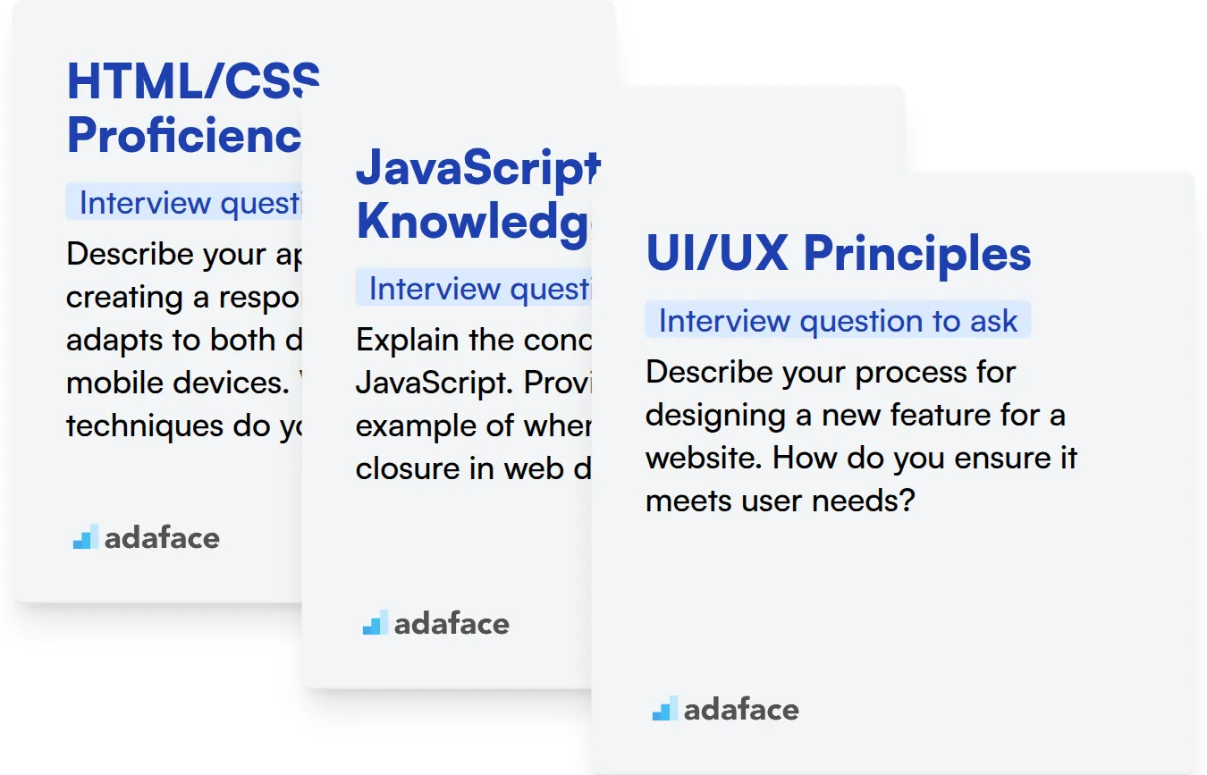
HTML/CSS Proficiency
An assessment test focusing on HTML/CSS can quickly filter candidates with a solid understanding of these languages. You can use Adaface's HTML/CSS test to evaluate their knowledge of selectors, box model, and responsive design principles.
To assess their HTML/CSS skills directly, ask a targeted interview question. This will allow you to understand their practical application of these concepts.
Describe your approach to creating a responsive layout that adapts to both desktop and mobile devices. What CSS techniques do you use?
Look for a clear explanation of media queries, flexible grids, and the use of viewport meta tags. The candidate should demonstrate an understanding of how to prioritize content and optimize the user experience for different screen sizes.
JavaScript Knowledge
Use an assessment test with JavaScript MCQs to quickly gauge their proficiency. Adaface's JavaScript assessment can help you evaluate their understanding of core concepts, libraries, and frameworks.
A targeted interview question can further reveal their practical JavaScript skills and problem-solving abilities.
Explain the concept of closures in JavaScript. Provide a real-world example of when you would use a closure in web development.
The candidate should be able to clearly define closures and explain their benefits, such as data encapsulation and preserving state. They should also be able to provide a practical example of how closures are used in event handling or creating private variables.
UI/UX Principles
You can assess UI/UX skills with an aptitude test focusing on user-centered design principles. This helps filter out candidates that don't meet this bar.
Probe their understanding with an interview question on how they approach design challenges.
Describe your process for designing a new feature for a website. How do you ensure it meets user needs?
Look for a structured approach that includes user research, wireframing, prototyping, and testing. The candidate should emphasize the importance of gathering user feedback and iterating on the design based on that feedback.
Hire Top Web Design Talent with Skills Tests and Targeted Interview Questions
When hiring for web design roles, it's important to accurately assess candidates' skills to ensure they possess the necessary expertise.
Skill tests offer a straightforward way to evaluate candidates' abilities. Consider using Adaface's UI/UX Design Test or Front End Developer Test to gauge their proficiency.
Once you've identified top candidates through skills assessments, you can proceed to interviews. This allows you to delve deeper into their experience and suitability for the role.
Ready to get started? Explore Adaface's Online Assessment Platform and streamline your web design hiring process. You can also sign up to try it yourself.
UI/UX Design Test
30 mins | 14 MCQs
The UI UX design test focuses on testing concepts around wire-framing, prototyping, A/B testing, landing pages, and UI/ UX design principles. It assesses a candidate's product designing skills and their ability to create useful designs for feature requirements via scenario based questions.
Try UI/UX Design Test
Download Web Design interview questions template in multiple formats
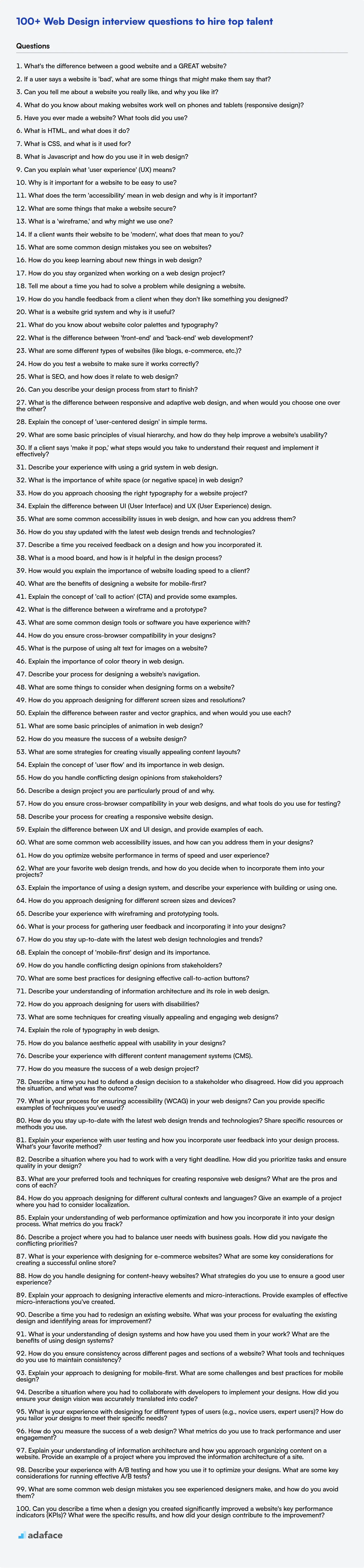
Web Design Interview Questions FAQs
What are some key areas to assess in a Web Design interview?
Key areas include understanding of design principles, UI/UX knowledge, technical skills like HTML, CSS, JavaScript, and problem-solving abilities.
How can I evaluate a fresher's Web Design skills?
Focus on their understanding of basic concepts, portfolio projects (if any), and their eagerness to learn and adapt. Ask questions about their favorite designs and why.
What are some good behavioral questions for Web Design candidates?
Ask about how they handle feedback, manage deadlines, and collaborate with developers and other designers. These questions reveal their soft skills and teamwork abilities.
How important is it to assess a candidate's knowledge of responsive design?
Very important. Responsive design is essential for creating websites that work well on all devices. Test their understanding of media queries and flexible layouts.
What's the best way to assess a candidate's problem-solving skills during a Web Design interview?
Present them with a hypothetical design challenge and ask them to walk you through their thought process. This reveals their ability to think critically and creatively.
Should I focus on technical skills or design aesthetic during the Web Design interview?
It depends on the role, but ideally, you should assess both. Technical skills are needed to execute designs, while aesthetic understanding ensures the design aligns with user needs and brand guidelines.
40 min skill tests.
No trick questions.
Accurate shortlisting.
We make it easy for you to find the best candidates in your pipeline with a 40 min skills test.
Try for freeRelated posts
Free resources

Join 1200+ companies in 80+ countries.
Try the most candidate friendly skills assessment tool today.

40 min tests.
No trick questions.
Accurate shortlisting.
No trick questions.
Accurate shortlisting.